Image: Screenshot, Gallup
Data Journalism Top 10: Global Migration, EU Pesticides, Russian Occupation, a Congressman’s Lies
Read this article in

Step-By-Step Guide for Journalists on the Basics of Google Sheets

Tipsheet for Using Ocean Data in Your Investigations

No Coding Required: A Step-by-Step Guide to Scraping Websites With Data Miner

GIJC23 – The Future of Data Journalism: New Analytical Tools, Data Visualization, and AI
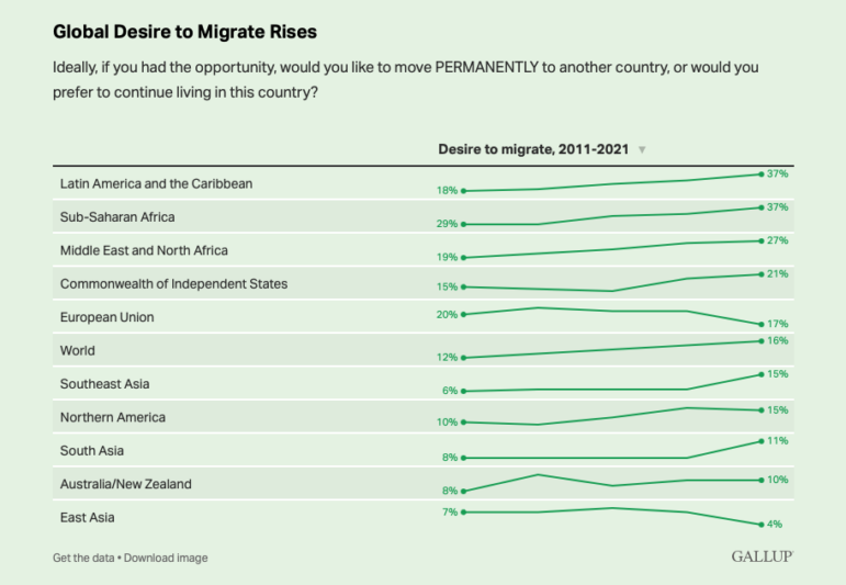
Recently, Gallup released its first worldwide survey since 2018 of adults’ desire to migrate to other countries, based on data gathered in 2021. They found that 16 per cent of adults wanted to migrate — the highest number in 10 years — despite curbs on migration growth caused by the COVID-19 pandemic.
Our weekly NodeXL and human curation of the most popular data journalism stories on Twitter also provides new ways to look at a hugely diverse range of issues, including a US Congressman’s epic lies, EU apple farming, how US pickup trucks got so huge, a Twitter analysis of Brazil’s coup plotters, and an interactive snowfall chart.
Migration Dreams
A Gallup survey on global desire to migrate found that in 2021, during the second year of the COVID-19 pandemic, the number of people wanting to leave their home countries reached its highest level in a decade — nearly 900 million worldwide. In 12 countries, including two in Europe, more than half of the population would move away if they could. The most desired destination remains, as in past years, the United States.
Unraveling a Phony Biography
George Santos, a Republican, was elected to the US House of Representatives in November 2022. Shortly after, journalists uncovered an extraordinary record of lies he made, ranging from where he worked, what schools he attended, his religious background, and even how his mother died. A Washington Post graphic tracked the changes and deletions in the “About” page of his campaign website, comparing the text from November 2020, when he launched his first candidacy, to November 2022, when he was elected, to January 2023, when many of the falsehoods were revealed in the media.
Poisoned Apples?
An interactive investigation by Süddeutsche Zeitung and Bavarian public broadcaster Bayerischer Rundfunk analyzed the records of 681 apple farmers in South Tyrol in northern Italy, and revealed just how much pesticide is used in apple farming. The dataset offered new insights into apple cultivation in the EU, where such records are generally not publicly available. Among other insights, the team found that a single orchard was sprayed an average of 38 times over the course of a season — between March and September — and in rare cases as many as 50 times.
Documenting Russia’s Occupation of Energodar
In March 2022, the Russian military captured the Zaporizhzhia nuclear power plant, as well as its satellite town, Energodar. Ukrainian data site Texty and the Zaporizhzhia Center of Investigation reconstructed the events that took place before and during the occupation. A data visualization modeled like a monthly calendar — covering February to December 2022 — shows the timeline for the capture and occupation of the city, and maps key events and moments. These incidents include Russian shelling, local resistance, arrival of the IAEA mission, and control of information.
How Pickup Trucks Got So Big
A visual storytelling team at Axios set out to find out how pickup trucks in the US got so big — in size and in popularity — by analyzing various datasets relating to Americans’ love affair with the vehicle. Among the findings: Originally a “workhorse vehicle,” more people now use their trucks for shopping and errands than for hauling and towing. They also looked at the evolution of truck size and design over 40 years, how deadly they are in collisions, and more. Will Chase shared the process behind the piece, and its 3D animation, in a tweet thread.
India’s Dangerous Factories
GIJN member Indiaspend dug into official government data on the deaths and injuries of factory workers in India. Between 2017 and 2020, a total of 1,109 deaths and more than 4,000 injuries were recorded on average each year. Journalists looked into the problems surrounding these occupational accidents, including industrial violations, lack of factory inspections, and underreporting due to collusion between companies, hospitals, and enforcement officials.
Analyzing Brazil’s Coup Plotters
Hundreds of people were arrested in Brazil last month for storming into, and vandalizing, government buildings in an attempt to overthrow the current president. At the request of fact-checking site Agência Lupa, data intelligence studio Lagom Data identified and analyzed the Twitter profiles of 131 people who were arrested in connection with the attempted coup. Among its findings: many of the detainees follow the Twitter accounts of former Brazilian President Jair Bolsonaro and extreme right-wing politicians. Also, don’t miss the dataset released by GIJN member Fiquem Sabendo which reveals the purchases made using the corporate card held by Bolsonaro while he was in office.
Harmful Smog in Bishkek
Bishkek, the capital of Kyrgyzstan in Central Asia, is notorious for suffering from terrible levels of smog. News site 24.kg analyzed air pollution data from December 2022 and the first half of January 2023 and found that, for most of the days observed, there was no possibility of inhaling fresh, unpolluted air.
Comparing US Snowfall Over 50 Years
Major cities along the US East Coast are seeing some of their least snowy seasons over the past 50 years. Climate change probably means later snows, and heavy snowfalls dumped in big storms. The New York Times created an interactive chart for readers to compare the amount of snow in 57 cities across the country over 50 years.
Blockbusters Fading from Oscar Radar
The Wall Street Journal took a look at the overlap between box-office hits and films nominated for Best Picture at the Academy Awards over four decades. It found that in the ’80s and ’90s, there tended to be more blockbuster movies vying for the Best Picture Oscar, but that pattern of overlap began to decrease in the early 2000s.
Thanks again to Marc Smith and Harald Meier of Connected Action for gathering the links and graphing them. GIJN’s Data Journalism Top 10 list is curated weekly.
 Eunice Au is GIJN’s global team manager. Previously, she was a Malaysia correspondent for Singapore’s The Straits Times, and a journalist at Malaysia’s New Straits Times. She has also written for The Sun, Malaysian Today, and Madam Chair.
 Alexa van Sickle is an associate editor at GIJN. She was previously a senior editor for the foreign correspondence magazine Roads and Kingdoms. She has also been an editor at the International Institute for Strategic Studies and a publisher at an international law non-profit in London. She lives in Vienna, Austria.
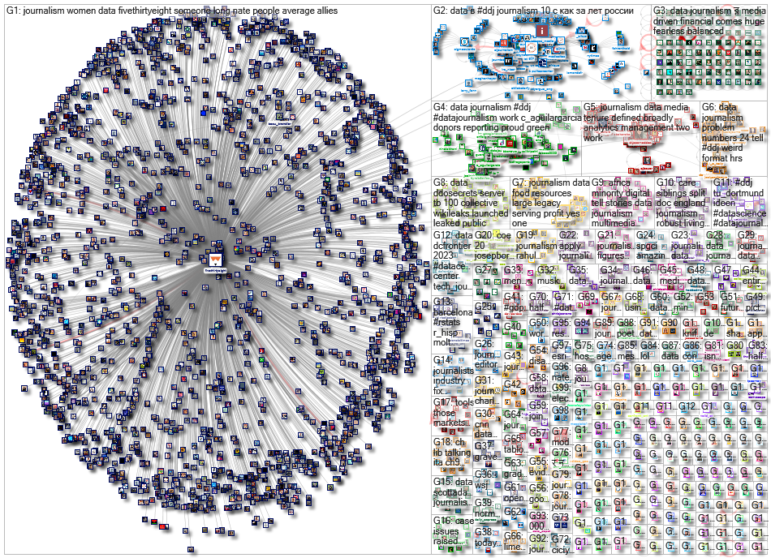
For a look at NodeXL’s mapping on #ddj and data journalism on Twitter, check out this map.
Step-By-Step Guide for Journalists on the Basics of Google Sheets
Tipsheet for Using Ocean Data in Your Investigations
No Coding Required: A Step-by-Step Guide to Scraping Websites With Data Miner
GIJC23 – The Future of Data Journalism: New Analytical Tools, Data Visualization, and AI

Turning the Threat to a Distant Glacier into a Local Story Through Data Visualization

One Name at a Time: How Die Zeit Built a Searchable Database of Nazi Party Members

Visualizing a Trillion Dollars, India’s Warming Cities, Russian Mercenaries at Sea, and World Cup Player Physiques
‘Super’ El Niño Threat, Myanmar Villages Razed, California’s Billionaire Tax Bill, and South Africa’s Murder Rate

This work is licensed under a Creative Commons Attribution-NoDerivatives 4.0 International License
Republish our articles for free, online or in print, under a Creative Commons license.
Republish this article
This work is licensed under a Creative Commons Attribution-NoDerivatives 4.0 International License
Read Next
Climate Data Journalism
Turning the Threat to a Distant Glacier into a Local Story Through Data Visualization
New York Times climate and environmental graphics reporter Mira Rojanasakul discusses how her team visualized the sea level rise threat from the melting Thwaites Glacier in Antarctica.
Data Journalism
One Name at a Time: How Die Zeit Built a Searchable Database of Nazi Party Members
An online tool set up by the German newspaper Die Zeit, in cooperation with archives in Germany and in the United States, allows people to search several million Nazi Party membership cards.
Data Journalism Top 10
Visualizing a Trillion Dollars, India’s Warming Cities, Russian Mercenaries at Sea, and World Cup Player Physiques
Also highlighting how films portray Ukrainians, increasing tree cover in Spain, and how couples meet.
Data Journalism Top 10
‘Super’ El Niño Threat, Myanmar Villages Razed, California’s Billionaire Tax Bill, and South Africa’s Murder Rate
Also highlighting exploitation of journalists in Egypt, Argentina’s returning World Cup squad, and the strain on Singapore’s aging caregivers.