Data Journalism Top 10: COVID’s Psychic Numbing, Disappearing Glaciers, Chemical Weapons, Homeschooling Fatigue, Basketball’s Three-Pointers
Read this article in
Homeschooling has posed plenty of challenges to parents around the world, leaving many dissatisfied with the online learning experience. Our NodeXL #ddj mapping from April 26 to May 2, which tracks the week’s most popular data journalism stories on Twitter, found a piece by Voxeurop highlighting that most people in Europe aren’t keen on their kids continuing to study remotely even with the necessary materials and support. In this edition, we also feature an interactive project by The Guardian exploring disappearing glaciers, a look at Stephen Curry’s remarkable basketball records by The Washington Post, and an archive of publications using data sonification to tell stories.
Our Disappearing Glaciers
The rapid disappearance of mountain glaciers is among the most striking examples of how climate change is reshaping the world. Using a database of glaciers called Global Land Ice Measurements from Space (GLIMS), The Guardian created an interactive visualization to show how 90 of the largest and best surveyed glaciers have been melting for decades.
Chemical Weapons
The Chemical Weapons Convention came into force in 1997 to ban the development, production, or stockpiling of chemical weapons. Only four countries — Egypt, South Sudan, North Korea, and Israel — have not signed or ratified the convention. A new project by Al Jazeera collected data on chemical weapon attacks in the Middle East to explain the impact of various agents on the human body.
Unhappy with Homeschooling
In much of the world, school closures have prompted a shift to remote and digital learning. In Europe, most parents and caregivers were unhappy with this major change in the education system, according to surveys by Eurofound, the agency of the European Union for the Improvement of Living and Working Conditions. Voxeurop’s story based on this data highlights that despite being provided with the necessary tools and having long distance support from teachers, most respondents were not keen on repeating the experience.
Streaming Battles
For the film streaming platform Netflix, the pandemic was a golden era. But the company’s results in the first quarter of 2021 indicate that the boom time may be over. Netflix is facing fierce competition from Disney, Amazon, Apple, and other large companies. The Financial Times took a look at the numbers to illustrate the battle to dominate the entertainment business.
Migrants in Europe
Many European countries are struggling to successfully integrate the thousands of migrants and refugees that have landed on their soil. This European Data Journalism Network story mapped the camps across the continent and examined the poor living conditions to illustrate how refugee camps are hindering social integration.
How Americans Moved
The pandemic may have stopped us from traveling, but it prompted some people to move, either temporarily or permanently. In the US, this trend of people moving to the suburbs of their core metropolitan area, and to farther away satellite cities, appears to predate the coronavirus crisis. But data suggests the rate has accelerated. Bloomberg analyzed US Postal Service change-of-address and mail-forwarding documents to paint a clearer picture of where Americans moved during the pandemic.
Stephen Curry’s Record
April was a memorable month for basketball player Stephen Curry, the Golden State Warriors’ star. Curry’s extraordinary shooting enabled him to score a record-setting 96 three-pointers, obliterating the previous record of 82 by James Harden in November 2019. The Washington Post’s graphics illustrate Curry’s incredible shot-making, which puts him on track to become the NBA player with the most career three-pointers ever.
COVID-19: Progress in the UK
Amid the depressing news about the pandemic’s soaring infection rates and growing death toll, there was some good news from the UK this week: an analysis by BBC News found that about 22 million people in the country live in areas that reported zero COVID-19 deaths in April. This marks a significant improvement compared to January, thanks to the latest lockdown and vaccinations.
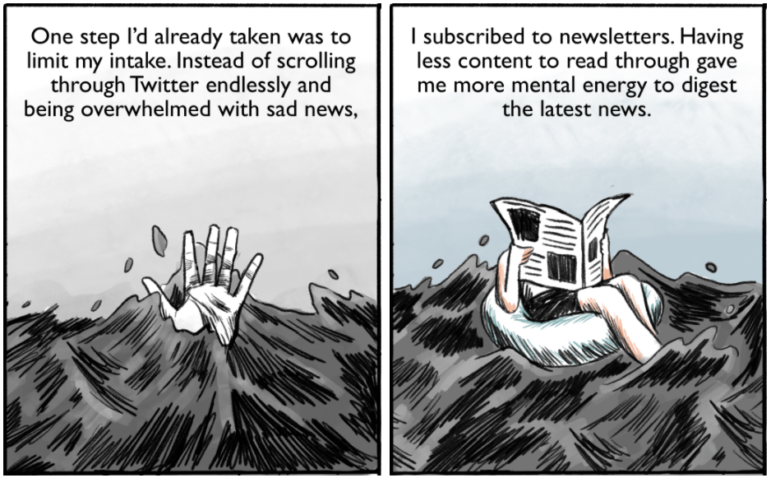
Psychic Numbing
News outlets across the world have tracked coronavirus cases since last spring, but the numbers can hardly convey the scale of the tragedy. For many people, looking at COVID-19 data no longer prompts an emotional response. This phenomenon is called “psychic numbing.” NPR graphic artist Connie Hanzhang Jin, who also started feeling numb to the numbers she was updating, made a comic to explain this psychological effect and how to cope with it.
Turning Data Into Sound
We know data can look beautiful. But what does it sound like? In recent years, especially during the pandemic, media outlets have experimented with data sonification — transforming data into audio to convey information. Now, researchers and design experts have created an entire archive of publications that use sonification as a storytelling technique. Examples include articles on COVID-19 spreading rates, unemployment, air pollution, cyber-attacks, and more.
Thanks again to Marc Smith and Harald Meier of Connected Action for gathering the links and graphing them. The Top Ten #ddj list is curated weekly.
 Peter Georgiev is GIJN’s social media and engagement editor. Previously, he was part of NBC News’ investigative unit in New York. He also worked as a correspondent for Bulgarian National Television and his reporting has been published by the Guardian, Deutsche Welle, and other international outlets.
For a look at NodeXL’s mapping on #ddj and data journalism on Twitter, check out this map.

Step-By-Step Guide for Journalists on the Basics of Google Sheets

How To Create a Data Journalism Team

Reporter’s Guide to Investigating Cryptocurrency

Tipsheet on Partnering with Civil Society Organizations and Non-Governmental Organizations
Step-By-Step Guide for Journalists on the Basics of Google Sheets

Lessons Learned: 10 Common Mistakes in Data Journalism
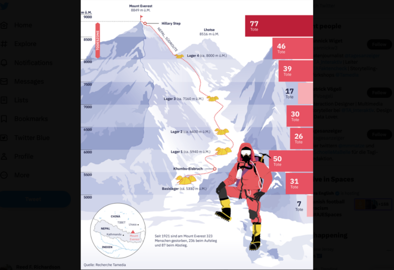
Data Journalism Top 10: Everest’s Deadly Legacy, Paris Metro Pollution, Migrant Worker Struggles in Singapore
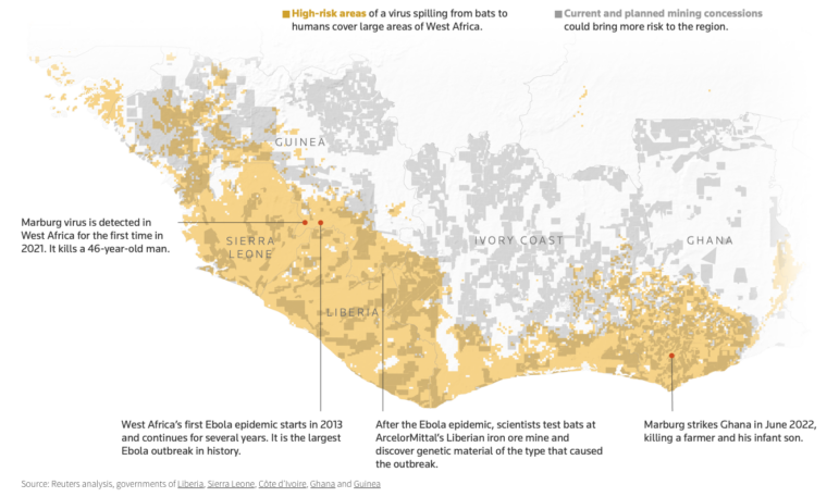
Data Journalism Top 10: Bats and the Next Pandemic, China’s Electric Battery Dominance, and Brazil’s Healthcare ‘Holes’

This work is licensed under a Creative Commons Attribution-NoDerivatives 4.0 International License
Republish our articles for free, online or in print, under a Creative Commons license.
Republish this article
This work is licensed under a Creative Commons Attribution-NoDerivatives 4.0 International License
Read Next
Guides Data Journalism Reporting Tools & Tips
Step-By-Step Guide for Journalists on the Basics of Google Sheets
Knowing how to use spreadsheets is a crucial skill, as it allows you to find potential stories in large amounts of data and to think critically about how to use it.
Data Journalism News & Analysis
Lessons Learned: 10 Common Mistakes in Data Journalism
GIJN asked speakers and attendees in the NICAR conference hallways for the data journalism gaps they see and for under-covered topic areas newsrooms can address.
Data Journalism Data Journalism Top 10
Data Journalism Top 10: Everest’s Deadly Legacy, Paris Metro Pollution, Migrant Worker Struggles in Singapore
This week, GIJN’s Top 10 in Data Journalism examines why the world’s tallest mountain has become increasingly deadly for those trying to climb it, pollution in Paris metro stations, US laws expanding gun access one year after the Uvalde mass shooting, and migrant worker struggles in Singapore.
Data Journalism Data Journalism Top 10
Data Journalism Top 10: Bats and the Next Pandemic, China’s Electric Battery Dominance, and Brazil’s Healthcare ‘Holes’
GIJN’s weekly, curated look at the Top 10 in Data Journalism highlights bats and predicting the location of the next pandemic, China’s electric battery dominance, and mapping out Brazil’s healthcare “holes.”