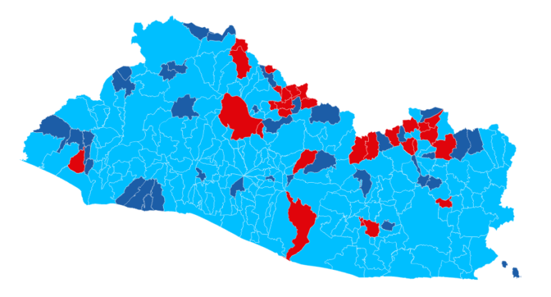
The newspaper El Diario de Hoy published an interactive map of election results.
GIJN’s Data Journalism Top 10: Earth’s Resources, “Good Data,” Who Owns Berlin

Step-By-Step Guide for Journalists on the Basics of Google Sheets

Tipsheet for Using Ocean Data in Your Investigations

No Coding Required: A Step-by-Step Guide to Scraping Websites With Data Miner

GIJC23 – The Future of Data Journalism: New Analytical Tools, Data Visualization, and AI
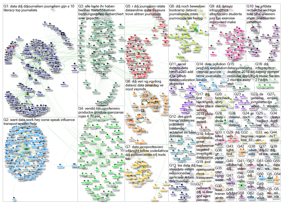
What’s the global data journalism community tweeting about this week? Our NodeXL #ddj mapping from February 11 to 17 finds learning opportunities from @utknightcenter and @WorldResources, while @Tagesspiegel and @correctiv_org ask who owns Berlin’s housing and @LacePadilla examines what makes a good visualization.
Leaving Central America
Costa Rican data journalist and trainer Hassel Fallas has created a visualization-rich story examining emigration from Honduras, Guatemala and El Salvador. The numbers are particularly stark in Honduras, where the rate of departures grew 2.5 times between 1990 and 2017.
Who Owns Berlin?
In Germany, Der Taggesspiegel and Correctiv have teamed up to figure out who owns Berlin’s housing, and how this relates to rental prices. They’re asking Berliners to provide information about their landlords and how much they pay in rent. Using the same method, Correctiv had previously looked into the rental market in Hamburg for their investigation “Who Owns Hamburg?”
Learning R
No time to learn the R programming language from A to Z? This free tutorial adapted from a Knight Center course has you covered. It aims to quickly teach journalists how to enhance their data analysis, complete with R journalism case studies.
“Good Data”
The Institute of Network Cultures has released “Good Data,” a book whose authors propose a set of “good data” practices, values and principles. They delve into issues like data sovereignty, citizen-led data initiatives and the need for strong information security. The book is available for free and in full here.
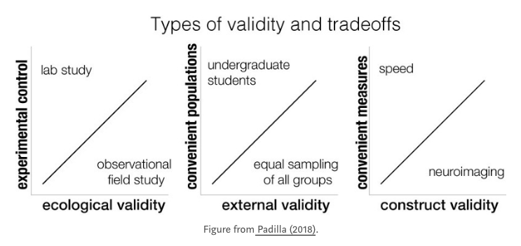
Good Viz
How do you decide what constitutes a good visualization? Lace Padilla, a postdoctoral research fellow at Northwestern University, attempts to answer that question from the perspective of a cognitive scientist. She cautions against a misplaced faith in fancy graphics and makes a case for objective measures.
El Salvador Votes
The Salvadoran newspaper El Diario de Hoy has published an interactive map showing the results of the country’s February 3 elections, municipality by municipality. In the map below, light blue shows wins by the conservative Grand Alliance for National Unity party, whose leader Nayib Bukele was elected president with more than half of Salvadorans’ votes.
DATA4CHANGE
There’s still time to apply for DATA4CHANGE, an event in which multidisciplinary teams (designers, journalists, data researchers and web developers) go on a five-day sprint to create prototypes of data-driven projects for social good. This year, it will be held in Nairobi from May 30 to June 3. The deadline for applications is Feb. 28.
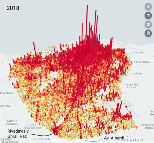
Insecurity in Buenos Aires
This visualization of crime in Buenos Aires was created by Argentina’s A24 television channel. It shows which corners of the city have the highest incidences of crime, as well as where it is decreasing. Overall, from 2017 to 2018, robberies and theft have gone up, while homicides have gone down.
Resource Watch
Journalists are invited to a Feb. 26 webinar held by experts from the World Resource Institute to learn how to use Resource Watch, a platform featuring data and maps on the state of the planet’s resources. It includes topics like population, poverty, natural disasters, air quality, coastal flooding and human migration.
Data Literacy in Turkey
VOYD, a Turkish association working on data literacy, open data and open government, is carrying out a survey to better serve its followers. If you’re interested in their work, help them by filling it out here.
Thanks, once again, to Marc Smith of Connected Action for gathering the links and graphing them.
 Gaelle Faure is GIJN’s associate editor. Previously, she worked for France 24, where she specialized in social newsgathering and verification. She has also worked as an editor for News Deeply and reported for Time Magazine.
For a look at Marc Smith’s mapping on #ddj on Twitter, check out this map.
Step-By-Step Guide for Journalists on the Basics of Google Sheets
Tipsheet for Using Ocean Data in Your Investigations
No Coding Required: A Step-by-Step Guide to Scraping Websites With Data Miner
GIJC23 – The Future of Data Journalism: New Analytical Tools, Data Visualization, and AI

Turning the Threat to a Distant Glacier into a Local Story Through Data Visualization

One Name at a Time: How Die Zeit Built a Searchable Database of Nazi Party Members

Making Trillions Make Sense: How Reuters Visualized the AI Economy

How the Hindu Is Embedding AI Into Its Data Journalism

This work is licensed under a Creative Commons Attribution-NoDerivatives 4.0 International License
Republish our articles for free, online or in print, under a Creative Commons license.
Republish this article
This work is licensed under a Creative Commons Attribution-NoDerivatives 4.0 International License
Read Next
Climate Data Journalism
Turning the Threat to a Distant Glacier into a Local Story Through Data Visualization
New York Times climate and environmental graphics reporter Mira Rojanasakul discusses how her team visualized the sea level rise threat from the melting Thwaites Glacier in Antarctica.
Data Journalism
One Name at a Time: How Die Zeit Built a Searchable Database of Nazi Party Members
An online tool set up by the German newspaper Die Zeit, in cooperation with archives in Germany and in the United States, allows people to search several million Nazi Party membership cards.
Data Journalism
Making Trillions Make Sense: How Reuters Visualized the AI Economy
How do you make a trillion dollars feel real to someone who has never seen that much money? Vineet Khare and Mayank Bhatt faced that very challenge for their data-driven investigation into AI investment.
Data Journalism
How the Hindu Is Embedding AI Into Its Data Journalism
LLMs are quietly reshaping data journalism workflows at The Hindu, helping reporters process vast document sets, write scripts and build interactive tools.