
GIJN’s Data Journalism Top 10: El Salvador’s Corpses, Searching for Women, Merging Data
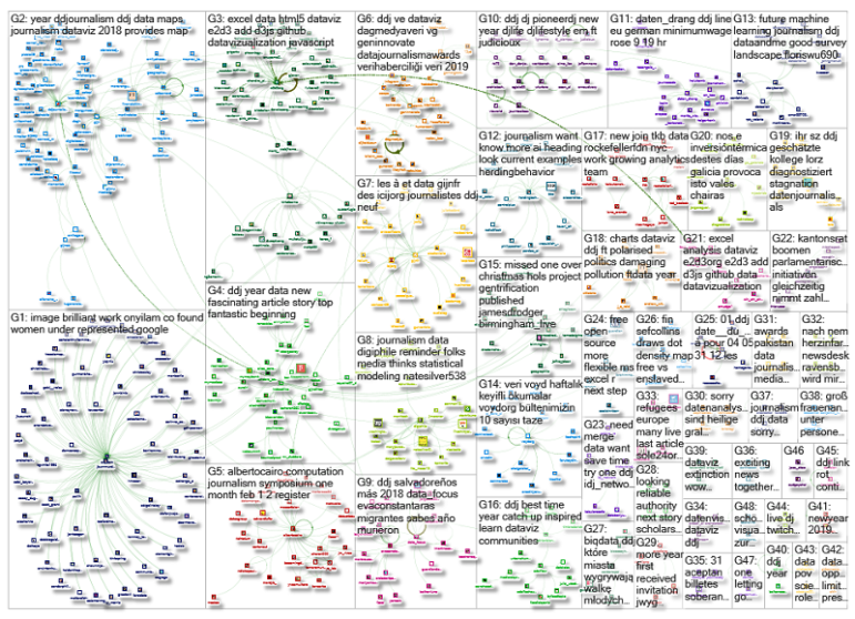
What’s the global data journalism community tweeting about this week? Our NodeXL #ddj mapping from December 31, 2018 to Jan 6, 2019 finds experts sharing their thoughts on machine learning in journalism with @storybench, @funkeinterativ and @webk1d‘s useful tool to merge datasets, @pewresearch‘s overview of female under-representation in online image searches, and an analysis by @EDHNoticias on corpses sent back to El Salvador.
Machine Learning in Journalism
Journalists can utilize machine learning as part of investigative reporting, or as a day-to-day tool to make repetitive tasks easier. Storybench gathered thoughts from experts in the industry about the advantages and pitfalls of using machine learning for journalism, whether it is truly necessary and the problem of algorithmic accountability.
Analyzing Dead Bodies Sent Back El Salvador
El Diario De Hoy investigated repatriation data for deceased Salvadorans. Between January 2009 and March 2018, 1,248 bodies were repatriated to El Salvador. The leading cause of death: homicide, followed by traffic accidents.
Merge Datasets with One Tool
Looking to merge datasets? Funke Interaktiv and Webkid’s Geo Data Merger tool is an open source tool which can handle json, csv, geojson and topojson files.
Searching for Women Online
The Pew Research Center used machine vision to study and analyze gender in online image search results and then compare those results with real-world gender composition data in the workforce. Researchers found that women were underrepresented in online images, when compared to their actual participation rates in majority of the jobs examined.
Data Journalism Handbook 2
Haven’t had time to read through the initial 21 chapters of the Data Journalism Handbook 2? You’re in luck, here’s a summary from AlJazeera Labs’ data journalist Mohammed Haddad, who shared 10 key takeaways from the book.
Compelling Arguments with Data
This 2017 presentation from Tableau research scientist Robert Kosara resurfaced. Here he is on the difference between storytelling and data presentation, as well as how to present data in a compelling way, with examples from the late Swedish statistician Hans Rosling.
Illustrating National Railway Delays
BBC England’s charts illustrate the problems facing Great Britain’s train network, including the causes of delays over 32 years, the influence of staff shortages and the level of passenger frustration. The code (#Python scraper and #R analysis) and analysis of the story is on github.
The Future of Data Analysis
This 2016 presentation by statistician Dr Edward Tufte has resurfaced online, thanks to Alberto Cairo. Here he is on the relationship between evidence, inference and conclusions: “Data analysis is about turning information into conclusions. Analytical thinking is about assessing and evaluating the relationship between information and conclusions.”
https://twitter.com/albertocairo/status/1080895996865990658
Computation + Data Journalism Symposium
This gathering in Miami — a celebration and synthesis of new ways to find and tell news stories with, by and about data and algorithms — is just three weeks away. The symposium will include topics such as the human touch in automated fact-checking, photomation or fauxtomation, and using algorithms to investigate algorithms and society. Register here.
Data Bulletin (in Turkish)
From interviews with data journalists to data journalism playbooks, the VOYD Veri bulletin will alert you to the latest tips and tools in the data journalism world, seen through Turkish eyes. Subscribe here.
Thanks, once again, to Marc Smith of Connected Action for gathering the links and graphing them.
 Eunice Au is GIJN’s program coordinator. Previously, she was a Malaysia correspondent for Singapore’s The Straits Times, and a journalist at the New Straits Times. She has also written for The Sun, Malaysian Today and Madam Chair.
For a look at Marc Smith’s mapping on #ddj on Twitter, check out this map.

Document of the Day: Algorithms for Journalists

How To Create a Data Journalism Team

Tipsheet: Latest Tools for Investigating with Telegram

Investigating Elections: Threat from AI Audio Deepfakes

Lessons Learned: 10 Common Mistakes in Data Journalism
Data Journalism Top 10: Everest’s Deadly Legacy, Paris Metro Pollution, Migrant Worker Struggles in Singapore

Data Journalism Top 10: Police Shootings, COVID Billionaires, Climate Budget Tetris, Halloween Blizzard

Data Journalism Top 10: Merkel’s Legacy, Russia’s Politics, Korea’s Missiles, Melting Ice Archives

This work is licensed under a Creative Commons Attribution-NoDerivatives 4.0 International License
Republish our articles for free, online or in print, under a Creative Commons license.
Republish this article
This work is licensed under a Creative Commons Attribution-NoDerivatives 4.0 International License
Read Next
Data Journalism News & Analysis
Lessons Learned: 10 Common Mistakes in Data Journalism
GIJN asked speakers and attendees in the NICAR conference hallways for the data journalism gaps they see, and for under-covered topic areas and under-used skills that newsrooms can address.
Data Journalism Data Journalism Top 10
Data Journalism Top 10: Everest’s Deadly Legacy, Paris Metro Pollution, Migrant Worker Struggles in Singapore
This week, GIJN’s Top 10 in Data Journalism examines why the world’s tallest mountain has become increasingly deadly for those trying to climb it, pollution in Paris metro stations, US laws expanding gun access one year after the Uvalde mass shooting, and migrant worker struggles in Singapore.
Data Journalism
Data Journalism Top 10: Police Shootings, COVID Billionaires, Climate Budget Tetris, Halloween Blizzard
Our weekly curation of the most popular data journalism stories on Twitter highlights non-fatal US police shootings, the rise and fall of COVID billionaires, racial disparities in internet service and road safety programs, and Minnesota’s great Halloween blizzard of 1991.
Data Journalism
Data Journalism Top 10: Merkel’s Legacy, Russia’s Politics, Korea’s Missiles, Melting Ice Archives
Tracking the most popular data journalism stories on Twitter from September 13 to September 19, using NodeXL mapping and our own human curation, we found projects by Reuters and the German newspaper Morgenpost analyzing Merkel’s legacy in numbers. In this edition, we also feature a story looking into North and South Korea’s missile programs, a piece on school segregation in the United States, and more worrying climate change revelations.