GIJN’s Data Journalism Top 10: Pollution in China, Visualizing Punctuation and the World Cup

Step-By-Step Guide for Journalists on the Basics of Google Sheets

Tipsheet for Using Ocean Data in Your Investigations

No Coding Required: A Step-by-Step Guide to Scraping Websites With Data Miner

GIJC23 – The Future of Data Journalism: New Analytical Tools, Data Visualization, and AI
What’s the global data journalism community tweeting about this week? Our NodeXL #ddj mapping from June 25 to July 1 finds @FinancialTimes’ timelapse map of pollution over China, @mcrosasb‘s choice of five World Cup 2018 visualizations, and @Internews‘ overview of its data journalism projects in developing country newsrooms.
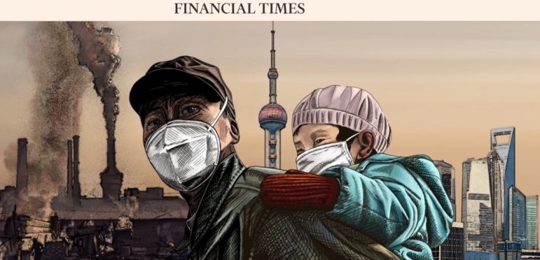
Is China’s Pollution Problem Blowing Over?
The skies over China have been a little less smoggy of late. But does that mean that the “smogocalypse” threat is over? The Financial Times collated NASA satellite data showing concentrations of nitrogen dioxide over China from January 2005 to May 2018 and found a resurgence in a common air pollutant.
Sweating the Small Stuff: Visualizing Punctuation
Most people think of a novel as a collection of words. Adam J Calhoun thinks a little differently. “I wondered what my favorite books look like without words,” he wrote in a post on Medium. So he took the words away and visualized the punctuation in some well-loved novels, including adding heatmaps. The post was originally from 2016 but has enjoyed a resurgence of interest on Twitter.
12 Reasons to Keep Loving Web Graphics
Elliot Bentley, who makes interactive graphics for The Wall Street Journal, recently wrote an article in defense of interactives. It’s difficult not to notice an industry-wide trend away from them, he wrote. So he listed 12 example of things web graphics can do that traditional article or static images can’t.
US: Creating The Segregation Map
Want to know what it takes to create a story like American is More Diverse Than Ever – But Still Segregated? The Data Journalism Den spoke to Aaron Williams, who worked on the story for The Washington Post, about what inspired the story, the help they got from academics and the decisions they made about maps.
Mapped: Deadliest Roads in Brittany
With nearly 1,000 fatal accidents on departmental roads in Brittany between 2012 and 2018, French daily Le Télégramme mapped out which sections were the most dangerous.
What One Nonprofit Did to Bring Data to Newsrooms
Internews, the media development nonprofit, has produced a website to showcase its work in the field of data journalism. You can read about its approach to bringing data journalism to newsrooms in developing countries around the world. And see some of the projects it’s worked on in Kenya, Pakistan, Afghanistan and Central America.
5 World Cup 2018 Visualizations
From the many and varied visualizations made about this year’s football tournament in Russia, @mcrosasb has chosen five, including FiveThirtyEight’s real-time predictions, the Telegraph’s visualization comparing teams and their players’ worth, and National Geographic’s look at foreign-born players.
Election in Turkey: Erdogan’s Power Base
The Frankfurter Allgemeine Zeitung put together an in-depth analysis of the Turkish election results, where Recep Tayyip Erdogan secured most of the votes in the central provinces, whereas the western and eastern provinces favored opposition candidates.
Netzwerk Recherche Sessions
Recordings of some of the sessions at this year’s Netzwerk Recherche conference held in Berlin and Munich are available online. If you understand German, and you want to hear what media creators had to say about the influence digital developments have had on our lives, take a look at the Spreerunde site.
Thanks, once again, to Marc Smith of Connected Action for gathering the links and graphing them.
 Laura Grant is filling in for GIJN’s Eunice Au, while she is on leave. She is a managing partner of the Media Hack Collective, a Johannesburg-based digital journalism initiative. She is the former associate editor of digital and data projects at the Mail & Guardian and teaches digital journalism at the University of the Witwatersrand in Johannesburg.
For a look at Marc Smith’s mapping on #ddj on Twitter, check out this map.
Step-By-Step Guide for Journalists on the Basics of Google Sheets
Tipsheet for Using Ocean Data in Your Investigations
No Coding Required: A Step-by-Step Guide to Scraping Websites With Data Miner
GIJC23 – The Future of Data Journalism: New Analytical Tools, Data Visualization, and AI

From Data to Storytelling: Concept and Design Tips from the Financial Times’ John Burn-Murdoch

Data Don’ts: Expert Tips to Avoid Misleading Audiences With Numbers

How Middle Eastern Data Outlets Use Data to Challenge Narratives and Advance Accountability

How The Pudding Used Data Visualizations to Recontextualize the Story of Climate Change

This work is licensed under a Creative Commons Attribution-NoDerivatives 4.0 International License
Republish our articles for free, online or in print, under a Creative Commons license.
Republish this article
This work is licensed under a Creative Commons Attribution-NoDerivatives 4.0 International License
Read Next
Data Journalism
From Data to Storytelling: Concept and Design Tips from the Financial Times’ John Burn-Murdoch
The chief data reporter for the Financial Times discusses how he considers the use of text, color, and annotation to aid visual storytelling through charts and graphics.
Data Journalism
Data Don’ts: Expert Tips to Avoid Misleading Audiences With Numbers
At a NICAR 2025 panel, data journalism experts discussed nuanced number errors that watchdog reporters often make that can confuse readers and disrupt story angles.
Data Journalism MENA Focus Week
How Middle Eastern Data Outlets Use Data to Challenge Narratives and Advance Accountability
Data journalism in the Middle East has been driven by organizations that have produced collaborations and projects that combine innovative techniques with nuanced local knowledge.
Climate Data Journalism
How The Pudding Used Data Visualizations to Recontextualize the Story of Climate Change
What does climate change feel like? How will your city’s climate shift, 50 years from now? Data scientist Derek Taylor explains his latest piece.