Accessibility Settings

color options

monochrome muted color dark

reading tools

isolation ruler

Tag

Hans Rosling

4 posts

Data Journalism

This Week’s Top 10 in Data Journalism

What’s the global data journalism community tweeting about this week? Our NodeXL #ddj mapping from January 15 to 21 finds an interactive @voxdotcom piece on American districts which are reducing or perpetuating racial segregation in schools, several data-related good book recommendations by @stephencredmond and @Gapminder and a podcast discussion of memorable visualizations between @michelle_borkin and @datastories.

Data Journalism

Top Ten Developments in Data Visualization This Year

Data visualization specialist Andy Kirk took a look at the most significant developments in the field so far this year and found the rise of the datagif, impressive work at the Hindustan Times and some beauties over at Periscopic. Here’s his top ten list in data visualization from January to June 2017.

Data Journalism

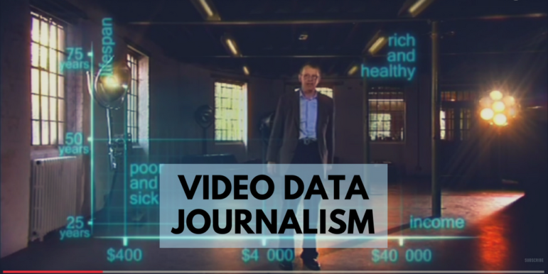
Best of Data Journalism for Video Storytelling

Wondering how to best adapt data journalism for broadcast? UK online journalism expert Paul Bradshaw has done a round-up of impressive examples from five countries — a primer on exploring data storytelling for video and television.

Data Journalism

Top Ten #ddj: The Week’s Most Popular Data Journalism Links

Here are the top data journalism tweets for Feb 13-19, per our NodeXL mapping: France’s capital of celibacy (@LeTelegramme); Ode to Hans Rosling (@ddjournalism); Portugal’s tax-free Madeira (@BR_Recherche); Love/hate pie charts (@storywithdata); Dutch ddj guide (@henkvaness); & more.