Accessibility Settings

color options

monochrome muted color dark

reading tools

isolation ruler

Tag

dataset

7 posts

Data Journalism

Data Journalism Top 10: Social Distancing Interactive, Epidemic Modeling, Germany’s Low Death Rate, and Zuckerburg TikTok Video

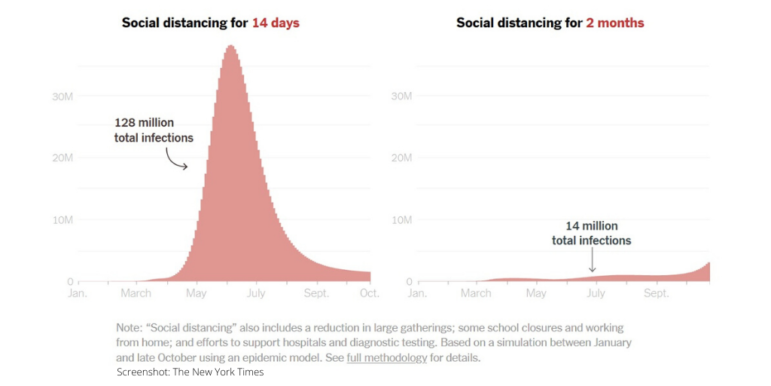
The coronavirus pandemic has resulted in the production of various interactives, charts, and simulations by data journalists and citizens around the world. This week’s NodeXL #ddj mapping from March 23 to 29 finds The New York Times explaining the dangers of ending social distancing measures by Easter, Germany’s Der Spiegel and Der Tagesspiegel measuring traffic levels and COVID-19 cases respectively, the Tampa Bay Times monitoring the situation in Florida, Kevin Simler making an interactive simulation to explain how general epidemics unfold, and Mona Chalabi creating a viral TikTok video on Mark Zuckerberg’s donation to advance coronavirus research.

Data Journalism

GIJN’s Data Journalism Top 10: Stories with Maps, Tools with Charts, Casting for Shakespeare

What’s the global data journalism community tweeting about this week? Our NodeXL #ddj mapping from October 15 to 21 finds @Esri’s @AllenCarroll talking the power of maps in storytelling, @visualizingdata’s catalogue of charts and corresponding tools to help information designers, and @ericwilliamlin’s deep dive into the data of casting decisions in Shakespearean plays since the 1900s.

Case Studies

Al Jazeera Analyzed 6,500 Homepage Images. Here’s What They Learned

Using image analysis tools on their own means nothing without asking the right questions. AJ Labs experimented with Google Vision API, a machine-learning technology, to analyze images used by Al Jazeera over the course of last year. They hope to integrate the technology into their newsroom in the future to make processes easier for their journalists.

Data Journalism

This Week’s Top Ten in Data Journalism

What’s the global data journalism community tweeting about this week? Our NodeXL #ddj mapping from Sept. 18 to 24 features Wikipedia of Data Visualization, the State of Data Journalism, Dear Data Postcard Kit, and German election data.

Data Journalism

Top Ten #ddj: The Week’s Most Popular Data Journalism Links

Here are the hottest data journalism tweets for Jan 23-29, per our NodeXL mapping: 100 Years of infographics (@NatGeoMag); Trump’s wall size (@thetruesize); Women’s March (@womensmarch); journocoding (@journocode); dataset viz 25 ways (@flowingdata); dataviz stocktake (@eagereyes); & more.