News & Analysis
GIJN’s Data Journalism Top 10: Aging Wimbledon, Must-Read DataViz, Bad Charts, German Opera
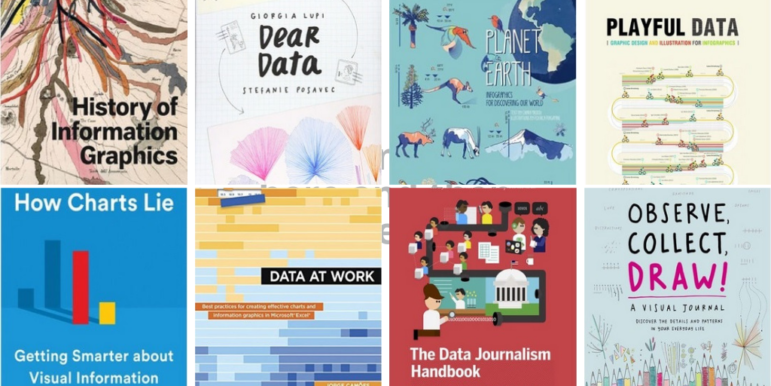
What’s the global data journalism community tweeting about this week? Our NodeXL #ddj mapping from July 15 to 21 finds Information Is Beautiful’s sharing its gallery of must-read data visualization books, Datajournalism.com highlighting pitfalls in creating charts, the FT analyzing the age of Wimbledon players, and WDR scrutinizing Germany’s opera repertoire.
