Accessibility Settings

color options

monochrome muted color dark

reading tools

isolation ruler

Tag

cartogram

3 posts

Data Journalism

GIJN’s Data Journalism Top 10: Sigma Awards, Campaign Trail Food, Data Cleaning Nightmares, Massive Leaks

What’s the global data journalism community tweeting about this week? Our NodeXL #ddj mapping from February 10 to 16 finds The Guardian US analyzing food expenditure on the Democrats’ campaign trail, The Washington Post’s Steven Rich sharing the pains of cleaning spelling permutations in data, The International Consortium of Investigative Journalists explaining the process of handling the massive #LuandaLeaks records, and the Sigma Awards announcing its shortlist.

Data Journalism

Seven Trends in Data Visualization

Data visualization is constantly changing as new technologies emerge and new techniques are discovered. Data visualization experts Lena Groeger and Jane Pong look at some of the current trends.

Data Journalism

Top Ten #ddj: The Week’s Most Popular Data Journalism Links

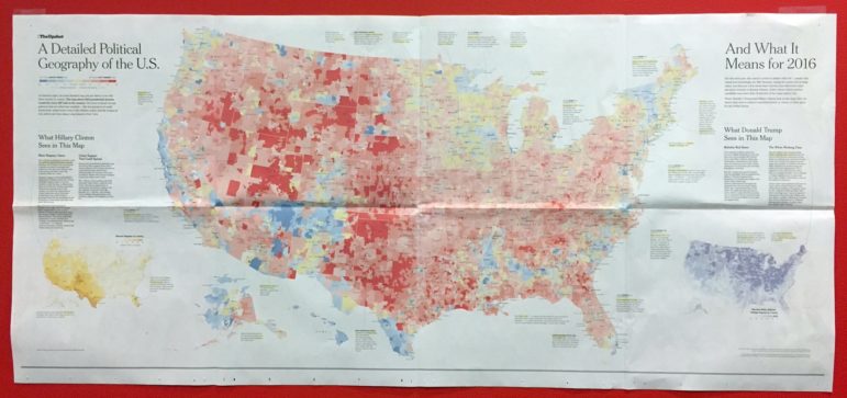
What’s the data-driven journalism crowd tweeting? Here are top links for Oct 31-Nov 6: election maps vs. cartograms (@LazaroGamio); US political geography (@nytgraphics); data pitfalls (@journalismnews); affordable healthcare (@sangerkatz); French literary awards @dataletemps); & more.