
Schematic of US B-2 bomber deploying the GBU-57 (Massive Ordnance Penetrator) bomb on Iran's underground nuclear facility at Fordow. Image: Reuters
Airstrikes in Iran and Israel, Los Angeles ICE Protests, India Plane Crash, and ‘Jaws’ Turns 50
The last few weeks have been marked by escalating tensions, both across the Middle East, with direct attacks between Israel and Iran, and inside the United States, where protests against Donald Trump’s immigration policies have resulted in clashes between police and demonstrators. This edition of our Top 10 in Data Journalism, which considered stories between June 7 and 20, also highlights a report from El Mundo on the humanitarian aid situation in Gaza; a mapping of literary mentions of Rio de Janeiro by Folha de São Paulo; and an analysis by the Korean broadcaster SBS of the return of nuclear power plants around the world.
Airstrikes Across the Middle East
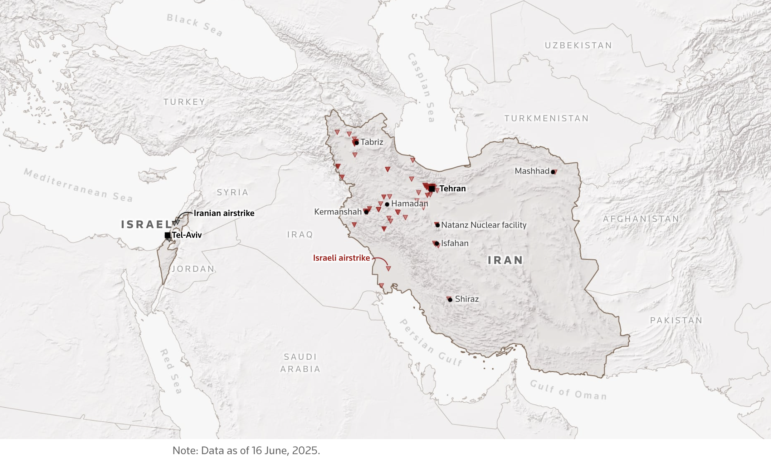
Map of Israel’s initial airstrikes in Iran (red triangles) and Iran’s attacks on Israel in response (black). Image: Reuters
On June 12, long-standing tensions between Israel and Iran escalated into a direct confrontation after Israel launched a surprise attack on military targets in Iran and killed members of the Iranian military’s top brass. Iran retaliated shortly thereafter with a series of missiles, most of which were intercepted by the Israeli defense system, and a series of daily strikes between the two countries began. More recently, after 12 days of conflict, a fragile ceasefire was announced. Reuters offered a special page with full coverage of the unfolding conflict, updated with each new development, always accompanied by a series of maps and illustrations, including explanations of Iran’s missile arsenal and Israel’s defense system; assessments and satellite images of the damage to Iran’s nuclear program — the main target of the attacks; and maps of the military installations of the United States, and much more.
Mapping the Protests in Los Angeles
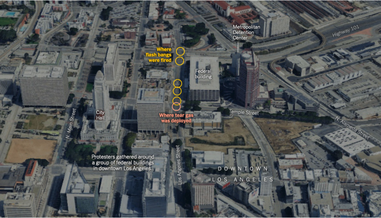
Map of protests around LA City Hall, showing where law enforcement deployed flash bang grenades and tear gas against the demonstrators. Image: The New York Times
Protests erupted in and around Los Angeles on June 6, and continued in the following days, after US Immigration and Customs Enforcement (ICE) agents arrested dozens of people during raids across the city, sparking clashes between protesters and police that resulted in numerous arrests. These migrant removal sweeps then sparked protests in several other cities throughout the US. On June 7, President Donald Trump issued an executive order to send National Guard troops to Los Angeles, despite objections from local and state leaders. The New York Times published a special report with a timeline of events as these raids first played out. The report includes images of the protests over the days, aerial and satellite images showing where clashes occurred, satellite images showing where stun grenades and tear gas were used, maps of follow-on protests in other cities, and a map of the eventual curfew imposed by Los Angeles Mayor Karen Bass in downtown Los Angeles.
Difficulties of Humanitarian Aid in Gaza
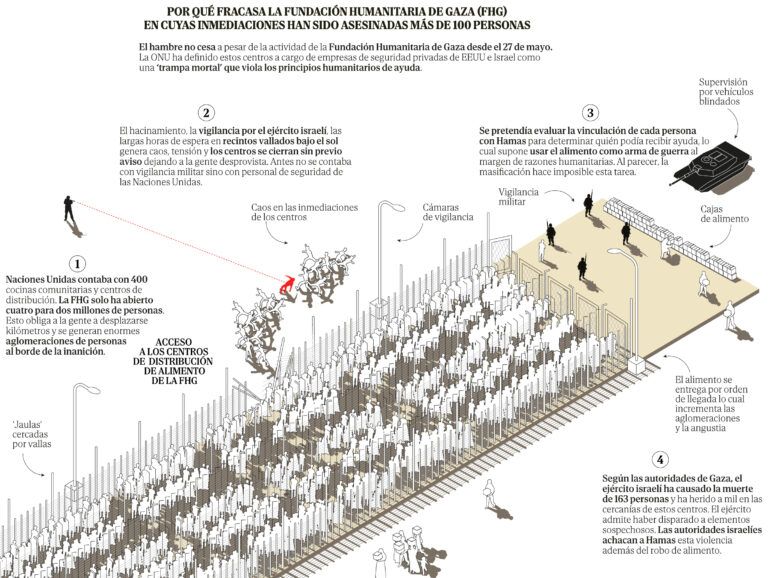
Graphic showing the chaotic and, at times, violent situations at aid stations inside Gaza. Image: El Mundo
El Mundo created a special report on the dire humanitarian aid situation in the Gaza Strip, guided by the testimony of a father who, like thousands of residents in the region, is struggling to buy food due to the Israeli blockade imposed since March on the entry of food, fuel, and medical supplies. The report recounts Ihab Okaal’s journey, his two-hour walk from the Rafah refugee camp to Tal al-Sultan, in southern Gaza, and the chaos he witnessed when trying to get one of the food boxes distributed by the Gaza Humanitarian Fund (GHF) — an organization supported by the US and Israel that replaced the UN in delivering humanitarian aid, which began operating on May 27. According to the UN, more than 400 people have died while waiting to receive food since the system was implemented. The report featured a series of illustrations that explain how the four mega-distribution centers work — which have very long lines and slow operation, since they assess each person’s ties to Hamas to determine whether they can receive aid — and also shows, through maps, a comparison between the situation of humanitarian aid up until January with the current state.
Plane Crash in India Leaves Only One Survivor
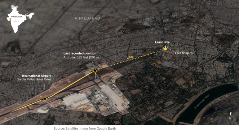
Image: Reuters
We typically avoid featuring two pieces from the same outlet in our column, but Reuters also stood out in its coverage of the Air India plane crash that left only one survivor. On June 12, minutes after taking off from the western Indian city of Ahmedabad bound for London’s Gatwick Airport, an Air India plane crashed into a residential area, impacting a medical college dormitory. The flight had 242 people on board, but the one survivor shocked the world by walking away from the scene of a crash that killed all those on board. The crash also killed 34 people and injured at least 60 more on the ground. Reuters created a special report on the accident, showing satellite images of the airport runway and its distance from the crash site, and an illustration of the plane, a Boeing 787 Dreamliner — which apparently had its landing gear down during a phase of flight when it should normally have been retracted. According to the report, this is the first fatal air crash involving a Dreamliner in the world in its nearly 15 years of service.
Data on Russia’s Costly War Effort in Ukraine
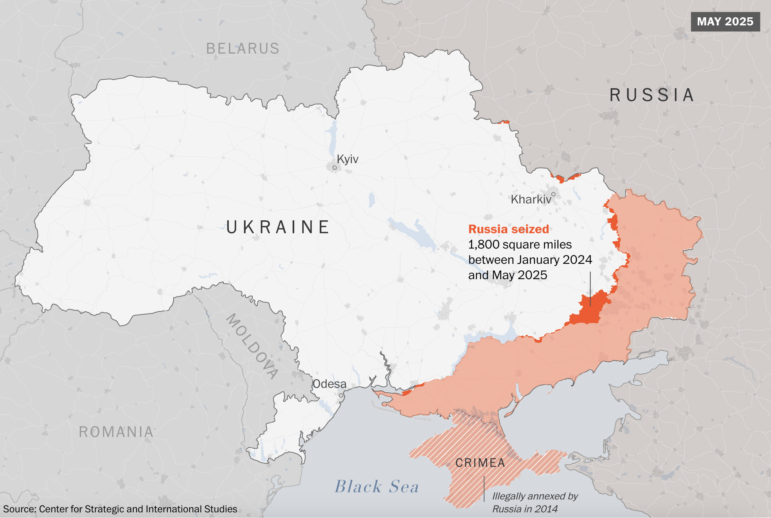
Image: The Washington Post
On June 1, Ukraine carried out one of its most ambitious counterattacks since being invaded by Russia in February 2022, using drones smuggled into Russian territory to damage dozens of strategic military aircraft at several air bases inside Russia. According to The Washington Post, the attack “showed how Kyiv can use limited tools to achieve significant effects.” In this piece, the newspaper demonstrated, through a series of data explanations, how Russia, despite claiming to be winning the war, has spent the last 17 months trying to advance in Ukraine with brute force, paying an extraordinary price in blood and equipment for marginal gains. The Post also included comparative maps of Ukrainian territory occupied by Russia in January 2024 versus May 2025. During that period, Russian forces gained control of less than 4,500 square kilometers, which corresponds to less than 1% of Ukrainian territory. Also presented were graphs showing that Russian casualties in Ukraine now exceed the total number of Soviet and Russian soldiers killed in all wars since World War II.
Literary Map of Rio de Janeiro
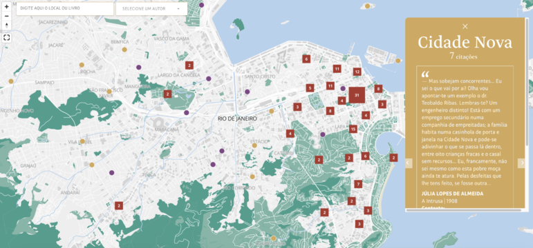
Map plotting locations of notable literary reference locations inside Rio de Janeiro. Image: Folha de São Paulo
The city of Rio de Janeiro is undoubtedly one of the most sought-after by tourists visiting Brazil, both for its natural beauty and its unique atmosphere. And it is also a living part of the imagination of many Brazilian writers, who not only set their narratives on its streets and corners, but also consider it a “living part of their stories,” according to DeltaFolha, the data hub of the Brazilian newspaper Folha de São Paulo. This year, the city received the title of World Book Capital, granted by UNESCO for the first time to a Portuguese-speaking city, and it recently hosted a Book Biennial. In this beautifully illustrated report, the newspaper presented an interactive map of the places in Rio de Janeiro mentioned in Brazilian literature from the 19th to the beginning of the 20th century. The team identified, with the help of artificial intelligence, the places mentioned in 47 works by 11 writers and geolocated them on the current map of the city.
Is the World Ready to Ditch Coal?
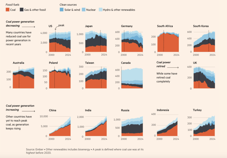
Image: Financial Times
In this interactive special report, the Financial Times examined why the world still can’t afford to abandon coal, the most polluting energy source. According to the newspaper, more than 30% of carbon emissions since the Industrial Revolution have come from burning coal. With an interactive graph, the newspaper showed that after the Paris Climate Agreement was signed in 2015, coal consumption appeared to be on a downward trend, with economists at the International Energy Agency believing that coal had peaked in 2013. But those beliefs proved wrong, and after 2020, coal use soared, reaching a record high last year — and, according to the report, shows no sign of slowing. The report presented a series of reasons why the world has not been able to abandon coal, like the fact that the fuel is cheap and abundant, that renewable energy, despite having grown at a record pace in the last decade, is not enough to meet the growing demand for electricity, and also several events that have tilted energy systems in favor of coal, such as the COVID-19 pandemic.
Reconstructing the Swiss Blatten Disaster
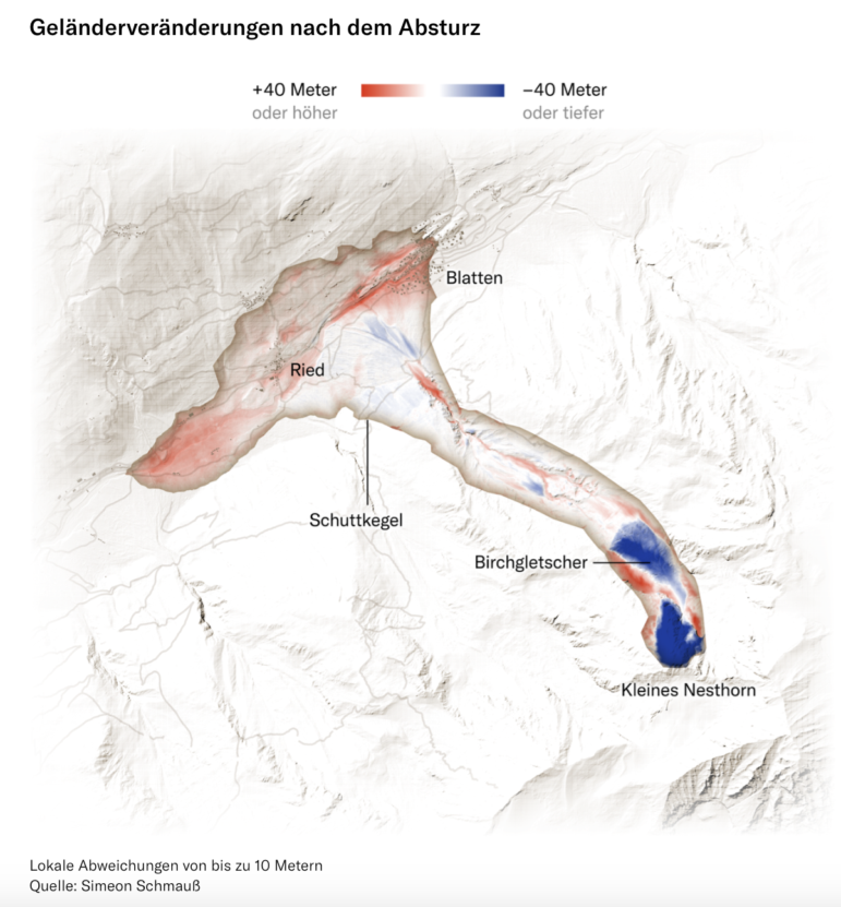
NZZ visual showing changes in landscape altitude in areas after the slide, with red indicating higher land and blue indicating lower land. (Image: NZZ
The village of Blatten was located at an altitude of about 1,500 meters (4,921 feet), nestled between steep rock faces and glaciers in the Swiss Alps. But little remains of the centuries-old village now. In May, several small rockfalls on the Kleiner Nesthorn mountain deposited about 3 million cubic meters of debris onto the Birch Glacier, both just above Blatten. The pressure from the debris intensified the melting at the base of the glacier, which began to slide faster. With the instability of the area, the 300 villagers were forced to flee their homes on May 19. Now, many of them may never return, because on May 28, the glacier completely collapsed. According to the Swiss daily Neue Zürcher Zeitung (NZZ), in just under one minute, 2.9 million cubic meters of ice and 6.4 million cubic meters of debris were deposited in the valley, burying 130 houses, including areas outside the evacuation zone. The pile of debris dammed a small nearby river, flooding the remaining houses. One person remains missing. The Swiss daily newspaper NZZ created 3D models from aerial photographs to show the unexpected chain of events that led to the destruction of the village.
50 Years of ‘Jaws’
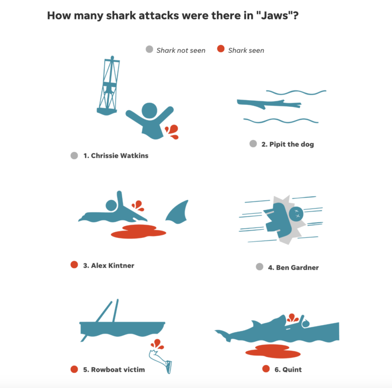
Image: USA Today
Have you ever avoided going into the sea for fear of what’s in the depths? You might be able to blame Hollywood. Sharks, especially great whites, were brought into the spotlight with the release of the 1975 movie “Jaws,” which is celebrating its 50th anniversary this year. The film tells the story of a huge great white shark that terrorizes the fictional summer resort community of Amity Island, and was responsible for introducing the world to director Steven Spielberg, who was 27 at the time. To mark the half-century since the release of what is considered the first blockbuster, USA Today published a special report with the numbers behind the classic and its three sequels. According to the report, Jaws is the 14th highest-grossing film of all time. But did you know that 81 minutes of the film pass before we see the first real shark on screen, and that it is seen for a total of only four minutes in the entire film?
Nuclear Energy’s Comeback

Korean broadcaster SBS graphed the global distribution, by country, of small modular reactors (SMRs), which have been a key reason behind the resurgence of nuclear power. Image: SBS
The “Five Graph” column by South Korean broadcaster SBS analyzed why countries that said they would phase out nuclear power are slowly returning to it, and what role small modular reactors (SMRs) play in this. According to the report, nuclear power companies have been gaining traction in the US stock market since the inauguration of the second Trump administration, and even European countries such as Italy and Denmark, which previously opted to eliminate nuclear power, are changing their position. The main reason for this reversal can be attributable to SMRs, a reactor smaller than conventional nuclear power plants that is made of modules assembled on site, which makes them, in addition to being smaller, theoretically safer. They would also be responsible for low carbon emissions and, therefore, considered cleaner. According to data from the Advanced Reactor Information System (ARIS), the US currently has the most SMRs planned with 30, followed by Russia with 22. In addition to favorable government incentives, the rise in SMRs can also be explained by investments from large technology companies, which have seen rapid increases in their energy needs.
 Ana Beatriz Assam is GIJN’s Portuguese editor and a Brazilian journalist. She has worked as a freelance reporter for the newspaper O Estado de São Paulo, mainly covering stories featuring data journalism. She has also worked for the Brazilian Association of Investigative Journalism (Abraji) as an assistant coordinator of journalism courses.

Guide to Mapping Analysis Using QGIS

Open Source Databases by Country

Tech Focus Project

2025 Conference Resources
Ukraine’s ‘Audacious’ Drone Strikes, Irish Data Centers, US Medical Funding Cuts
Measles Vaccine Impact, Tracking Narco-Submarines, Portugal’s Electoral Shift, and a Mission to Saturn’s Moon
Blackout in Spain and Portugal, Canada and Australia Elections, and a New Pope Elected
Electing a New Pope, North Korea Fighting Ukraine, Vaccination Rates to Stop Outbreaks, and a Deadly Gold Mine in Turkey

This work is licensed under a Creative Commons Attribution-NoDerivatives 4.0 International License
Republish our articles for free, online or in print, under a Creative Commons license.
Republish this article
This work is licensed under a Creative Commons Attribution-NoDerivatives 4.0 International License
Read Next
Data Journalism Top 10
Ukraine’s ‘Audacious’ Drone Strikes, Irish Data Centers, US Medical Funding Cuts
Our data journalism column also features medical research funding at risk in the US, a report on Antarctica, and an interactive that lets you ‘drive’ the Monaco Grand Prix circuit.
Data Journalism Top 10
Measles Vaccine Impact, Tracking Narco-Submarines, Portugal’s Electoral Shift, and a Mission to Saturn’s Moon
We also highlight an analysis of whether flying has become less safe, an investigation into a Philippine reforestation program, and the numbers behind the Eurovision song contest.
Data Journalism Top 10
Blackout in Spain and Portugal, Canada and Australia Elections, and a New Pope Elected
This Top 10 in Data Journalism column also highlights the death of a Ukrainian journalist in a Russian prison, Trump’s first 100 days, and India and Pakistan’s nuclear arsenals.
Data Journalism Top 10
Electing a New Pope, North Korea Fighting Ukraine, Vaccination Rates to Stop Outbreaks, and a Deadly Gold Mine in Turkey
Also highlights how X influences Elon Musk’s government policy, the numbers behind the successful Danish toy maker Lego, and mapping the Sudan conflict.