
GIJN’s Data Journalism Top 10: Simon Says, AI’s Breakthrough Year and Global Migration’s Portal
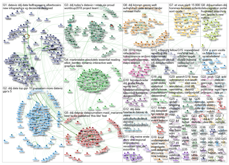
What’s the global data journalism community tweeting about this week? Our NodeXL #ddj mapping from June 4 to 10 finds an awesome curated list of resources for visualizing music by @Willian_justen, a deep dive into unsolved murders in America by @washingtonpost and @CarbonBrief mapping of the past, present and future of global coal power plants.
Simon Says: Music Visualization
Check out this mega-list of music visualization-related resources compiled by Willian Justen, including books, experiments, tutorials and fun sites, such as “Play a Cornet to Donald Trump,” “Typatone” and “Simon Says.”
Awesome list of over 200 tools, experiments and tutorials about audio visualization ??:https://t.co/nAiEmXmuem via @moklick #dataviz #ddj pic.twitter.com/8w4a1mj7oT
— Steffen Kühne (@stekhn) June 5, 2018
Diving Deep Into Unsolved Murders
The Washington Post has mapped more than 52,000 homicides in 50 US cities over the past decade and found dozens of “low-arrest zones” where murder is common but arrests are rare. The homicide data collected in this 18-month project is shared on Github. It includes the location of the killing, whether an arrest was made and, in most cases, basic demographic information about each victim.
In major cities all over U.S., there are neighborhoods where murders are consistently going unsolved.
We analyzed more than a decade of homicide data to find out where: https://t.co/5onNL2Cx81 pic.twitter.com/quOiqY9J8Z
— Kaeti Hinck (@kaeti) June 6, 2018
Mapping Coal
The way coal’s next chapter unfolds is key to tackling climate change. Carbon Brief created a cool interactive map of the past, present and future of the world’s coal power plants.
Probs the best thing this week: @CarbonBrief‘s sensational map and analysis of every coal power plant in the world https://t.co/sLjP9o7zRp pic.twitter.com/H9XJvq5HRC
— Unearthed (@UE) June 9, 2018
AI’s Breakthrough Year in Journalism
Paul Bradshaw summarizes the key takeaways of the Global Editors Network Summit on the influence of artificial intelligence in journalism, covering voice AI, bots, monetization and verification.
Thoughts on this year’s AI-dominated #gensummit (plus chatbots and the commoditisation of #ddj) https://t.co/TMeD7Di8Op
— Paul Bradshaw (@paulbradshaw) June 5, 2018
Global Migration Data Portal
The Global Migration Data Portal brings together key facts and figures about global migration trends and topics in one place and communicates global data on migration through visualizations, infographics and videos, including a spin-the-wheel visualization on Sustainable Development Goals.
Frustrated searching for migration data? @IOM_GMDAC‘s new portal makes it easier: https://t.co/CURnEqpn4L #ddj #datajournalism #dataviz #migration pic.twitter.com/xb239OTLs7
— DataDrivenJournalism (@ddjournalism) June 9, 2018
News, Numbers and Public Opinion
An Nguyen’s edited collection “News, Numbers and Public Opinion in a Data-Driven World” is a timely contribution in a period rife with concern about disinformation and fake news. Sabrina Wilkinson reviews the book.
News, Numbers and Public Opinion in a Data-Driven World https://t.co/KDICh53Qx6 pic.twitter.com/OTjMcvvGQo
— The Sociological Review (@TheSocReview) June 7, 2018
Webinar: Turning Numbers into Narrative
Poynter’s NewsU is offering a two-part Investigative Reporting: From Numbers to Narrative webinar taught by WRAL News investigative reporter Tyler Dukes. This webinar is for those looking for strategies to wrangle data and use it accurately to find and tell stories.
Reminder: Join me and @Poynter next week for a two-part webinar on turning numbers to narratives. Learn to supercharge your reporting with data. https://t.co/y5n4Xk4buz
— Tyler Dukes (@mtdukes) June 12, 2018
Transparency in Spain (Spanish)
Rafa Camacho curated 313 articles related to transparency in Spain and put them together in one handy downloadable PDF.
Archivo de #TransparenciaEnEspaña – Mayo 2018 | @scoopit
?https://t.co/IraOf4jzN4#Transparencia #GobiernoAbierto #ParticipacionCiudadana #DatosAbiertos #Comunicacion #AAPP #ddj #Gobierno #AdministraacionElectronica #RGPD #LCSP#ContentCuration #curation #contentcurator pic.twitter.com/oZJVeb0B1V
— Rafa Camacho (@rafacamu) June 6, 2018
Free Course: DataViz for Human Rights
Learn how to write a data visualization brief, explore and analyze a data set, organize your data and select the most appropriate visualization method for your data. This free course is taught by information designer Stefanie Posavec.
Want to make #SocialChange happen with #data led #design? Learn for free with award-winning designer @stefpos with @small_media https://t.co/lQjzJQbwVS pic.twitter.com/ZQgdE4FqDn
— Advocacy Assembly (@Advocassembly) June 6, 2018
DataViz Summer School in Netherlands
Graphic Hunters is organising a data visualization summer school on August 21, 23 and 24 at the Centraal Museum in Utrecht, Netherlands. Learn from information designers Federica Fragapane and Moritz Stefaner.
Designing with #data – here you can sign up for my #dataviz workshop with @GraphicHunters! https://t.co/z7tPTKP9aa. We’ll work together on the design of meaningful and elegant visual narratives and we’ll also experiment with #datasculpture! #datavisualization #ddj #infographics pic.twitter.com/jHQi2FJiGM
— Federica Fragapane (@fedfragapane) June 5, 2018
Thanks, once again, to Marc Smith of Connected Action for gathering the links and graphing them.
 Eunice Au is GIJN’s program coordinator. Previously, she was a Malaysia correspondent for Singapore’s The Straits Times, and a journalist at the New Straits Times. She has also written for The Sun, Malaysian Today and Madam Chair.
For a look at Marc Smith’s mapping on #ddj on Twitter, check out this map.

GIJC23 – The Future of Data Journalism: New Analytical Tools, Data Visualization, and AI

GIJC23 – The Basics of Using Google Sheets

GIJC23 – Using Pinpoint to Organize Unstructured Data

GIJC23 – Measuring Impact

From Data to Storytelling: Concept and Design Tips from the Financial Times’ John Burn-Murdoch

Tracking US Migrant Detention Data: What Journalists Need to Understand

Data Don’ts: Expert Tips to Avoid Misleading Audiences With Numbers

How The Pudding Used Data Visualizations to Recontextualize the Story of Climate Change

This work is licensed under a Creative Commons Attribution-NoDerivatives 4.0 International License
Republish our articles for free, online or in print, under a Creative Commons license.
Republish this article
This work is licensed under a Creative Commons Attribution-NoDerivatives 4.0 International License
Read Next
Data Journalism
From Data to Storytelling: Concept and Design Tips from the Financial Times’ John Burn-Murdoch
The chief data reporter for the Financial Times discusses how he considers the use of text, color, and annotation to aid visual storytelling through charts and graphics.
Data Journalism News & Analysis
Tracking US Migrant Detention Data: What Journalists Need to Understand
The US government’s detained immigrant population flatlined in April, but there’s more to the numbers than meets the eye. Here’s what journalists need to know about the data.
Data Journalism
Data Don’ts: Expert Tips to Avoid Misleading Audiences With Numbers
At a NICAR 2025 panel, data journalism experts discussed nuanced number errors that watchdog reporters often make that can confuse readers and disrupt story angles.
Climate Data Journalism
How The Pudding Used Data Visualizations to Recontextualize the Story of Climate Change
What does climate change feel like? How will your city’s climate shift, 50 years from now? Data scientist Derek Taylor explains his latest piece.