
Top Ten #ddj: This Week’s Top Data Journalism
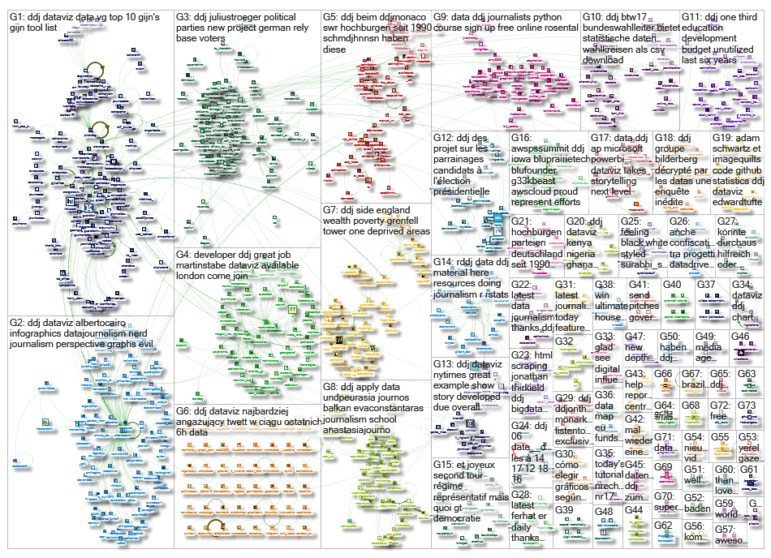
 What’s the global #ddj community tweeting about? Our NodeXL mapping from June 12 to 18 includes Google Images quilts from @verge, nerd journalism by @albertocairo, mapping of German’s political party strongholds from @morgenpost and misleading election graphics from @los_replicantes.
Google Images Quilts
Statistician Edward Tufte collaborated with software engineer Adam Schwartz to share a free web-app with the rest of us. ImageQuilts is a Chrome extension that acts as a plug-in for Google Images which lets you build a collage based on the results of your search.
Adam Schwartz + ET on #imagequilts code at github . #statistics #ddj #dataviz https://t.co/8F1MM6HnqK
— Edward Tufte (@EdwardTufte) June 12, 2017
Nerd Journalism
In data expert Alberto Cairo’s 272-page PhD dissertation draft, titled “Nerd Journalism: How Data And Digital Technology Transformed News Graphics,” he examines the transformation of the craft of news graphics by consulting with dozens of professionals at several news organizations and analyzing two decades of Malofiej Infographics Awards.
Nerd Journalism https://t.co/lCXlYuZte6 #dataviz #infographics #ddj #dataJournalism pic.twitter.com/2CRE68LOw4
— Alberto Cairo (@albertocairo) June 12, 2017
Mapped: Political Support in Germany
Interactive map by Berliner Morgenpost displays the voter strongholds for political parties across Germany and their unique characteristics, based on election analyses since 1990.
Neues Projekt: Wir haben die Dauerhochburgen der Parteien bei Bundestagswahlen seit 1990 ermittelt. https://t.co/2h52ymWRUW … #BTW2017 #ddj pic.twitter.com/ZtXcqNiupB
— André Pätzold (@AlterPaetz) June 12, 2017
Misleading Graphics
Los Replicantes lists eight hilarious examples of media misrepresenting election data by using misleading graphics.
This is why perspective graphs are evil: https://t.co/SNt28W6b2C via @acangros #dataviz #infographics #ddj pic.twitter.com/oe8mODm9no
— Alberto Cairo (@albertocairo) June 13, 2017
Downloading Germany’s Data
The German Federal Returning Office releases data on population, economy, labour market and more in downloadable CSV files.
#Wahlkreis-Daten u.a. zu Bevölkerung, Wirtschaft, Bildung, Arbeitsmarkt, Sozialem als csv-Download verfügbar https://t.co/5A3hvSwOaw #btw17 pic.twitter.com/dODjEYgVO0
— Der Bundeswahlleiter (@Wahlleiter_Bund) June 16, 2017
Pakistan’s Unspent Education Budget
A Balochistan Voices analysis of the past six budgets in Balochistan, Pakistan found that the government failed to utilize one-third of its education development budget. The unspent money could have been used to educate almost 430,000 children and build almost 3,000 small primary schools.
One third of education development budget in Balochistan unutilized in last 6 years. https://t.co/OmVmkwJqaz
— Surriya Manzoor (@SaadaChenab) June 15, 2017
French Elections: Abstentions Above 15%
In a representative government, the ideal is that elected representatives represent the citizens. Data Guele shows that the number of votes obtained by elected representatives are steadily falling while abstentions have consistently been above 15 percent.
Le dernier @Data_Gueule remet bien les choses en place… 56 % hier pour rappel. #legislatives2017 https://t.co/dJc6pCcsam pic.twitter.com/vgpi1c69YW
— Duriez Romain (@DuriezR) June 19, 2017
Beautiful News: #Dataviz & Interactives
ProPublica tweeted a thread of praise for cool data visualizations created by local American media organizations, including links to work by Dallas Morning News, Los Angeles Times, The Denver Post and Tampa Bay Times.
Data viz and interactive news give readers useful tools while reporting the news in a beautiful way. Local news orgs are doing amazing work:
— ProPublica (@ProPublica) June 12, 2017
Women’s Tennis Rankings Need Overhaul
Statistician Stephanie Kovalchik believes there is a major flaw with the points-based rankings system in women’s tennis: the arbitrariness of points assigned to different events and rounds which ignore opponent or match difficulty.
#sports #journos take note – women’s #tennis rankings may not be what they seem: https://t.co/o0hoH2TMLi #ddj @ejcnet
— DataDrivenJournalism (@ddjournalism) June 15, 2017
“R” Resources for Data Journalism
Timo Grossenbacher curated a list of resources to guide you through the thick jungle of countless R packages, from learning the basics of R’s syntax to scraping HTML tables, and a guide on how to make your work comprehensible and reproducible.
Check out this new example of using #rstats in #ddj by @abtran on https://t.co/lP31WYkFT1 (gladly submitted by @Yeedle – thanks!)
— Timo Grossenbacher (@grssnbchr) June 19, 2017
Thanks, once again, to Marc Smith of Connected Action for gathering the links and graphing them.


