Accessibility Settings

color options

monochrome muted color dark

reading tools

isolation ruler

Tag

Interactives

21 posts

Data Journalism

Data Journalism Top 10: Hawaii’s Disappearing Beaches, Stolen Paintings, Investigating Disappearances, Herd Immunity Calculator

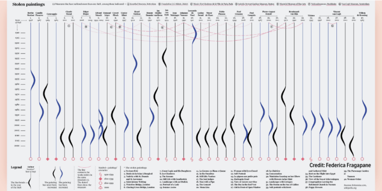
Hawaii’s scenery can be breathtaking, with cliff-rimmed white-sand beaches and surf-worthy waves. But our NodeXL #ddj mapping (Dec. 28-Jan. 3) found ProPublica highlighting dramatic erosion of the island state’s beaches over the past century. Also in this edition, we feature an interactive graphic to calculate the time to achieve COVID-19 herd immunity based on the US vaccination rate, a global vaccine distribution tracker, Federica Fragapane’s visualization of stolen paintings, and a compilation of 2020’s best data visualization lists.

Data Journalism

Data Journalism Top 10: Scented Candles, COVID Risk Simulator, Trump’s Final Regs, Sigma Awards

Are scented candles a casualty of the coronavirus crisis? Our NodeXL #ddj mapping from November 23 to 29 found researcher Kate Petrova’s data analysis revealing that scented candles have suffered a blow in online reviews and a decrease in ratings, possibly linked to the coronavirus’ ability to affect people’s sense of smell. Elsewhere, Germany’s Zeit Online created a COVID-19 infection risk calculator, the COVID Tracking Project explained how holidays and weekends disrupt the recording and publishing of virus data, and Reuters analyzed the shortcomings of the coronavirus contact tracing system in England. Meanwhile, the Sigma Awards, which celebrate the world’s best data journalism, have opened for entries.

Data Journalism

Data Journalism Top 10: Beirut Blast, Predicting Crime, US Election Simulators, and COVID in Ukraine

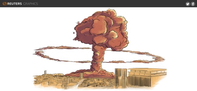
What was the magnitude of the Beirut port blast and how did it compare to other infamous explosions in history? Our NodeXL #ddj mapping from August 31 to September 6 finds Reuters illustrating just how powerful last month’s blast was in relation to the Chernobyl disaster and other explosions. The Tampa Bay Times highlighted how a county sheriff’s office is using an algorithm to supposedly predict and intercept the criminals of the future, while The New York Times used satellite maps to show how physical and political geographies interact across the United States. ESPN has been looking into the potential of people in college football crowds to become COVID-19 super-spreaders, and Slate analyzed the overuse of the word “murmur” in the popular Twilight novel series.

Data Journalism

Data Journalism Top 10: Tracking Police Accountability; Racism and Housing; China’s Hidden Prison Camps

The police shooting of Jacob Blake, a 29-year-old African American man, in the United States has reignited national unrest just months after the death of George Floyd. Our NodeXL #ddj mapping from August 24 to 30 finds ProPublica documenting police violence against Black Lives Matter protesters and tracking police accountability. The New York Times shows how the process of redlining, or denying mortgage finance to predominantly Black neighborhoods from the 1930s onwards, has resulted in heat disparities among cities, and BuzzFeed News uncovers scores of new internment camps in Xinjiang, China, by analyzing satellite data.

Data Journalism

Data Journalism Top 10: Herd Immunity, Coronavirus in Prison, Elder Abuse, Journalism Rock Stars, Layoffs

Throughout the coronavirus pandemic, we’ve seen heated debate on whether to best solve the health crisis through “herd immunity” — the indirect protection that occurs when much of a population becomes immune to infection. Our NodeXL #ddj mapping from May 11 to 17 finds FiveThirtyEight creating a simulation calculator which shows that getting to herd immunity without a vaccine isn’t quite that simple; The Marshall Project tracking COVID-19 cases and deaths in prisons across America; the BBC’s Media Show highlighting data journalists as the media’s latest rock stars; and Istories and MediaZona examining elder abuse in Russia, which experts fear may worsen during the pandemic with so many people staying home.

Data Journalism

Data Journalism Top 10: Social Distancing Interactive, Epidemic Modeling, Germany’s Low Death Rate, and Zuckerburg TikTok Video

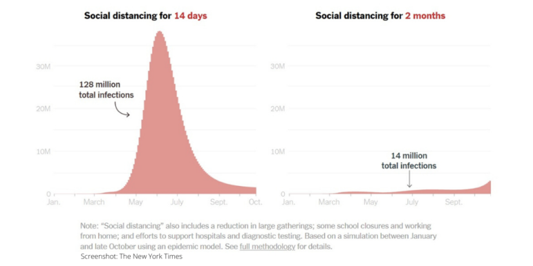
The coronavirus pandemic has resulted in the production of various interactives, charts, and simulations by data journalists and citizens around the world. This week’s NodeXL #ddj mapping from March 23 to 29 finds The New York Times explaining the dangers of ending social distancing measures by Easter, Germany’s Der Spiegel and Der Tagesspiegel measuring traffic levels and COVID-19 cases respectively, the Tampa Bay Times monitoring the situation in Florida, Kevin Simler making an interactive simulation to explain how general epidemics unfold, and Mona Chalabi creating a viral TikTok video on Mark Zuckerberg’s donation to advance coronavirus research.

Data Journalism

GIJN’s Data Journalism Top 10: Trump’s Tweets, London’s Polluted Tube, Rising Seas, Data Voids

What’s the global data journalism community tweeting about this week? Our NodeXL #ddj mapping from November 4 to 11 finds The New York Times analyzing more than 11,000 of Trump’s tweets, The Financial Times measuring air quality in London’s Underground, Der Tagesspiegel creating an interactive of the Berlin Wall, and Nieman Lab discussing data voids exploited by media manipulators.

Data Journalism

GIJN’s Data Journalism Top 10: Visualizing Climate Change, Numbers from Phrases, Democratic Donors, Moscow Money

What’s the global data journalism community tweeting about this week? Our NodeXL #ddj mapping from July 29 to August 4 finds a number of articles related to the climate crisis, including the BBC’s piece on tree planting and its interactive tool on temperatures across the world, as well as Alberto Cairo’s blog post on misleading charts created by climate deniers. We also found useful tips and tools: a data GIF maker by Google News Initiative, Datajournalism.com’s strategies for teaching data journalism, and Paul Bradshaw’s tutorial on how to extract numeric data from phrases.

Data Journalism

GIJN’s Data Journalism Top 10: Data Feminism, Blockchain for Investigations, Train Speeds, EU DataViz Conference

What’s the global data journalism community tweeting about this week? Our NodeXL #ddj mapping from April 15 to 21 finds an informative interactive tool about the health of our generation by @srfdata, a piece by academic @wsaqaf explaining how journalism can utilize blockchain for investigations, data visualization teaching materials by @R_Graph_Gallery, and a book draft on data feminism by @kanarinka and @laurenfklein.