
OVER NEW ORLEANS -- Tech. Sgt. Keith Berry looks down into flooded streets searching for survivors. He is part of an Air Force Reserve team credited with saving more than 1,040 people in the aftermath of Hurricane Katrina. He is a pararescueman with the 304th Rescue Squadron from Portland, Ore. (U.S. Air Force photo by Master Sgt. Bill Huntington)
Guide Resource
GIJN’s Guide to Investigating Sea Level Rise
Chapter Guide Resource
GIJN’s Guide to Investigating Sea Level Rise: Chapter One — Key Questions

Chapter Guide Resource
GIJN’s Guide to Investigating Sea Level Rise: Chapter Two – Understanding Rising Sea Levels
Chapter Guide Resource
GIJN’s Guide to Investigating Sea Level Rise: Chapter Three — Maps and Data

Chapter Guide Resource
GIJN’s Guide to Investigating Sea Level Rise: Chapter Four — Story Tips and Best Practices

Chapter Guide Resource
GIJN’s Guide to Investigating Sea Level Rise: Chapter Five — Visualizing Rising Oceans

Chapter Guide Resource
GIJN’s Guide to Investigating Sea Level Rise: Chapter Six — Notable Investigations


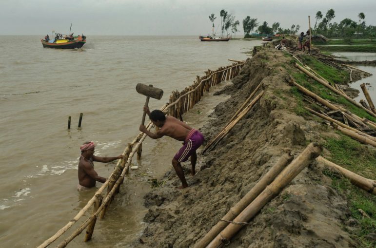
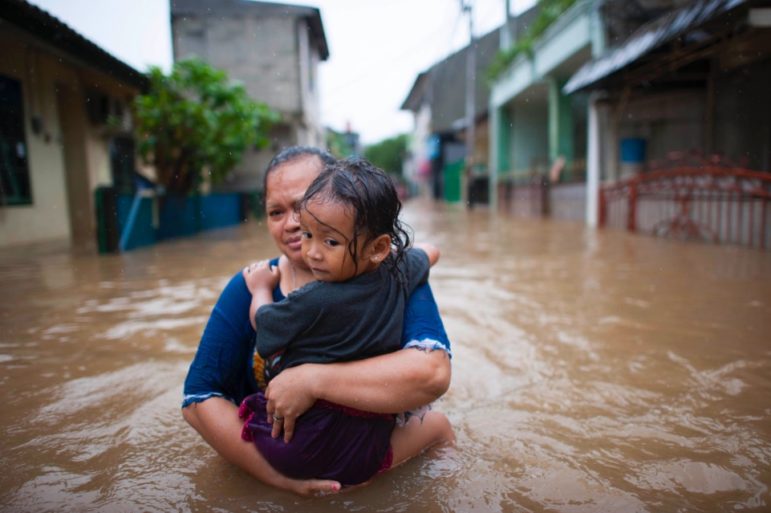
Writing about sea level rise doesn’t necessarily require using historic data or scientific projections, although such information is available for coastal locations worldwide. The practical effects are already visible and affecting people’s lives.
“Start with who is being affected now and then you can back into ‘it’s getting worse,’” counsels John Upton, the Partnership Journalism Editor at Climate Central, a nonprofit news organization that reports on climate science.
Documenting Sea Level Rise
Still, numbers speak loudly when it comes to sea level rise. How much has occurred already? How high could it go? GIJN has found resources to help, but first a quick note on the data and where it comes from.
Existing sea levels are measured by tide gauges around the world and by satellite altimeters. Tide gauges, of which there are about 2,000 worldwide, use sensors to record the height of the surrounding water level. Satellites use radio waves to measure the height of the ocean’s surface. For more, see this FAQ on sea level measurement from the US National Oceanic and Atmospheric Administration (NOAA).
The most widely accepted projections of future sea level rise come from the UN’s Intergovernmental Panel on Climate Change (IPCC). They were updated in late 2021. Five scenarios are given, based on what steps are taken to slow global warming. Modeling is done to predict outcomes up to 2150. The predictions vary by location. They also come with statements about the degree of confidence behind them.
To reveal how high the seas might rise, projections can be applied to maps showing land elevations. The accuracy of the result depends significantly on the precision of the topographical maps. Accurate maps showing the height of the land don’t exist in some places. Complex scientific papers have been written on the accuracy of digital elevation models (DEMs), such as this one on Egypt.
There are other factors, too. In some places the land is rising or falling. Also, the type of modeling used produces varied results. The so-called “bathtub model” shows all the sea-connected land that might be below a particular water level. More accurate, but harder to do, is “hydrodynamic modeling,” which accounts for seasonal waves, extreme storm surges, erosion, and other factors.
Explaining the underlying materials on which a story or investigation is based helps build reader understanding of the topic and enhances the credibility of the reporting.
Climate Central: Most Journalist-Friendly Resource
The maps showing sea level rise that are most widely used by journalists come from Climate Central. Start here on Climate Central’s Surging Seas page. For international maps go to the Coastal Risk Screening Tool. The resources are also available in Spanish, and reporters can watch an explanatory video.
These tools offer a variety of options for showing potentially inundated areas on downloadable maps.
Climate Central’s information is regularly updated with the latest scientific projections and with updated maps. The latest IPCC data has been incorporated. Climate Central uses proprietary digital elevation models for coastal areas. When looking at a map, there’s a “details and limitations” description. Other material on the website explains the scenario options, the sources for the maps, and other underlying information. The team at Climate Central advises “these maps should be regarded as screening tools to identify places that may require deeper investigation of risk.”
Climate Central has participated in such investigations, often working with journalists in the United States. The group’s Partnership Journalism program collaborates with US newsrooms to report dozens of stories on sea level rise and other topics. (Journalists from outside the US can email Climate Central’s communications director Peter Girard.)

Projections show which parts of New York and New Jersey will be underwater if the water level rises by 10 meters. Image: Screenshot/Climate Central
Climate Central has used its data to prepare many interesting custom resources. For example, this look at how sea level rise will affect iconic structures at 189 locations worldwide, such as the Lujiazui Skyscrapers in Shanghai, China, the Lagos Central Mosque in Nigeria, and Estádio dos Aflitos in Recife, Brazil. The group’s data is also relied upon for academic studies and was used in a 2021 report by environmental NGO Greenpeace: The Projected Economic Impact of Extreme Sea-Level Rise in Seven Asian Cities in 2030.
Other Sources on Projected Sea Level Increase
Some official sources provide data on projected increases or trend lines, but the information is not overlaid on elevation maps. Nevertheless, projections for some locations are available. Some are based on projecting the historic information, others rely on the IPCC models.
Relative Sea Level Trends is from The Permanent Service for Mean Sea Level (PSMSL), an organization based in Liverpool, UK, at the National Oceanography Centre (NOC). PSMSL’s world map shows many locations, though with limited coverage of South America and Africa. You can email queries about the data or other press inquiries to the organization.
The Sea Level Projection Tool from the US National Aeronautics and Space Administration (NASA) shows projections at locations worldwide based on the IPCC’s AR6 report. NASA’s Sea Level Evaluation and Assessment Tool has trend projections for many locations around the world based on PSMSL data and satellite measurements. The press contact is Jane Lee.
The US NOAA Tides and Currents Data Trends provides historic sea level rise data and trend analysis for locations in 65 countries worldwide. The direct press contact is Jennie Lyons and there is also a general media contact.
Climate Analytics’ Local Sea-Level Projections shows predicted trends at the locations of gauges worldwide based on the work of Robert Kopp, a sea-level scientist and scholar at Rutgers University in the US.
The IPCC Interactive Atlas shows projected increases for large regions, based on data from the 2021 IPCC’s AR6 report. However, it’s not very useful for journalists due to its broad coverage and because it doesn’t deal with extremes such as storm surges or factor in sinking land masses, according to Lena Reimann, a postdoctoral researcher at Vrije Universiteit Amsterdam.

IPCC WGI Interactive Atlas: Regional Information. Long term sea level rise projection to 2100. Image: Screenshot
Seek Access to National Data
There are other places to look for maps showing potential inundation.
Predictive maps and new data are coming out regularly. Watch for studies by government bodies at all levels, and for articles by scientists and environmental groups.
For example, India’s National Centre for Coastal Research (NCCR), according to a Times of India article, informed Parliament that it has prepared 526 maps for the entire Indian coast to show areas vulnerable to erosion from rising seas. Here’s an article in NewsNine based on a study concerning six Indian coastal cities.
See also this warning about sea levels in China, which reached their highest levels on record in 2021, according to an official report from the National Marine Environmental Monitoring Centre, and reported by Reuters.
Questions about sea level rise to pose to government officials might include:
- What data does the government have about sea level rise?
- Are maps being created showing the projections?
- Are the latest IPCC projections being applied?
- Are the consequences of sea level rise being evaluated (and by whom)?
- What contingency/mitigation plans are being made?
Build on Reports
It should be noted that much of the coverage of sea level rise is driven by new research from scientists and others who have measurement capabilities beyond those of journalists, but reporters can build on such findings.
For example, an academic study forecast the inundation of coastal resorts in Egypt. A reporter might question the effects on the local tourism business.
Another report looks at the potential costs for sea ports. Might that lead to a costly bill for adaptation and retrofitting of facilities?
This study describes how sea level rise might impact UNESCO sites in Africa. Can this loss of heritage be stopped?
More broadly focused is a report on the potential for more tension among nations around the Bay of Bengal due to sea level rise, which might lead to a long-term geopolitical story.
Regional and National Sources

A coastal Haiti town is flooded as a result of Hurricane Sandy. Image: Logan Abassi/UN/MINUSTAH/ Climate Visuals
GIJN has collected regional and national sources for information. Suggestions of additional resources would be welcome.
Outside of Europe and North America, there are few maps showing projected sea level rise. Data on Africa in a European Union database (LISCoAsT (Large Scale Integrated Sea-level and Coastal Assessment Tool) was used for a 2022 study, African Heritage Sites Threatened as Sea-level Rise Accelerates. But the data is not publicly available because of lack of funding, GIJN was told by an official.
Entrepreneurs are rapidly building new databases around climate change, geared toward investors and companies looking to assess the impact of heat and flooding and other factors on their businesses. Some are listed here in this Reuters article, but access to most of these databases is fee-based.
United States
Sea Level Rise Viewer is a useful interactive tool from NOAA that allows users to call up tidal flood prediction maps based on an address search. The agency also puts out NOAA Sea Level Trends and a Sea Level Rise Technical Report. Predictions on sea level rise for selected locations in the US and its territories are provided in the Interagency Sea Level Rise Scenario Tool based on the most recent sea level rise scenarios from a 2022 US government report titled Global and Regional Sea Level Rise Scenarios for the United States: Updated Mean Projections and Extreme Water Level Probabilities Along US Coastlines. The scenarios have been updated using information from the IPCC’s AR6 report. The report projects sea levels along the US coastline will rise an additional 25-30 centimeters (10-12 inches) by 2050 with specific amounts varying regionally (see the press release here). Also see the August 2022 Sea Level Rise Technical Report with updated projections about high tide flooding.
Flood Factor: This free online tool was released in June 2020, by the nonprofit First Street Foundation. It allows searching flood risk in the continental US by address and shows information on the surrounding area. The First Street Foundation also produces reports, such as one from 2021, The 4th National Risk Assessment: Climbing Commercial Closures, which analyzed the risk of flood damage to business and residential properties across the country. Flood Factor’s research found that FEMA maps understate the risk of flooding. For help, contact communications officer Michael Lopes.
FEMA: Flood maps are available from the Federal Emergency Management Agency (FEMA).
Local governments, academics, and NGOs are also creating maps. For example, the Virginia Institute of Marine Science each year issues a report on recent sea-level trends and projects sea-level height to the year 2050 for 32 localities along the US East, Gulf, West, and Alaskan coasts. See its summary of trends. Also, Toxic Tides is a collaborative effort among community-based organizations and academic researchers with maps of California.
Canada

Climate change threatens estuaries worldwide, making effective management essential, like in Muizenberg beach, a popular Cape Town surf spot on the Zandvlei estuary. Image: Brendon Bosworth/Climate Visuals Countdown
The Canadian government has posted information based on the IPCC’s previous projections and will soon update them with the latest projections from the AR6 report. Scroll to page on sea level rise data. The map of gridded projections, however, is at a coarse resolution.
Europe
European Environment Agency: Maps and charts on Global and European sea level rise show historic levels and projected sea level increases at many specific locations. Also provided is information on area and populations of low-lying regions. A collection of resources – including EU-related studies – is available on Climate ADAPT.
The European Commission’s Joint Research Centre is a source for studies (search for “sea level rise”) and hosts the JRC Sea Level Database and the Large Scale Integrated Sea-level and Coastal Assessment Tool (LISCoAsT). The database has been used for studies such as the 2020 Sandy Coastlines Under Threat of Erosion, but is not publicly available.
France: France Info has posted an interactive map allowing users to observe whether the coastline has receded (in red), advanced (in blue), or hasn’t moved (in gray). The data is from the Center for Studies and Expertise on Risks, the Environment, Mobility, and Planning (Cerema).
Other Sources
Also look for national and regional resources. For example:
- The Australian government provides Coastal Risk Australia
- In New Zealand, risks are mapped for Wellington
- The Norwegian Mapping Authority created an interactive map
- For France, see an interactive map using Climate Central data.
Studying Historic Records
Because sea levels are already rising, a look backwards is warranted.
But a word of caution: While various institutions have detailed information on sea levels worldwide dating back decades, this is a complicated subject. The websites are designed for scientists. The data comes with many caveats and variables, especially concerning land movement. Try getting help from local experts to interpret the data.
Look for historic records from:
- Several international sources (detailed below)
- National governments, such as environmental ministries, weather forecasters, agricultural agencies
- Regional bodies, such as water resources agencies
- Local governments, such as land planning agencies
- Academic sources, such as geographers and environmental scientists
- Commercial sources . These may be fee-based, but some will work with journalists. Fathom, for example, a UK firm specializing in flood mapping, has sea level rise data for the UK and Japan that it will share with journalists.
Here’s a list of national sea level experts. It’s put together by the National Oceanographic Center in the UK, and while some of the people listed may have moved on, it’s a comprehensive compendium of relevant agencies.
Since 1933, the Permanent Service for Mean Sea Level (PSMSL) – mentioned above – has collected and analyzed sea level data from the global network of tide gauges. This guide to Obtaining Tide Gauge Data shows information from more than 2,000 tide gauge stations. Search for the place you’re interested in and click on the station, for example, Montevideo, Uruguay. The page with a map that appears has monthly and annual data plotted, with the underlying data available, but it’s complicated to understand and not advisable to just use the first and last year numbers to show past sea level rise. See note on the formats here. For queries about the data e-mail: psmsl@noc.ac.uk. Press enquiries go to: noc@grayling.com.
NOAA’s Tides and Currents Data Trends provides historic sea level rise data and trend analysis for locations in 65 countries worldwide. (NOAA also tracks worldwide ocean temperatures, reported in Coral Reef Watch.) Contact Jennie Lyons: jennie.lyons@noaa.gov.
The National Aeronautics and Space Administration has historic sea level information not only from PSMSL but also from satellites, from 1993 to 2022, that gets updated. Contact Jane Lee: jane.j.lee@jpl.nasa.gov.
The Climate Data Store of the European Commission links to a page containing Sea level daily gridded data from satellite observations for the global ocean from 1993 to present, and also pages on the Mediterranean and the Black Sea. Access to the data is possible, though it requires registration through the European Centre for Medium-Range Weather Forecasts (ECMWF), and the material is challenging. Contact: copernicus-press@ecmwf.int.
The European Organisation for the Exploitation of Meteorological Satellites (EUMETSAT), an EU agency, has satellite data on sea levels dating back to around 2010, now provided by the Copernicus Sentinel-6 satellite. Contact: Press@eumetsat.int.

This work is licensed under a Creative Commons Attribution-NoDerivatives 4.0 International License
Republish our articles for free, online or in print, under a Creative Commons license.
Republish this article
This work is licensed under a Creative Commons Attribution-NoDerivatives 4.0 International License
Read Next

Methodology
Remotely Investigating Russia’s Devastation of Mariupol
In March 2022, Human Rights Watch embarked on what would become an almost two year-long investigation into the Russian siege of Mariupol. Here, we explain the methodology behind our findings.

News & Analysis
Spotting Deepfakes in an Election Year: How AI Detection Tools Work — and Sometimes Fail
This Reuters Institute story offers preliminary insights on how to evaluate and understand the outcomes provided by publicly accessible AI detectors that are available for free or at low cost.

Tipsheet
Tipsheet: Latest Tools for Investigating with Telegram
Telegram’s rapid growth means reporters and investigators need to become trained in new tools that can be used to search and analyze data from the platform.

Reporting Tools & Tips
Lessons from Taiwan’s Resistance to an Election Disinformation Wave
Taiwan’s recent experience during its 2024 election cycle offers useful lessons for journalists and democracy defenders elsewhere — as well as some much-needed hope.