
Image: Screenshot
Data Journalism Top 10: Global Food Crisis, Radiotherapy Access, Costs of Breastfeeding, TikTok Impact


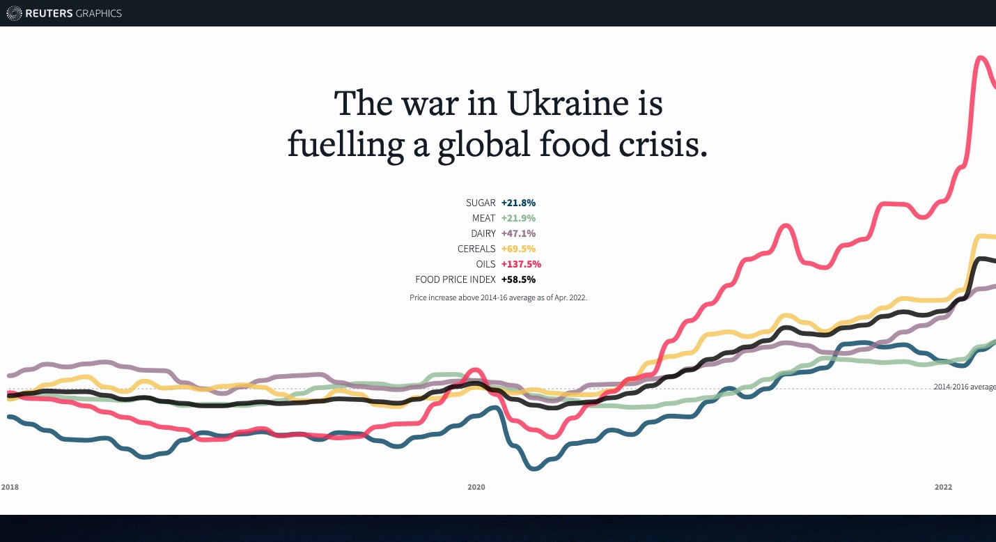
Image: Screenshot
A highlight from the world of data journalism this week was Reuters’ analysis of the impact of the war in Ukraine on food prices, and the snowball effect it is having around the world. Our weekly NodeXL and human curation of the most popular data journalism stories on Twitter also looks at visualizations showing inequality in radiotherapy access in Spain, the cost of breastfeeding for women, TikTok’s impact on the music industry, a giant pipeline project in Uganda, concerns by Americans going into their midterm elections, and how far Germans can travel for €9 (US$10).
War’s Ripple Effect on Food Security
In this story, Reuters analyzed the repercussions of Russia’s invasion of Ukraine on world food prices, with supplies already strained by the pandemic and climate change. By cross-referencing data from the UN’s Food and Agriculture Organization, the International Food Policy Research Institute, and the Organization for Economic Co-operation and Development, the news agency showed how the war is impacting global agricultural prices. As a result of the surge in the price of wheat, many countries have imposed restrictions on exports in order to control local markets. Additionally, the rise in the price of fertilizer could have a dramatic impact on agricultural production worldwide. The story also showed how the principal victims of inflation are, unsurprisingly, the poorest countries and households.
Lack of Radiotherapy Access in Spain
Sixty percent of the estimated 280,000 people who will be diagnosed with cancer this year in Spain will require radiotherapy, which often requires daily sessions. Spanish online newspaper elDiario.es developed an interactive map calculating the average travel time for patients to receive this treatment. The resulting story found deep geographical disparities: while Barcelona and Madrid have 15 and 23 hospitals respectively offering radiotherapy services, five Spanish provinces — Palencia, Soria, Ávila, Huesca, and Teruel — and two autonomous cities — Ceuta and Melilla — do not have any. According to the report, 10% of the population would have to travel for two hours to get treatment.
‘Breastfeeding Isn’t Free’
Alyssa Rosenberg, a columnist for The Washington Post, used an app to calculate how much time she spent breastfeeding or pumping milk for her son from his birth until he was six months old. The total: nearly 500 hours, which averages out to two hours and 40 minutes per day. In addition, the journalist breastfed or pumped 1,700 times, with “sessions” ranging from five minutes to an hour and a half. The piece also includes a calculator to estimate the economic value of nursing and pumping — if it were paid time — in the United States, one of the few countries in the world not to offer paid maternity leave. According to Rosenberg’s calculations, the average 486 hours that a woman earning a median salary in the country spends breastfeeding or pumping in the first six months of a newborn’s life is worth US$11,460.
Drilling for Oil in Uganda
Based on satellite images and public databases, this visual long-form story from German newspaper Tagesspiegel explores how a huge oil drilling project in Uganda endangers biodiversity and could impact inhabitants of the region. To transport the necessary extraction equipment, an international airport is being built near a huge national park, Murchison Falls, home to elephants, leopards, monkeys, giraffes, hundreds of bird species, and wetlands of international importance. Satellite images show how forests and fields are disappearing and reveal the displacement of entire villages. As many as 100,000 people may have to abandon their land because of the project. Nor is Uganda alone, as evidenced by Tagesspiegel’s mapping of oil and gas prospects across the continent. Read the piece in English here.
What Happens After Your TikTok Goes Viral?
Data journalism site The Pudding joined news site Vox to find out how going viral on TikTok impacts musicians and changes their career prospects. The journalists created a dataset of independent artists whose posts saw a surge in popularity in 2020 and tracked what happened to them. They found that 46% had signed a deal with a record label after going viral. “This is one of the hardest data projects I’ve ever worked on,” said Matt Daniels, a journalist at The Pudding. He explained how difficult it was to reconstruct charts from TikTok. But beyond the statistics and numbers, the video also offered a look behind the scenes of the evolving music industry and the competition among artists, platforms, and labels.
Cities For Rent
The Cities for Rent project recently won the European Press Prize’s “Innovation Award.” Last week, Tagesspiegel translated into English some of the findings of this collaborative project, which was released in 2021. Over the course of seven months, scores of journalists from 16 European countries dug into housing data in Europe and after collecting original data on more than 600,000 properties, showed how aggressive investors stoked price increases across the continent. According to their analysis, the cities which attract the most property investors are London, Amsterdam, Berlin, Paris, and Vienna.
Relabeling 6,293 French Candidates
This unique explainer highlights the important role data journalists can have in filling gaps and amending biases in official government data. In the piece, journalists from Le Monde showed why and how they relabeled 6,293 candidacies for the upcoming legislative elections in France. Since the Ministry of the Interior did not recognize the left-wing Nupes coalition, but did recognize the presidential majority coalition Ensemble in its public official database, journalists pointed out that the media would not be able to report accurately on the June elections. That is why reporters at Le Monde relabeled all the candidates one by one, relying on the knowledge of their local correspondents. Their extensive database is updated daily. You can also follow the results of the French legislative elections in this map developed by Contexte.
How Far Will €9 Take You?
In Germany, it is now possible to travel anywhere in the country using regional trains for only €9 per month — a little under US$10. The Berliner Morgenpost developed an interactive map allowing passengers to see how far they could go with this new ticket, using direct trains or by making use of connections. For example, the map shows how travelers can go from the capital Berlin to Lake Constance in Bavaria 600 kilometers (373 miles) away. The journey may be cheap, but takes around 12 hours.
Midterm 2022: Issues that Matter to Americans
Six months before the 2022 midterm elections in the US, the news website Axios analyzed the main topics of concern to voters. They dug into Google Trends data and search interests district by district. The dashboard that the team created allows users to see what US voters care about according to their state, zip code, or street address. Among the topics of concern visualized: abortion, jobs, taxes, firearms, Ukraine, and wages.
https://twitter.com/DanielleAlberti/status/1531611183580598273?s=20&t=k_jWTs2Ha1AA56uQ4XYy0g
More Livestock than People
Jules Grandin, a data journalist at the French newspaper Les Echos, published a series of fun maps on Twitter that showed which parts of France have more cows, sheep, and pigs than humans. His analysis also reveals a regional disparity in farming preferences: the west of France has more pigs, while the center has more cows, and the south more sheep.
Thanks again to Marc Smith and Harald Meier of Connected Action for gathering the links and graphing them. The Top Ten #ddj list is curated weekly.
 Marthe Rubio is GIJN’s French editor. After working for five years in Spain and Argentina, she is now based in France. She worked for two years on the data team of Argentina’s La Nacion. She has also published in Slate and Libération and worked as a correspondent in Buenos Aires for French newspapers Le Figaro and Mediapart.
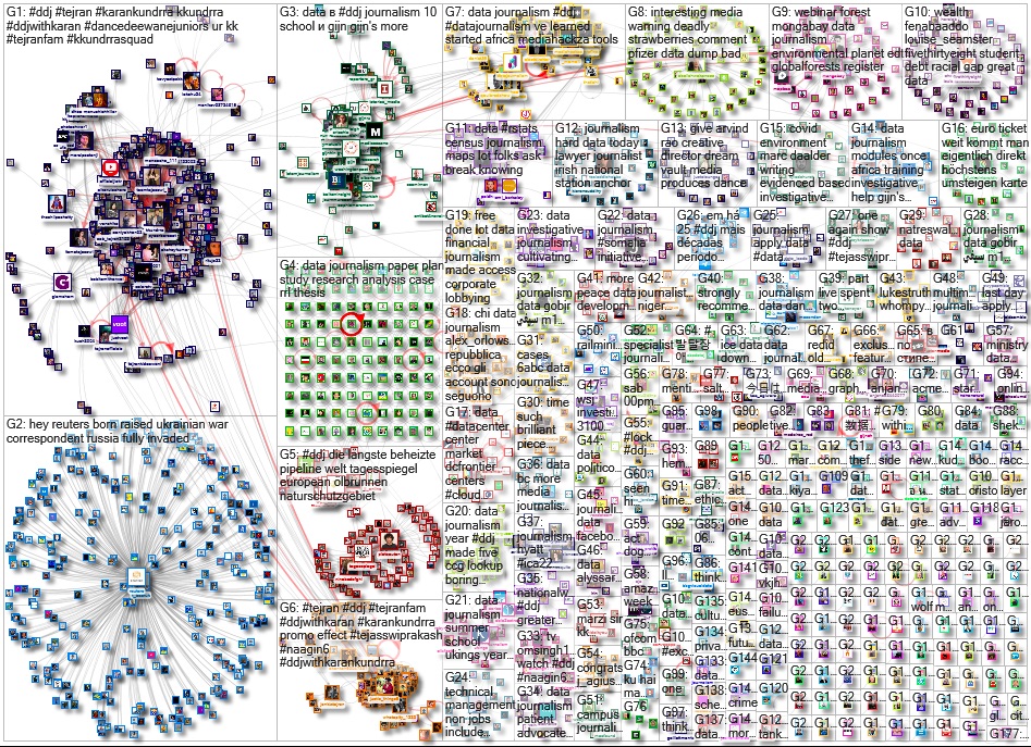
For a look at NodeXL’s mapping on #ddj and data journalism on Twitter, check out this map.

This work is licensed under a Creative Commons Attribution-NoDerivatives 4.0 International License
Republish our articles for free, online or in print, under a Creative Commons license.
Republish this article
This work is licensed under a Creative Commons Attribution-NoDerivatives 4.0 International License
Read Next

Data Journalism
10 Outstanding Data Projects Win the 2024 Sigma Awards
There were 52 data journalism entries from 22 countries in shortlist for the 2024 Sigma Awards. Here are the top 10 winning projects.

Tipsheet Data Journalism Reporting Tools & Tips
Tipsheet for Using Ocean Data in Your Investigations
Investigations into what happens on, under, and around the ocean can often be answered thanks to the vast amount of data available online.

Data Journalism Reporting Tools & Tips
Best Practices for Working With Mass Shootings Data
There can be confusion among journalists about “mass shootings” data, which leads to wildly different numbers and deeper confusion among audiences.

News & Analysis Reporting Tools & Tips
Tips From — And For — Women Investigative Journalists Reporting on 2024 Elections
GIJN’s global team spoke with women investigative journalists about their election coverage best practices.