Data Journalism Top 10: Russia’s Global Propaganda, Inflation Calculators, Zelensky’s Speeches, Animating Dataviz
Read this article in


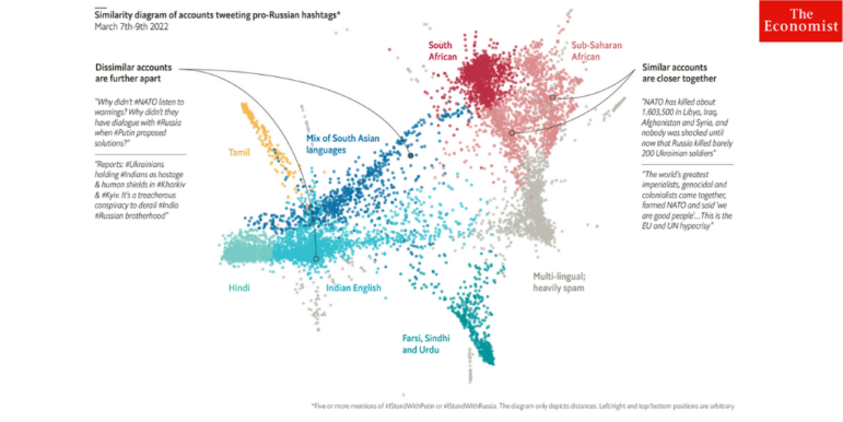
The Economist found pro-Russian propaganda has made notable inroads in South Asia and sub-Saharan Africa. Image: Screenshot
Three months after the invasion of Ukraine, an analysis by The Economist found two unmistakable but perhaps surprising regions with a propensity to support and repeat Russian propaganda on Twitter: South Asia and Africa. Our weekly NodeXL and human curation of the most popular data journalism stories on Twitter also highlights The Washington Post’s piece on how Texas allocated emergency funds away from predominantly Black and Hispanic areas that are more prone to natural disasters, inflation calculators by The New York Times and IndiaSpend, an analysis of Ukrainian President Volodymyr Zelensky’s speeches, and an explainer on UK Prime Minister Boris Johnson’s failure to fulfill campaign promises.
Russia’s Global Propaganda Blitz
Pro-Russian accounts largely invisible to the Western Twitterati are spreading anti-Ukraine propaganda in places like South Asia and sub-Saharan Africa. So says The Economist, which studied messages gathered by a British analytics firm from more than 7,000 Twitter accounts that used the hashtags #IStandWithPutin or #IStandWithRussia. In South Asia, these accounts often highlighted Russia’s diplomatic support of India. The journalists said they found “an army of suspicious accounts,” which they suggest are more likely to be run by human Twitter trolls rather than bots.
Who Gets Disaster Funding?
What happened when Washington gave the southern state of Texas a US$1 billion grant to prevent disaster-related flooding? Federal officials found that the state “shifted money away from the areas and people that needed it the most.” This included primarily Black and Hispanic neighborhoods in Houston, which are amongst the most vulnerable to flooding. The Washington Post illustrates these findings along with rainfall data from the National Weather Service to show how the funds were misallocated.
Zelensky’s Speeches
Speeches by Ukrainian president Volodymyr Zelensky are thought to have played a major role in motivating Ukrainians since the Russian invasion, and have garnered global attention. But how exactly does he achieve this and who is he addressing? German daily Süddeutsche Zeitung carried out an analysis of the nearly 150 speeches Zelensky has given since the conflict began to understand the rhetorical patterns and structure of his messages. Reporters found that positive words usually outweighed the negative in his speeches, and discovered a pattern of forceful repetition emphasizing key ideas of freedom and one of his favorite terms: “heroes of Ukraine.”
Inflation Calculator
Inflation is soaring around the world, with the conflict in Ukraine helping to trigger global increases in the cost of food and gas. In the US, consumer prices have increased by 8.5% over the past year. But what inflation looks like for the average American can differ based on how they spend their money. Those who drive a car or travel a lot will be more exposed to rising prices. The New York Times created a calculator to help readers determine their inflation rate based on seven questions.
UK’s Growing Inequality
Three years ago, Boris Johnson led his Conservative Party to victory with a campaign pledge to improve the lives of UK citizens. Bloomberg examines the progress his government has made so far — and finds that Johnson’s efforts have fallen short in most of the country. In fact, the analysis discovered that large swaths of the UK have made no progress at all and most regions are falling further behind London and its suburbs, where almost all of the benefits have accrued.
Tracking Election Promises in Australia
Is the Australian government keeping its promises? This live tracker by The Guardian looks at how members of parliament from the Coalition government and the Labor Party are allocating funding and resources. The data, sourced from press releases and other public data, is sorted by party, electorate, category, and project. Reporters named the tracker the pork-o-meter, from the term “pork-barreling,” where government funds are used for projects designed to please voters or legislators.
Ripple Effects of Conflict
Russia’s invasion of Ukraine has impacted countries worldwide. US public broadcaster NPR explores the war’s global impact — from rocketing prices of basic food items and soaring energy costs to the strain that Ukrainian refugees has put on receiving countries. Reporters used a rotating globe to illustrate the “seismic repercussions” of the conflict on countries from Australia to Brazil.
Rising Food Costs in India
While consumers everywhere are feeling the pinch of global inflation, economists at the IMF warn that poorer countries will bear the brunt of rising food prices. GIJN member IndiaSpend, a nonprofit news site that focuses on data, wrote an explainer on inflation and created a calculator for readers to understand how price increases affect them. Unlike the New York Times inflation calculator above, this looks at only one parameter: the grocery bill. The calculations are based on data from India’s Wholesale and Retail Price Information System. Try it out here.
Awaiting Trial in the EU
Nearly 100,000 people across the European Union are detained while awaiting trial. But pre-trial detention can have a serious and long-lasting impact. Apart from the social stigma attached to being in prison, reporters found that those detained in jail find it difficult to access lawyers and prepare their defense. This collaborative investigation by a GIJN member, Spanish nonprofit Civio, and partner media outlets, analyzed the percentage of pre-trial detainees in prison across several European countries.
Animating Data Visualizations
From an Olympic race winner to a country’s population growth, when it comes to data visualization, animation can help to tell important stories. This Twitter thread by Joey Cherdarchuk, an analytics and data visualization consultant, sums up the myriad ways in which animations have been used to enhance data visualization.
Thanks again to Marc Smith and Harald Meier of Connected Action for gathering the links and graphing them. The Top Ten #ddj list is curated weekly.
 Amel Ghani is the regional editor for Urdu with the Global Investigative Journalism Network. She has worked as a journalist for over eight years and has reported on land rights in urban areas, real estate, environment, and the rise of religious political parties.
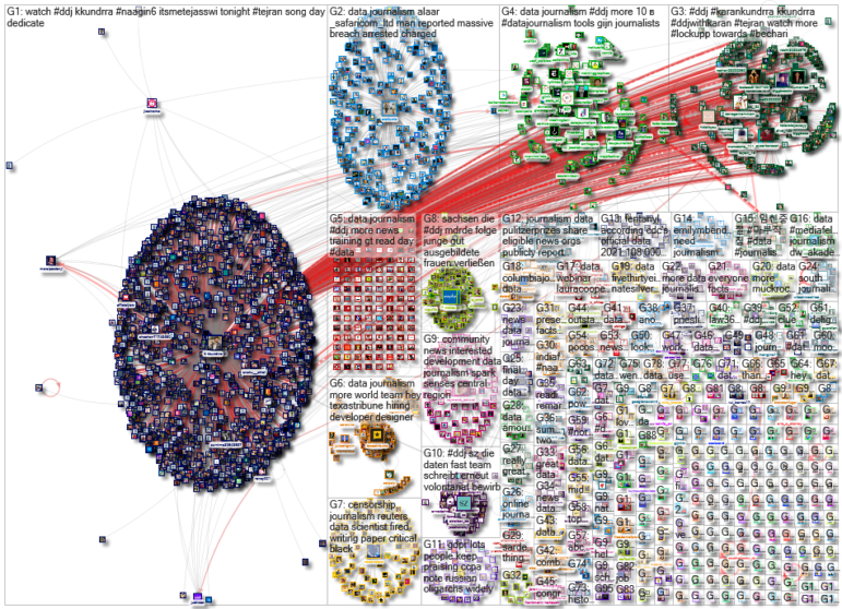
For a look at NodeXL’s mapping on #ddj and data journalism on Twitter, check out this map.

This work is licensed under a Creative Commons Attribution-NoDerivatives 4.0 International License
Republish our articles for free, online or in print, under a Creative Commons license.
Republish this article
This work is licensed under a Creative Commons Attribution-NoDerivatives 4.0 International License
Read Next

Data Journalism News & Analysis
Lessons Learned: 10 Common Mistakes in Data Journalism
GIJN asked speakers and attendees in the NICAR conference hallways for the data journalism gaps they see, and for under-covered topic areas and under-used skills that newsrooms can address.

Data Journalism News & Analysis
From Space to Story in Data Journalism
Over the past 10 years satellite imagery has become an important component of data journalism. In the next 10, it will likely evolve further, from a tool used primarily for illustrating stories to an integral part of research and investigative reporting.

Data Journalism
10 Outstanding Data Projects Win the 2024 Sigma Awards
There were 52 data journalism entries from 22 countries in shortlist for the 2024 Sigma Awards. Here are the top 10 winning projects.

Tipsheet Data Journalism Reporting Tools & Tips
Tipsheet for Using Ocean Data in Your Investigations
Investigations into what happens on, under, and around the ocean can often be answered thanks to the vast amount of data available online.