
Data Journalism Top 10: Uninhabitable Earth, Back to Flying, Ukraine Sirens, Bezos Billions


Berliner Morgenpost mapped the parts of planet earth that due to climate change could become uninhabitable by 2100. Image: Screenshot
According to climate models examined by Germany’s Berliner Morgenpost, many places on earth won’t be habitable for humans by the end of this century if nothing is done to curb climate change. Our weekly NodeXL and human curation of the most popular data journalism stories on Twitter also highlights a story by the Financial Times looking at the recovery of the airline industry, The New York Times’ visualization of Jeff Bezos’ wealth, a study of air raid siren patterns in Ukraine, and the winners of this year’s Sigma Awards.
‘Uninhabitable’
Climate change is leading to more frequent occurrences of extreme weather events such as tropical cyclones, rising sea levels, drought, lethal heat, or a combination of all these. These conditions could result in some places becoming inhospitable for human life. Drawing from various data sources, German newspaper Berliner Morgenpost mapped on a 3D rotating globe the areas that will become “uninhabitable” by the year 2100 unless more radical action is taken to combat global warming. The story is available in English and in German.
Back to the Skies
The COVID-19 pandemic severely impacted the airline industry, particularly in the first year of the virus, with the number of flights canceled in April 2020 reaching nearly two-thirds of pre-pandemic figures. But according to data on about 100 million scheduled flights provided by Cirium, an airline analytics company, the demand for flying is rebounding — with global scheduled flights for this month just 11% below the same month in 2019. The Financial Times analyzed the data and reported that the industry is steadily recovering, even though the improvement is uneven by region, type of carrier, and distance travelled. Read a short thread on the story here.
Jeff Bezos’ Wealth
There is no doubt that Jeff Bezos, founder of Amazon, is an incredibly wealthy man. So wealthy, that it can be hard to picture the extent of his riches. Data journalist Mona Chalabi brings her signature hand-drawn style to this piece in The New York Times, comparing Bezos’ fortune to the average US household wealth using unconventional units of measurement such as heat, size, acres (hectares), and slices of cake. Among the excellent comparisons, Chalabi visualizes how an Amazon employee would have had to start working in the Pliocene Epoch (4.5 million years ago) to accumulate the same amount of wealth as Bezos now.
Sigma Awards’ Winners
This month, the Sigma Awards announced 12 winners for its 2022 competition honoring the best data journalism worldwide. The winning projects covered topics ranging from US race riots and Myanmar military violence to India’s coronavirus deaths and France’s nuclear tests. Check out the stories in the Sigma Awards database, and hear from Marianne Bouchart, Gina Chua, and Aron Pilhofer, who all spoke at the International Journalism Festival, on some of the most creative, most innovative uses of data among this year’s awardees.
Ukraine’s Sirens
Since Russia’s invasion of Ukraine, air raid sirens, which warn of imminent attacks from the air, have become a daily norm for Ukrainians. Mapbox engineer Volodymyr Agafonkin explored the patterns of air threats across Ukraine by scraping data from the Air Alert Ukraine Telegram channel and visualizing it on a timeline.
Deaths in the Gig Economy
According to a study by worker advocacy group Gig Workers Rising, more than 50 gig workers were killed while on the job over the past five years in the United States. Some of the workers were accidentally caught in drive-by shootings, others in road rage incidents or botched carjackings and robberies. The Markup independently verified the incidents listed in the report and presented the data in a searchable table.
When Depression Begins
How old are people when they first develop depression? A study by psychiatrist Marco Solmi and others looked at the onset of the condition by analyzing data from 192 epidemiological studies. Our World In Data charted the data, showing that the median age of onset — the age at which people experience depression for the first time — is 26. On average, they found, people experience symptoms of depression five years before a diagnosis.
Asylum System Delays
Journalists from the European Data Journalism Network analyzed the asylum system in the European Union in light of the Ukrainian refugee crisis. They found a system already creaking at the seams and facing a massive backlog; at the end of 2021, EU member states had more than 761,000 asylum applications pending resolution. That number is equivalent to 15 months of applications. The delay in each member country varies, from almost 15 months in France to more than 29 months in Ireland. See the data for this story here.
Mapping French Election Results
Last Sunday was the first round of the French presidential election, which saw incumbent Emmanuel Macron face far-right candidate Marine Le Pen. French daily Le Monde mapped the results in granular detail in a color-coded interactive map, using data disseminated by the country’s Ministry of the Interior. Readers can explore the results by commune (a French version of a township or municipality).
Diversity in Fashion
This Quartz story from March 2021 tried to determine whether fashion and beauty brands kept their mid-2020 Black Lives Matter pledges to increase diversity. By analyzing the skin tones of models in 27,000 images posted on the brands’ Instagram accounts, the team found that while many of the companies did increase diversity across their images, the improvements were often only marginal. This piece resurfaced on Twitter last week after winning a data journalism award from an American association for business journalists.
Thanks again to Marc Smith and Harald Meier of Connected Action for gathering the links and graphing them. The Top Ten #ddj list is curated weekly.
 Eunice Au is GIJN’s program manager. Previously, she was a Malaysia correspondent for Singapore’s The Straits Times, and a journalist at the New Straits Times. She has also written for The Sun, Malaysian Today, and Madam Chair.
For a look at NodeXL’s mapping on #ddj and data journalism on Twitter, check out this map.


This work is licensed under a Creative Commons Attribution-NoDerivatives 4.0 International License
Republish our articles for free, online or in print, under a Creative Commons license.
Republish this article
This work is licensed under a Creative Commons Attribution-NoDerivatives 4.0 International License
Read Next

Data Journalism
10 Outstanding Data Projects Win the 2024 Sigma Awards
There were 52 data journalism entries from 22 countries in shortlist for the 2024 Sigma Awards. Here are the top 10 winning projects.

Tipsheet Data Journalism Reporting Tools & Tips
Tipsheet for Using Ocean Data in Your Investigations
Investigations into what happens on, under, and around the ocean can often be answered thanks to the vast amount of data available online.

Data Journalism Reporting Tools & Tips
Best Practices for Working With Mass Shootings Data
There can be confusion among journalists about “mass shootings” data, which leads to wildly different numbers and deeper confusion among audiences.
Data Journalism Methodology
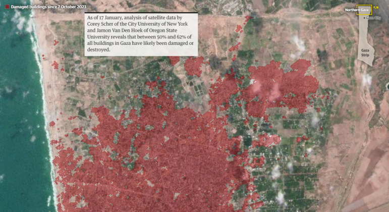
Mapping Conflict: Using Satellite Radar Data to Track the War Damage in Gaza
Gaza’s urban landscape has changed profoundly since the start of Israel’s military campaign. Researchers Jamon Van Den Hoek and Corey Scher have been mapping the impact.