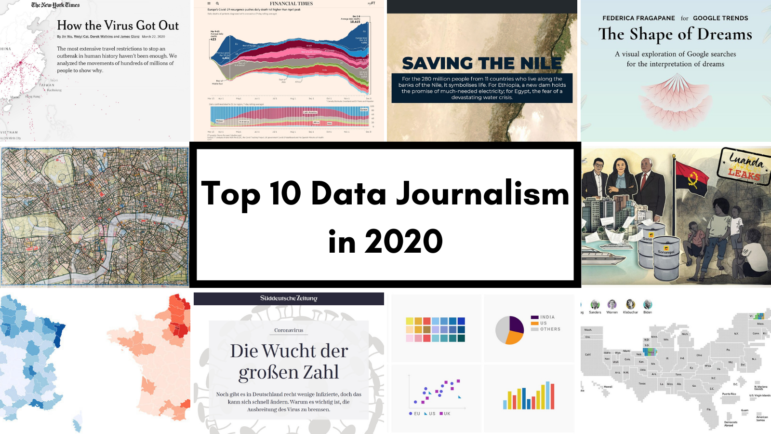
Data Journalism Top 10 for 2020: COVID-19, Saving the Nile, Shape of Dreams, Visualizations for the Colorblind
Read this article in


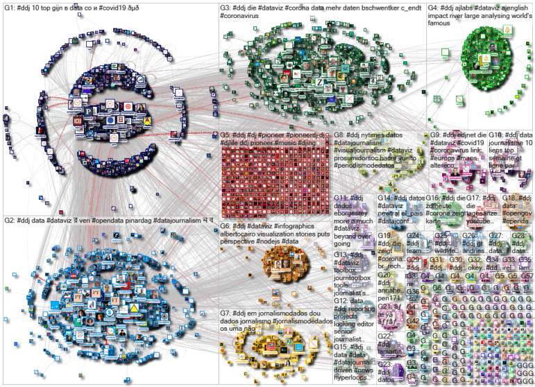
For those unfamiliar with GIJN’s Top 10 Data Journalism roundup, each week we select the most popular data journalism items on Twitter. We do this by using NodeXL to map use of the terms #ddj and data journalism, and then add a bit of old-fashioned human curation to highlight the most compelling items. At the end of the year, we survey the entire period and pick the best from hundreds of tweets.
This year — the year of the pandemic — in which the coronavirus dominated public conversation and news headlines, our mapping from January 1 to December 13 reflects that reality. We found popular data journalism pieces covering different facets of the COVID-19 crisis produced by The New York Times, The Financial Times, Süddeutsche Zeitung and Mediapart. There were also in-depth interactive explainers by Al Jazeera, an imaginative and beautiful exploration of dreams by data visualization designer Federica Fragapane, and a guide to visualizing data for colorblind readers by Datawrapper’s Lisa Charlotte Rost.
How the Virus Spread Across the World
Countries across the globe were scrambling to implement border lockdowns and travel restrictions earlier this year in an attempt to halt the widespread novel coronavirus outbreak, but it was already too late. The New York Times explores why these restraints haven’t been enough by mapping the movements of hundreds of millions of potentially infected people travelling across the world. Other noteworthy data journalism pieces from the NYT this year: tracking how COVID-19 spread locally in the United States, and mapping the devastating wildfires in Australia.
Coronavirus Tracker
Since March, The Financial Times has been tracking the trajectories of coronavirus-related deaths worldwide, and comparing the death toll in different countries within the same chart. The newsroom also examined rates of “excess mortality” — the numbers of deaths over and above the historical average. It found that overall excess deaths worldwide are much higher than reported COVID-19 death counts.
Saving the Nile
The construction of a mega dam triggered a major dispute between Egypt and Ethiopia over access to water resources from the Nile, the oldest and longest river on the planet. Al Jazeera analyzed five scenarios that were being negotiated among Egypt, Sudan, and Ethiopia, and provided a look at the potential irreversible consequences to the region. Also worth checking out from Al Jazeera are these popular pieces: mapping India and China’s disputed borders, and analyzing Trump’s Middle East Plan.
The Shape of Dreams
Ever wondered if people share the same dreams based on culture? Data visualization designer Federica Fragapane created a beautiful dream explorer based on Google Trends search data. She analyzed the different types of dreams across the globe, the search frequency for their meanings, the possible connections among languages that shared the same dream subjects, as well as unique dream subjects according to language. For example, there were searches for picking mushrooms in Russian and garlic dreams in Portuguese. She explains the process of making this project here.
Cycling Every Street in London
Davis Vilums got bored cycling the same 25 minutes route to work everyday and started getting creative. He decided to visit not only every main road but every single accessible mews, yard, park trail, and path in central London, and record his journeys on the Endomondo app. It took him four years but he did it!
Massive Cross-Border Investigations
The International Consortium of Investigative Journalists has been busy this year. In January, the consortium and partners in 20 countries published the Luanda Leaks investigation. It revealed how Isabel dos Santos, known as Africa’s richest woman, made her fortune through two decades of inside deals and government giveaways. The investigation was based on more than 715,000 leaked financial and business records. Here’s how the team tackled the massive dataset. In September, the consortium revealed the role of global banks in industrial-scale money laundering in its FinCENFiles investigation involving more than 400 journalists.
Flattening the COVID-19 Curve
German daily Süddeutsche Zeitung charted the increase in number of cases in countries with high rates of infection, such as South Korea, Italy, France and Germany, to show a trend of exponential growth, and to emphasize the importance of “flattening the curve” — diminishing the rate at which new cases occur. Other popular SZ data journalism pieces this year: tracking major political debates among German politicians, and evolution of climate change discussions in German parliament sittings.
Which COVID-19 Figures Are Trustworthy?
In March, French online investigative site Mediapart highlighted the flaws in France’s official COVID-19 case and death count. It revealed that restrictive testing policies were leading to an undercount in infections, and coronavirus-related deaths in nursing homes and in private homes were not taken into account. Also, check out this Mediapart project that highlights impunity for police wrongdoing by revealing the authorities’ frustratingly slow process of investigating police misconduct and an alarming lack of follow up to public complaints of police violence.
Visualizing Data for Colorblind Readers
How can you make sure colorblind readers understand your visualizations? Lisa Charlotte Rost, from Datawrapper, writes a three-part series on helping readers tell different colored elements apart. This includes using labels, interactivity, symbols, and colorblind-safe color palettes. Here are parts one, two, and three.
Perspective from Visualizations
Throughout the year, dataviz expert Alberto Cairo drew attention to a host of intriguing data journalism items on his blog, accompanied by short commentaries on what makes them work or what can be improved. This piece on how visualization puts things in perspective resonated with the data community on Twitter. Cairo also highlighted a good example of annotating data visualizations by The Financial Times, and an innovative COVID-19 project published by Agência Lupa.
https://twitter.com/AlbertoCairo/status/1227588878514692096
Thanks again to Marc Smith and Harald Meier of Connected Action for gathering the links and graphing them. The Top Ten #ddj list is curated weekly.
 Eunice Au is GIJN’s program manager. Previously, she was a Malaysia correspondent for Singapore’s The Straits Times, and a journalist at the New Straits Times. She has also written for The Sun, Malaysian Today, and Madam Chair.
For a look at NodeXL’s mapping on #ddj and data journalism on Twitter, check out this map.

This work is licensed under a Creative Commons Attribution-NoDerivatives 4.0 International License
Republish our articles for free, online or in print, under a Creative Commons license.
Republish this article
This work is licensed under a Creative Commons Attribution-NoDerivatives 4.0 International License
Read Next

Data Journalism News & Analysis
From Space to Story in Data Journalism
Over the past 10 years satellite imagery has become an important component of data journalism. In the next 10, it will likely evolve further, from a tool used primarily for illustrating stories to an integral part of research and investigative reporting.

Data Journalism
10 Outstanding Data Projects Win the 2024 Sigma Awards
There were 52 data journalism entries from 22 countries in shortlist for the 2024 Sigma Awards. Here are the top 10 winning projects.

Data Journalism Data Journalism Top 10
Trump’s Disappearing Donors, Tracking the Mars Rover, and the Ongoing Wars in Gaza and Ukraine
Our column of the best in data journalism also features stories on AI’s ability to forecast the weather, analyzing the Argentine president’s Tweetstorms, and apathetic EU voters.

Data Journalism
Updating the Inverted Pyramid of Data Journalism
Data journalist and instructor Paul Bradshaw has updated the Inverted Pyramid of Data Journalism — and brought together resources for every stage.