From Relationships to Ranking: Angles for Your Next Data Story


In my data journalism teaching and training, I often talk about common types of stories that can be found in datasets. So I thought I would take 100 pieces of data journalism and analyze them to see if it was possible to identify how often each of those story angles is used.
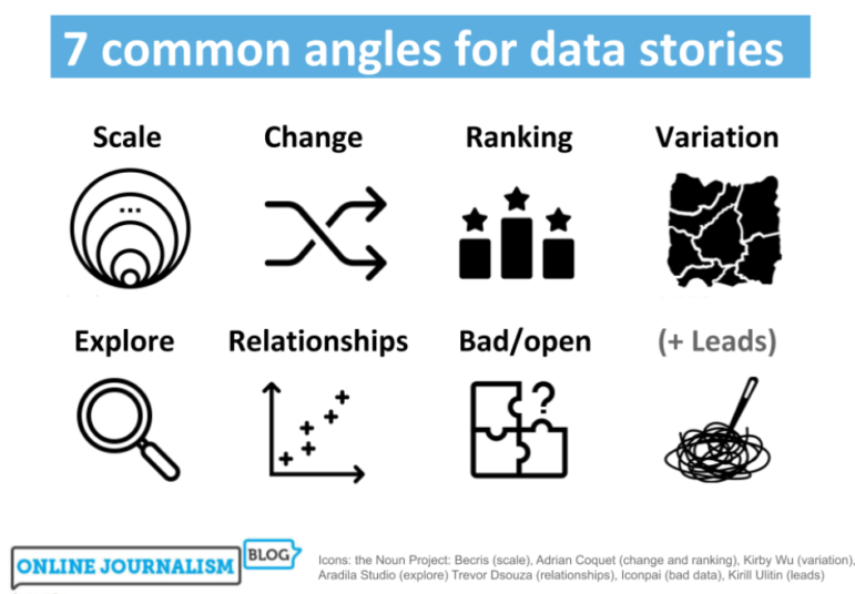
I found that there are actually broadly seven core data story angles. Many incorporate other angles as secondary dimensions in the storytelling (a “change” story might go on to talk about the scale of something, for example), but all the data journalism stories I looked at took one of these as its lead.
I walk through how the most common angles can help you identify story ideas, the variety of their execution, and the considerations to bear in mind.
Data Angle 1: Scale — This is How Big a Problem Is
Perhaps the most common type of story found in data is the scale story. These are stories that identify a big problem, or the size of an issue which has become topical.
At their most simple, scale stories provide an update on new numbers being released: It could be the latest unemployment figures, the amount of crime, air pollution, money spent on some area, births, deaths, or marriages.
During the first months of the pandemic, for example, we had daily scale stories on the numbers of cases, deaths, and tests, among other things.
Examples of scale stories include “Death toll in UK care homes from coronavirus may be 6,000, study estimates,” but also stories like “Unduly lenient sentences review scheme inadequate” where the lead is based on reaction to the scale of an issue you have identified.
Sometimes scale is provided as background to a single-event story, as in “Drone causes Gatwick Airport disruption” (how many near misses are there?) or to a policy proposal, such as in “New drivers could be banned from driving at night, ministers say” (how many new drivers are under 19).
Scale stories are one of the easier genres to write: in many cases, no calculation is needed.

This New York Times piece outlines the scale of the death toll during the pandemic. Screenshot.
Indeed, the main work involved is likely to be in setting context to that scale — at its worst, a scale story simply becomes a “big number” story (“A lot of money was spent on stuff” or “Something happens to a lot of people”), and the reader is left unclear whether this is actually newsworthy or just normal.
For that reason, it’s important to put scale into context by using percentages or proportions (e.g. “one in five”) or comparisons and analogies (“The money spent on the scheme is the equivalent of the wages of 500 teachers”).
You might also bring in change and/or variation as a secondary angle: establishing historical context to the scale you’ve just outlined, or how that scale varies.
In the New York Times piece above, for example, the “true toll” (scale) of the coronavirus outbreak is immediately contextualized by charts which show how that has changed since the start of the year, in different parts of the country.
Data Angle 2: Change and Stasis — Things are Going Up, Things are Going Down, Things aren’t Happening
Change stories are almost as common as scale stories — and probably more straightforward to pitch.
After all, change is inherently newsworthy and gives you the verb (“rises,” “plummets,” “goes up”) that you need in a headline.
Once you’ve identified some sort of change in your data, it’s likely you will need further reporting to answer the why? question. Why are those numbers going up or down?
You might also add a secondary angle to your story which explores variation in that trend – the areas where those numbers have gone up or dropped; the most and least.
This can help you direct your reporting on “why?” because chances are that the areas affected most will be those most aware of the issue, and able to comment on it.

This story in the Belfast Telegraph illustrates the power of a “change” data angle. Screenshot.
When reporting on change, it’s important to be aware of two considerations: seasonality and margins of error.
Seasonality is the role that (typically predictable and normal, and therefore non-newsworthy) seasonal factors can play in numbers, such as the end of a financial year or school term, the release of new cars, or simply changing temperatures. Year-on-year comparisons (this August compared to last August, for example) or seasonal adjustment is often used to prevent this effect.
The margin of error, meanwhile, is the range within which the real numbers actually lie. Because many datasets are based on samples which are then generalized to the rest of the population being looked at, a margin of error (or confidence interval) is used to indicate how accurate that generalization actually is. If any change is within that margin of error, then we can’t really report that anything has changed.
A variation of the change story is the lack of change angle. This story on company insolvencies, for example, looks for change where you would expect it, but identifies the absence of any increase in companies going bust during the pandemic and seeks expert comment for this counter-intuitive finding.
Data Angle 3: Ranking and Outliers — Who’s Best and Who’s Worst? Who’s Unusual and Why?
Ranking stories are all about who or what comes out worst or best in a dataset, or where a particular entity of interest (the local police force, schools or teams, or an industry if it’s the specialist press) sits in comparison to others.
Typical stories in this category might include “Local area one of worst areas for crime” or “Local school among best performers in the country.”
You might focus on the places “worst-hit,” as in “The parts of Birmingham in top 10 UK areas worst-hit by Universal Credit advances,” or you might look at where your sector compares to others, as in “Construction is third most dangerous UK industry.”

This Economist article is a “ranking” story because it identifies the “gloomiest” month. Screenshot
But ranking stories can also be about the best or worst times, places, or categories that a dataset reveals.
The Economist article above, for example, is about the top-ranked month for listening to gloomy songs. A Birmingham Live story, on the other hand, leads on “The most common crimes in Sandwell – and where you’re most likely to be a victim.”
Data Angle 4: Variation — Postcode Lotteries, Maps, and Distributions
Variation stories work best when we expect equal treatment, or when we seek to hold a mirror up to a part of life.
The classic example uses a choropleth map or heatmap to show how some parts of a country have less access to something, or more demand for something, than other parts.
The phrase “postcode lottery,” for example, reflects the sense that a person’s access to something which is supposed to be equally distributed is actually a game of chance.
The BBC data unit story “IVF: NHS couples face social rationing,” for example, maps out how where you live in England can mean the difference between being able to access fertility treatment or not.
A variation story may be revealing that the unfairness exists — or, if people are aware of it, precisely how and where it plays out (particularly in their area).

This BBC Shared Data Unit story by Aimee Stanton focused on the variation in access to electric car charging point. Screenshot.
Algorithmic accountability stories such as ProPublica’s Machine Bias series are often about variation and the unfairness that is revealed when an algorithm is unpicked. It may be people being sentenced differently, or given different insurance quotes, despite no meaningful difference between them on the dimensions that matter.
A variation story can equally be used to highlight areas of underserved demand, or lack of supply. One story that I worked on for the BBC Shared Data Unit about electric car charging points involved identifying how much infrastructure existed in the country, and where. The picture that the data painted provided a foundation for case studies and reaction.
Data Angle 5. Explore: Tools, Interactivity — and Art
Exploratory angles are largely web-native. Its selling point is often characterized by a call to action, such as “Explore,” “Play,” or “Take the quiz.” Alternatively, it might sell the comprehensiveness of the analysis in the way that it is mappe”, or documents “every X that ever happened,” or simply answers the question “who/how/where”.
Readers are often invited to explore the data in an explanatory story to generate a personal version of it, from quizzes such as the BBC’s “7 billion people and you: What’s your number?” and The New York Times’s ‘Take the quiz: Could you manage as a poor American?‘ to interactive maps such as the LA Times’s “Every shot Kobe Bryant ever took. All 30,699 of them.”

This New York Times interactive became one of their most-read stories of all time. Screenshot.
This category also takes in simulators like the Washington Post’s record-breaking “Why outbreaks like coronavirus spread exponentially, and how to flatten the curve” and Matt Korostoff’s “Wealth shown to scale,” as well as games, calculators, and chatbots, among other formats.
Exploratory stories don’t have to be interactive: The Guardian’s “Who is dying from coronavirus and in which NHS trusts?‘ “s exploratory in offering broad insights and a static map, but does not offer any particular control to the reader, and Bloomberg’s excellent narrated visualizations such as “How Americans Die” allow some interaction with the charts but are strongly author-driven.
They can also be quite quirky — even a form of art. “Sweet Love: Popular Wedding Songs Reimagined As Cupcakes,” for example, is simply an exploration of what happens when playlists are treated as data and that data is visualized in a particular way.
Data Angle 6. Relationships and Debunking: When Things are Connected — Or Not
Journalists often seek to establish relationships by looking at data, but this can be problematic: correlation is, of course, not the same as causation, so even though two things may be going up or down at the same time it does not mean that the two are related — as The Guardian’s “Is rise in violent crime due to cuts to neighborhood policing?” explores.
For that reason it is perhaps just as often that you will see a story debunking a relationship between two data points as you will see one trying to establish that X is causing Y.
Channel 4 News’s FactCheck, for example, looked at data to answer the question “Are migrants causing the A&E crisis?” and found no relationship between the size of non-British population in an area and A&E performance.
The complexity involved means that any relationship-angled story is likely to be quite explanatory — or at least need to be explanatory in order to communicate the caveats involved in any exercise.
The Economist’s “How an obsession with home ownership can ruin the economy,” for example, spends over 12 minutes exploring the relationship between those two variables rather than pitching the story as a simple claim that home ownership is ruining the economy.
Relationship stories don’t have to be about correlation; network analysis offers another way of telling stories which are grounded in factually established relationships such as donations, directorships, family connections, social media follows or other interactions.
The project “Investigating Google’s revolving door,” for example, uses data to expose the number of people moving between the tech giant and government bodies, while The Seattle Times’s “In Seattle art world, women run the show” uses a network diagram visualization to tell the story of connections within the local art scene (built by asking women “in the Seattle-area art community to name mentors, collaborators and peers who have influenced their careers.”)

This Seattle Times story walks you through the connections in a local network but also allows you to explore them. Screenshot.
But even network analysis can lack concreteness: a connection between two people or a movement between organizations is rarely proof alone of corruption or causation of suspect-looking decisions.
For that reason network analysis is also often presented as an exploratory story (“Australian political donations 2016-17: who gave what to which parties”), as part of an explanatory feature (“Radiohead’s corporate empire: inside the band’s dollars and cents”), or the process is used to identify a single data point based on its relationships, which then informs further reporting (“Top Tory has family link with offshore banker who gave party £800,000“).
Many of the stories to come out of the Panama Papers, for example, come under this latter category, and the ICIJ’s The Power Players is an exploratory angle on the various stories that the documents helped uncover.
Reuters’s Connected China is one of the best examples of navigating the challenges of network-based storytelling, leading you carefully through the structures of power it has mapped out and allowing you to explore along the way.
Data Angle 7: Problems and Solutions: Bad Data, No Data, and Get the Data Stories
The final category of story may feel a little bit ‘meta’ — stories about data itself: the lack of it, the problems with it, or simply its availability — but that doesn’t mean it might not be a good story.
Bad data stories can be incredibly important: power is exercised, money spent, and lives affected on the basis of data, so if the data is flawed then the exercise of power is likely to be flawed too. Algorithmic accountability stories might also, for example, lead on the flawed data underpinning those algorithms, as in Der Spiegel’s “Increased Risk,” the credit reference agency Schufa, it reports, “knows far less about many people than one might think – and yet dares to calculate an exact score.”
Data also often forms the basis of political claims of success or accusations of failure, so if a police force is underreporting crime, a hurricane-hit country is inaccurately reporting deaths, or tests sent are being counted as tests conducted, then there is the risk of those in power making false claims unchallenged.

This Tampa Bay Times story exposes flaws in official data. Screenshot.
Bad data story ideas can come from those claims, from hearing about someone who has been through the system and seen its gaps, or from simply scrutinizing existing data for problematic features: both this Guardian story on homelessness data being “not fit for purpose.” and this BBC article on concerns over gender pay data came from journalists noticing red flags in the data.
They can also lead to follow-up stories where better data is sought through alternative sources, as in this story on homelessness figures by my BBC colleague Dan Wainwright.
A related data problem angle is the no data story: often the lack of data on an issue represents a lack of political interest in that issue, or will to address it.
‘No data’ stories typically report on concerns being raised about the lack of information or transparency.
The BMJ’s investigation “Are medical schools turning a blind eye to racism?,” for example, leads on the line “Medical schools in the UK are ill prepared to deal with the racism and racial harassment experienced by ethnic minority students,” while a BIJ investigation into farm emissions lists as one of its main findings that “The government only monitors ammonia emissions from the largest intensive poultry and pig farms, completely missing the biggest polluters — beef and dairy farms.”
If the missing data was previously published then the story may focus on the decision to stop publishing (The Tampa Bay Times’s “Florida medical examiners were releasing coronavirus death data. The state made them stop” is one example), and occasionally it may form the basis of an editorial, such as this one by The Chicago Reporter on the police force shutting down its API.
Occasionally the lack of data may compel a news organization, journalist or activist to compile their own data — at which point you have a get the data story.

The Washington Post’s Fatal Force project attempted to fill the gap in data around police shootings. Screenshot.
Perhaps the most famous examples of these – the Guardian’s The Counted and Washington Post’s Fatal Force — revolve around people killed by law enforcement, and I have written previously about similar examples in “Giving a voice to the (literally) voiceless: data journalism and the dead.”
Others focus on the activists trying to solve the problem, in what can become part-human interest story: “Nobody Accurately Tracks Health Care Workers Lost to COVID-19. So She Stays Up At Night Cataloging the Dead” by ProPublica and this story about Brazilian coders building alternative Covid-19 tallies are two recent examples.
Get the data stories don’t have to be so ambitious or personal, however. In the early part of the last decade many of the Guardian Datablog‘s earliest stories led with the call to “Get the data” as they opened up datasets that they had found, cleaned, or combined.
Of course, the novelty of merely making data available has faded over the last decade, and some journalists just put their data on GitHub rather than write an article about it.

Many Guardian Datablog stories invited the reader to “Get the data.” Screenshot.
But if you’ve obtained some interesting data which isn’t available elsewhere — for example through combining multiple datasets, using FOI [freedom of information], or scraping — then there is a lot of value in opening that up to your audience as an act of relationship-building and — in the best cases — community-building.
The point to remember here is that if you do want to build a community the data alone won’t do the work for you: engaging with potential collaborators (for example through organizing hackdays) can make it more likely that they build on top of your valuable groundwork.
One More Angle: Finding Stories Through, Not In, Data
Having mapped these seven likely angles in data-driven stories, it is worth emphasizing that there is another type of story that none of them may cover: the stories where data is the means by which an interview, event, document, or relationship is uncovered or highlighted, enabling the journalist to find the story behind that.
You might call this the single data point or needle in the haystack story.
In a previous blog post I explored some of these techniques, from interviewing individuals connected to a single data point (for example someone running a church in the UK’s least religious city), to seeking an update from an organization responsible for tackling the numbers you are looking at.
Many investigative stories, for example, use data journalism techniques to help direct their interview and FOI requests, or choose which locations to visit, as they build a bigger picture of a systemic problem.
So while those seven angles are useful for sparking ideas and editorial brainstorming when faced with a dataset, they shouldn’t be the limit of your options: any story can benefit from data journalism techniques.
This piece was first posted on the website of the Online Journalism Blog, and is reproduced here with permission.
 Paul Bradshaw leads both the MA in Data Journalism and the MA in Multiplatform and Mobile Journalism at Birmingham City University, and works as a consultant data journalist in the BBC England data unit.

This work is licensed under a Creative Commons Attribution-NoDerivatives 4.0 International License
Republish our articles for free, online or in print, under a Creative Commons license.
Republish this article
This work is licensed under a Creative Commons Attribution-NoDerivatives 4.0 International License
Read Next

Data Journalism
10 Outstanding Data Projects Win the 2024 Sigma Awards
There were 52 data journalism entries from 22 countries in shortlist for the 2024 Sigma Awards. Here are the top 10 winning projects.

Tipsheet Data Journalism Reporting Tools & Tips
Tipsheet for Using Ocean Data in Your Investigations
Investigations into what happens on, under, and around the ocean can often be answered thanks to the vast amount of data available online.

Data Journalism Reporting Tools & Tips
Best Practices for Working With Mass Shootings Data
There can be confusion among journalists about “mass shootings” data, which leads to wildly different numbers and deeper confusion among audiences.

Data Journalism Data Journalism Top 10
Trump’s Disappearing Donors, Tracking the Mars Rover, and the Ongoing Wars in Gaza and Ukraine
Our column of the best in data journalism also features stories on AI’s ability to forecast the weather, analyzing the Argentine president’s Tweetstorms, and apathetic EU voters.