Data Journalism Top 10: #StayAtHome by Income, Spanish Flu, African Americans, Flattening the COVID Curve


Data journalists are starting to dig into the impact of the coronavirus and social distancing measures on poorer communities. Our NodeXL #ddj mapping from March 30 to April 5 finds The New York Times and Reuters using smartphone location tracking data to analyze the relationship between income and changes in people’s movements post-lockdowns, National Geographic visualizing how earlier implementation and longer social distancing measures can help slow infections and lower death rates, ProPublica looking into disproportionate infection rates among African Americans, and statistician Nathan Yau offering an R tutorial for a “flattening the curve” chart.
The Wealthy Stay Home while the Poor Commute
The implementation of social distancing measures across the US has offered a glimpse into its divides in socioeconomic status. Wealthier people are more likely to have desk jobs and can afford to stay home, while lower-income workers are usually employed in essential services that require them to get out and show up for work. The New York Times’ analysis of smartphone location data from Cuebiq revealed that those living in the highest-income locations were able to not only restrict their movement more than those in poorer areas, but they also had a head start. Journalist Jennifer Valentino-DeVries explains this story in a tweet thread. The Times also utilized Cuebiq data in its story, Where America Didn’t Stay Home Even as the Virus Spread.
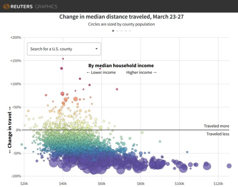
Travel Habits by Income
As US social distancing measures started to kick in during the second week of March, people started traveling less. By month’s end, most of the country was staying close to home. Using data by the Kochava Collective, Reuters was able to compare the distances people (and their phones) traveled in March compared to February, which revealed some troubling trends. Statistician Nathan Yau wrote about this story in his blog.
Lessons from the Spanish Flu
Social distancing isn’t a new idea — it was utilized during the 1918 flu pandemic, also known as the Spanish flu, and helped saved thousands of lives. National Geographic visualized the death rates and the duration of social distancing measures in 36 American cities during that time. The charts showed that cities which ordered social distancing measures sooner and for longer periods usually slowed infections and lowered overall death rates.
https://twitter.com/nicolergalloway/status/1245504983275048962
Simulating a Pandemic
You’ve probably seen The Washington Post’s viral simulation of a disease outbreak by now. Curious about the process behind the successful explainer? Datajournalism.com spoke to graphics reporter Harry Stevens to find out the motivations behind the piece, and the tools he used to produce the popular story.
R Tutorial for Flattening the Curve
“Flatten the curve” has become a common phrase when referring to the need to slow the spread of COVID-19 in order decrease strain on the healthcare system. Statistician Nathan Yau offers an R tutorial to create charts to illustrate the effects of decreasing social interaction.
Race Factor in Coronavirus Fatalities
ProPublica looked into early data on coronavirus cases and deaths in Milwaukee, Michigan and New Orleans, and found that African Americans were getting infected and dying of the coronavirus at higher — and disproportionate — rates.
Spain: Slowing the Chain of Infections
Since March 14, many Spaniards have confined themselves to their homes in a bid to reduce their number of daily contacts. The objective is to decrease the reproductive number of the COVID-19 virus — that is, the average number of people that each infected person can infect. El Pais explains this through “scrollytelling.” The piece is in Spanish, but easily understood using Google Translate.
Sourcing Johns Hopkins’ COVID-19 Data
The coronavirus cases dashboard run by the Johns Hopkins University, based in the United States, quickly became the go-to site for worldwide COVID-19 figures when the pandemic broke out. Puzzled by the data differences between the university and the Robert Koch Institute (Germany’s federal institution responsible for disease control and prevention), Tagesschau, ZAPP, and NDR dug into the sources used by Johns Hopkins and others. Benedict Witzenberger, data journalist at Süddeutsche Zeitung, wrote a blog post that references this. (In German.)
Tracking Coronavirus in Turkey
VOYD, a Turkish association working on data literacy, is tracking and visualizing the number of coronavirus cases, deaths, and recoveries in Turkey and around world using data from Turkey’s Ministry of Health and Johns Hopkins University.
Information Design Journal
Alberto Cairo, Knight Chair in Visual Journalism at the University of Miami, highlights in his blog a free special issue of the Information Design Journal, which is a collection of submissions from the 2018 Information+ conference.
https://twitter.com/AlbertoCairo/status/1246056575162298373
Thanks again to Marc Smith of Connected Action for gathering the links and graphing them. The Top Ten #ddj list is curated weekly.
 Eunice Au is GIJN’s program coordinator. Previously, she was a Malaysia correspondent for Singapore’s The Straits Times, and a journalist at the New Straits Times. She has also written for The Sun, Malaysian Today, and Madam Chair.
For a look at NodeXL’s mapping on #ddj and data journalism on Twitter, check out this map.

This work is licensed under a Creative Commons Attribution-NoDerivatives 4.0 International License
Republish our articles for free, online or in print, under a Creative Commons license.
Republish this article
This work is licensed under a Creative Commons Attribution-NoDerivatives 4.0 International License
Read Next

Data Journalism News & Analysis
From Space to Story in Data Journalism
Over the past 10 years satellite imagery has become an important component of data journalism. In the next 10, it will likely evolve further, from a tool used primarily for illustrating stories to an integral part of research and investigative reporting.

Data Journalism
10 Outstanding Data Projects Win the 2024 Sigma Awards
There were 52 data journalism entries from 22 countries in shortlist for the 2024 Sigma Awards. Here are the top 10 winning projects.

Data Journalism Data Journalism Top 10
Trump’s Disappearing Donors, Tracking the Mars Rover, and the Ongoing Wars in Gaza and Ukraine
Our column of the best in data journalism also features stories on AI’s ability to forecast the weather, analyzing the Argentine president’s Tweetstorms, and apathetic EU voters.

Data Journalism
Updating the Inverted Pyramid of Data Journalism
Data journalist and instructor Paul Bradshaw has updated the Inverted Pyramid of Data Journalism — and brought together resources for every stage.