GIJN’s Data Journalism Top 10: Giraffe Anatomy, 3D Animation, Pub Crawls, ISIS Talks, Trump Lobbyists


What’s the global data journalism community tweeting about this week? Our NodeXL #ddj mapping from October 14 to 20 finds National Geographic illustrating the unique anatomy of giraffes, The Washington Post explaining the process of building a 3D interactive animation on autonomous driving, The Pudding creating a fun pub crawl generator, and Robert Kosara investigating how people read pie charts.
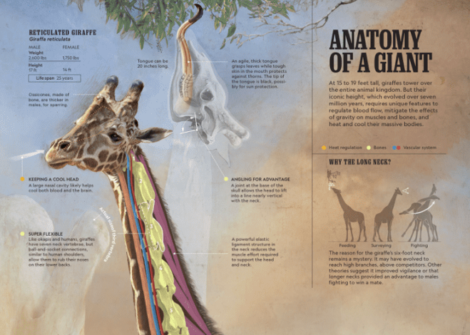
Anatomy of a Giant
National Geographic illustrated and explained the unique anatomy of giraffes that help them with heat regulation, blood circulation, and supporting their own weight. RJ Andrews, author of Info We Trust, interviews National Geographic’s senior graphics editor Fernando G. Baptista about the making of the infographic.
3D Animated Interactive of Self-Driving Cars
The Washington Post took a graphics-driven look at how well autonomous cars can actually “see” and “hear” on the roads. The 3D animated interactive it created put readers in the shoes of a safety driver and highlighted potential flaws of the autonomous driving system. The team behind the project explains their production process step by step.
Epic Pub Crawl Generator
Many pubs in the United Kingdom follow typical naming patterns of color + noun, royalty + noun, or noun + inn. The Pudding created a pub crawl generator that will map the shortest route between pubs with the same name in the UK. If you pick Red Lions, you’ll have 339 pubs to get through. Fox & Hounds? Only 89.
The Blood Speeches
InfoTimes analyzed the speeches from ISIS leader Abu Bakr Al-Baghdadi from mid-2014 until September 2019 to see how the language he used has changed over time and why. The speeches were mapped and contextualized according to the organization’s influence and defeats over the five years.
Reading Pie Charts
How do you read a pie chart? By angle, area, or arc length? Robert Kosara, senior research scientist at Tableau Software, conducted a study to determine the primary visual cue we use in reading pie charts.
Revolving Door of Lobbyists in Trump Town
ProPublica recently updated its Trump administration employee database with 639 new appointees. An investigation by ProPublica and Columbia Journalism Investigations into the latest records show that the administration hired a lobbyist for every 14 political appointments made, welcoming a total of 281 lobbyists on board. This number is four times more than the Obama administration had six years into office.
Confusing Media Bias with Trustworthiness
Data visualization expert Alberto Cairo critiques a chart that categorizes online news media according to their perceived bias. He points out the flaws in the chart and explains how having an ideological bias doesn’t automatically make a media outlet untrustworthy.
https://twitter.com/AlbertoCairo/status/1184098555713277952
Police Stop-and-Search Analysis
The Los Angeles Times analyzed police stop-and-search statistics and found that LA’s police officers were far more likely to search black and Latino people when they pulled over vehicles, but white people were more often found to possess contraband. Data on Github.
Data Scraping
Need to scrape data from the web for your story? Datajournalism.com gathered tips from Paul Bradshaw, Peter Aldhous, Mikołaj Mierzejewski, Maggie Lee, Gianna-Carina Grün, and Erika Panuccio on how to overcome common scraping challenges.
Polish Parliament Power Distribution
Gazeta Wyborcza took a look at the party affiliation declarations made by Polish parliamentarians and analyzed the parliament’s distribution of power.
Thanks, once again, to Marc Smith of Connected Action for gathering the links and graphing them. The Top Ten #ddj list is curated weekly.
 Eunice Au is GIJN’s program coordinator. Previously, she was a Malaysia correspondent for Singapore’s The Straits Times, and a journalist at the New Straits Times. She has also written for The Sun, Malaysian Today, and Madam Chair.
For a look at Marc Smith’s mapping on #ddj on Twitter, check out this map.

This work is licensed under a Creative Commons Attribution-NoDerivatives 4.0 International License
Republish our articles for free, online or in print, under a Creative Commons license.
Republish this article
This work is licensed under a Creative Commons Attribution-NoDerivatives 4.0 International License
Read Next

Data Journalism News & Analysis
From Space to Story in Data Journalism
Over the past 10 years satellite imagery has become an important component of data journalism. In the next 10, it will likely evolve further, from a tool used primarily for illustrating stories to an integral part of research and investigative reporting.

Data Journalism
10 Outstanding Data Projects Win the 2024 Sigma Awards
There were 52 data journalism entries from 22 countries in shortlist for the 2024 Sigma Awards. Here are the top 10 winning projects.

Data Journalism Data Journalism Top 10
Trump’s Disappearing Donors, Tracking the Mars Rover, and the Ongoing Wars in Gaza and Ukraine
Our column of the best in data journalism also features stories on AI’s ability to forecast the weather, analyzing the Argentine president’s Tweetstorms, and apathetic EU voters.

Data Journalism
Updating the Inverted Pyramid of Data Journalism
Data journalist and instructor Paul Bradshaw has updated the Inverted Pyramid of Data Journalism — and brought together resources for every stage.