
GIJN’s Data Journalism Top 10: Visualizing Climate Change, Numbers from Phrases, Democratic Donors, Moscow Money


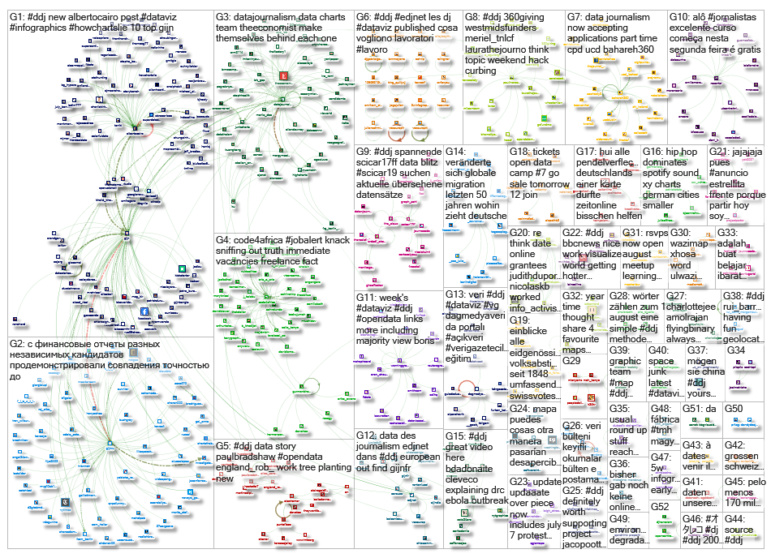
What’s the global data journalism community tweeting about this week? Our NodeXL #ddj mapping from July 29 to August 4 finds a number of articles related to the climate crisis, including the BBC’s piece on tree planting and its interactive tool on temperatures across the world, as well as Alberto Cairo’s blog post on misleading charts created by climate deniers. We also found useful tips and tools: a data GIF maker by Google News Initiative, Datajournalism.com’s strategies for teaching data journalism, and Paul Bradshaw’s tutorial on how to extract numeric data from phrases.
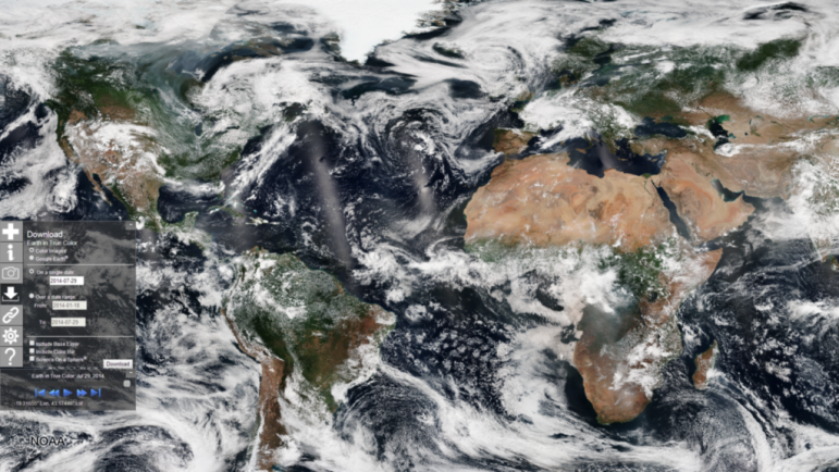
How Much Warmer Is Your City?
The BBC’s Visual and Data Journalism team created an interactive tool to show how much the temperature in 1,000 major cities across the world has changed since 1900 and how much it could increase in coming years. The piece also includes a beautiful spinning globe visualizing how July temperatures have increased in the last 10 years compared with 1880 to 1990. (For ideas on how to investigate the climate crisis, see GIJN’s Climate Resource.)
Extract Numeric Data From Phrases
How can you take a collection of words such as “11 years and 5 months imprisonment” and convert that into something that could be used in spreadsheet calculations? Paul Bradshaw writes a blog post explaining how to extract numbers from phrases.
Data GIF Maker
Bring your data visualizations to life with Google News Initiative’s data GIF maker tool, launched in March. The tool makes it easy for people to create simple visuals that compare different terms, or contrast between numbers. Read more here.
Lying Climate Charts
Data visualization expert Alberto Cairo finds climate change deniers to be a steady source of lying charts. Here, he explains the usual tricks climate deniers utilize to skew readers’ perceptions, using a chart example from The Global Warming Policy Forum.
https://twitter.com/emsmid1/status/1155387955449610240
Strategies for Teaching Data Journalism
In today’s data-intensive society, journalists must learn how to accurately gather and analyze data for stories. And journalism teachers need to equip students with these skills. Data lecturers Nouha Belaid, Anastasia Valeeva, Bahareh Heravi, Roselyn Du, Kayt Davies, Adrian Pino, Eduard Martín Borregon, Soledad Arreguez, and Jeff Kelly Lowenstein share their strategies for teaching data journalism.
The Race for Democratic Donors
Attracting individual donors is particularly important for Democrats in the 2020 US presidential race as the Democratic National Committee is using grassroots fundraising as a qualification standard for the debates. Candidates will need at least 130,000 unique donors to qualify for the next round of debates in September. The New York Times mapped out which candidates are winning the race for the most individual donors and in which states.
RAWGraphs Plans an Update
Are you a user of the open source data visualization software RAWGraphs? The last major release of the software was two years ago and the team is planning a crowdfunding campaign to improve it with more charts, more control on exports, more visualization options, and more templates, among other ideas. Sign up for updates on the campaign that will start October 1.
Financial Statements Factory
Novaya Gazeta analyzed the financial statements of the electoral candidates for Moscow City Duma, a Russian regional parliament in Moscow. It found quite a number of financial reports had suspicious similarities, suggesting a centralized production of these documents.
Plant Trees to Combat Climate Crisis
A British Committee on Climate Change recommends that 30,000 hectares of woodland should be planted annually. And if other carbon reduction targets are not achieved, that number may have to rise to 50,000 hectares. The BBC visualizes the most popular tree planting areas and rates between 2010 and 2018.
Open Data Camp UK #7
The 7th edition of Open Data Camp UK, an unconference entirely devoted to sharing ideas and challenges around open data, takes place at the Geovation Hub in London on November 2 and 3. Tickets will be released at 4 p.m. on August 15.
Thanks, once again, to Marc Smith of Connected Action for gathering the links and graphing them. The Top Ten #ddj list is curated weekly.
 Eunice Au is GIJN’s program coordinator. Previously, she was a Malaysia correspondent for Singapore’s The Straits Times, and a journalist at the New Straits Times. She has also written for The Sun, Malaysian Today and Madam Chair.
For a look at Marc Smith’s mapping on #ddj on Twitter, check out this map.

This work is licensed under a Creative Commons Attribution-NoDerivatives 4.0 International License
Republish our articles for free, online or in print, under a Creative Commons license.
Republish this article
This work is licensed under a Creative Commons Attribution-NoDerivatives 4.0 International License
Read Next

Data Journalism News & Analysis
From Space to Story in Data Journalism
Over the past 10 years satellite imagery has become an important component of data journalism. In the next 10, it will likely evolve further, from a tool used primarily for illustrating stories to an integral part of research and investigative reporting.

Data Journalism
10 Outstanding Data Projects Win the 2024 Sigma Awards
There were 52 data journalism entries from 22 countries in shortlist for the 2024 Sigma Awards. Here are the top 10 winning projects.

Data Journalism Data Journalism Top 10
Trump’s Disappearing Donors, Tracking the Mars Rover, and the Ongoing Wars in Gaza and Ukraine
Our column of the best in data journalism also features stories on AI’s ability to forecast the weather, analyzing the Argentine president’s Tweetstorms, and apathetic EU voters.

Data Journalism
Updating the Inverted Pyramid of Data Journalism
Data journalist and instructor Paul Bradshaw has updated the Inverted Pyramid of Data Journalism — and brought together resources for every stage.