GIJN’s Data Journalism Top 10: Aging Wimbledon, Must-Read DataViz, Bad Charts, German Opera
What’s the global data journalism community tweeting about this week? Our NodeXL #ddj mapping from July 15 to 21 finds Information Is Beautiful’s sharing its gallery of must-read data visualization books, Datajournalism.com highlighting pitfalls in creating charts, the FT analyzing the age of Wimbledon players, and WDR scrutinizing Germany’s opera repertoire.
Old World Opera
WDR scrutinized the opera schedules of 13 municipal theaters in North Rhine Westphalia, Germany, last year. While there was a total of more than 1,000 shows performed, WDR found that living composers barely had a chance to be included in the repertoire.
https://twitter.com/choere/status/1150491165642375168
Dataviz Books Everyone Should Read
Looking to improve your knowledge on data visualization? Information is Beautiful, in association with the Data Visualization Society, put together a neat gallery of books to read with links to purchase them.
Bad Charts
This edition of the Conversations with Data newsletter looks at the common pitfalls in creating data visualizations. Learn from the visual faux pas other data journalists have made so you can avoid the same mistakes.
Veterans Dominate Wimbledon
The failure of men’s tennis younger players to break the hegemony of the Big Three — Djokovic, Federer, and Nadal — at Wimbledon this year meant that the average age of men in Wimbledon’s last 16 surpassed 30 years old for the first time.
Which EU Country Is Family Friendly?
VoxEurop takes a look at UNICEF’s report on family-friendly policies in European Union member states. Explore the ranking of each country in several interactive graphs according to four key indicators, including paid leave and childcare. Spoiler alert: Sweden does well, as expected, but the top spot is grabbed by… Portugal. This piece is also available in French, German, and Italian.
Importance of Legends
Think twice before getting rid of legends in data visualizations, as viewers might get frustrated if they cannot find explanations or references for the graphics. Data viz expert Alberto Cairo argues that legends aren’t optional add-ons but an integral part of visualizations.
Representing Data Through Touch
Data physicalization can be seen, touched, heard, tasted, smelled, and more. Alice Corona, co-founder of the Batjo data site, explains the potential journalistic benefits of physical data representations and how to create such artifacts.
Disinformation Website Exposed
After months of analysis, Blick revealed who is behind Schweizer Morgenpost and breaks down its successful strategy in disseminating propaganda and disinformation.
Teaching Data Journalism
Digital journalism professor Mindy McAdams attempts to answer the question: “How can we prepare emerging journalists to work with data, and what are the essential computational skills that need to be conveyed?” in her paper for the World Journalism Education Congress.
Open Source Datashare
Have you tried ICIJ’s Datashare document analysis tool yet? It now offers journalists the ability to star documents to bookmark them and search within documents using Control+F or Command+F.
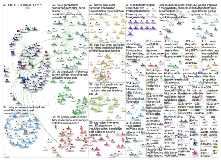
Thanks, once again, to Marc Smith of Connected Action for gathering the links and graphing them. The Top Ten #ddj list is curated weekly.
 Eunice Au is GIJN’s program coordinator. Previously, she was a Malaysia correspondent for Singapore’s The Straits Times, and a journalist at the New Straits Times. She has also written for The Sun, Malaysian Today and Madam Chair.
For a look at Marc Smith’s mapping on #ddj on Twitter, check out this map.

Lessons Learned from Investigating Misinformation Around the World

Tipsheet: Latest Tools for Investigating with Telegram

Investigating Elections: Threat from AI Audio Deepfakes

Updated GIJN Databases (Poverty, Crime, Corruption, and Terrorism)

From Space to Story in Data Journalism

Election Disinformation, Telegram Blackmailers, Water Lords: 2023’s Best Investigative Stories from Bangladesh

Forever Pollution Sites, Mass Killing of Civilians, African Timber Trafficking: 2023’s Best Investigative Stories in French
4 Common Angles Data Journalists Use to Tell Stories

This work is licensed under a Creative Commons Attribution-NoDerivatives 4.0 International License
Republish our articles for free, online or in print, under a Creative Commons license.
Republish this article
This work is licensed under a Creative Commons Attribution-NoDerivatives 4.0 International License
Read Next
Data Journalism News & Analysis
From Space to Story in Data Journalism
Over the past 10 years satellite imagery has become an important component of data journalism. In the next 10, it will likely evolve further, from a tool used primarily for illustrating stories to an integral part of research and investigative reporting.
Editor's Picks News & Analysis
Election Disinformation, Telegram Blackmailers, Water Lords: 2023’s Best Investigative Stories from Bangladesh
Also featuring stories exposing political disinformation, human rights violations by police, online abuse of women, and exploitation of agriculture workers.
Editor's Picks News & Analysis
Forever Pollution Sites, Mass Killing of Civilians, African Timber Trafficking: 2023’s Best Investigative Stories in French
Featuring stories covering natural resources theft, forever pollution, corrupt business practices, and child sexual exploitation.
Data Journalism News & Analysis
4 Common Angles Data Journalists Use to Tell Stories
At the Online Journalism Blog, data journalism expert Paul Bradshaw analyzed 100 pieces of data that journalists use and found that there are several common story angles.