
Eight Simple Ways to Let the Spreadsheet Do the Math So You Can Focus on the Story


Photo: Pixabay
It is still the easiest laugh to get from a group of journalists — professionals or students — throughout the world. All that needs to be said is: “We all know you got into journalism to do math.”
The laughs come because most journalists have seen themselves primarily as storytellers and word artists. For them, numbers are worrisome, boring or interfere with the flow of an article.
Furthermore, the perception of journalists’ inadequacy and inability to deal with numbers has been increased by mathematicians and statisticians over the decades. They’ve pored through newspapers and websites, listened to radio and watched broadcast news with the purpose of finding errors and ignorance whenever journalists have reported on numbers.
The book “A Mathematician Reads the Newspaper,” by John Allen Paulos, was relentless in its pursuit of journalists’ mathematical misfortunes. That book followed his previous book, “Innumeracy,” which was broader in its criticism of math impairment across many professions, but included journalists among those wrongheaded.
Paulos’ books and other statisticians’ criticism implied that journalists hate numbers and can’t do math and, perhaps, never will. But that has become untrue over the past two decades. This change can be linked to the surge of journalists using data and to the self-realization that they often do some kind of math every day. Whether it is deciphering budgets, examining salaries or looking at accident or murder rates, most journalists these days are constantly counting and comparing numbers.
Certainly, up until the 1980s, it was the rare journalist who understood the difference between mean and median, could calculate a percentage difference or do a simple rate. At the Kansas City Star, where I worked in the 1980s, there was a copy editor who knew how to do percentage difference by paper and pencil and he sometimes had a small line of reporters at his desk waiting for him to do that calculation for each of their stories.
A major example of innumeracy over the years was that news stories would favor sports team owners — without realizing it — during labor negotiations between owners and players. These stories would cite the average salary of players rather than the median, thus letting the huge salaries of a few star players inflate the average. If the reporters had used the median, they would have seen how few players made the average and that the perception that all players were millionaires was false.
In other instances, journalists would report that it was fair for workers to get the same percentage increase in wages, without realizing that a 3% increase for someone making $150,000 (it’s $4,500) is much greater than a 3% increase for someone making $30,000 (it’s $900). Journalists would also fail to use rates for putting raw numbers in perspective. One city would be called the murder capital of a country based on the total number of murders, despite having a much lower murder rate than other cities. A road intersection would be deemed the most perilous based on total number of collisions, rather than the rate of collisions compared to traffic.

Always check the mathematics behind “murder capital” claims — sometimes it isn’t as robust as it seems.
An intersection that has a hundred collisions a year, when the traffic through it is 100,000 cars a year, is less risky than an intersection that that has a hundred collisions a year with only 10,000 cars passing through it in the same year.
But the public shaming of journalists who made mathematical errors left reporters, as the long-time journalist and top data journalism instructor Sarah Cohen wrote in her book, “Numbers in the Newsroom,” with “the impression we can’t use any numbers without fearing retribution.” (Cohen’s book is an invaluable guide on journalism and math.)
Yet it was in the late 1980s that a small band of journalists began to embrace the power of accurate numbers and calculations as they began to work with data. They also discovered the spreadsheet. And, inspired by Philip Meyer’s book, “Precision Journalism,” they came to see the power of math and numbers, rather than scorning or avoiding them.
Data journalism workshops given by Meyer at the University of North Carolina and by Investigative Reporters and Editors (IRE) with its companion organization, NICAR, drew hundreds of journalists eager to learn data analysis. At those workshops and then at NICAR conferences, they received training that included math — training that was seldom, if ever, offered in classrooms for journalists or newsrooms. In fact, journalism professors wanting to keep up with the profession attended those workshops and became the few including math and numbers in their classes.
In those workshops, I and my colleagues found the previous teaching of math had lacked the appropriate approach and perspective. The best approach demystifies “math” and focuses on the basics that allow journalists to apply math in a practical way — that is, to summarize numbers, put them in context and determine if the numbers are misleading or lies.
The result of the workshops — which spread globally — was an increased understanding of numbers and thus the ability to write more lucidly about those numbers. Numbers were not boring if they revealed shocking ethnic disparities, large numbers of failing bridges or alarming rates of murder.
It was clear that it was much easier to deal with numbers if the teaching led to that immediate illumination about a topic.

A screenshot of Visicalc, the first spreadsheet that combined all essential features of modern spreadsheet applications. Credit: Wikimedia.
In addition, the use of spreadsheets, be it Microsoft Excel or Google Sheets, made the math easier because journalists could rely on automatic calculations once the numbers were entered in. That also increased journalists’ confidence in interpreting statistics and surveys, as well as encouraging them to employ more advanced statistical methods.
Another manifestation is the Philip Meyer Awards, international awards given by IRE, that recognize the best uses of social science in journalism. Year after year, since 2005, these awards show the progress that has been made in the field’s numeracy. For example, an investigation by Bayerischer Rundfunk and Der Spiegel, “No Place for Foreigners: Why Hanna Is Invited to View the Apartment and Ismail is Not,” revealed discrimination against foreigners in the German housing market through a large-scale survey of landlords. They found that potential renters with Arab and Turkish names were frequently ignored.

Screenshot of Bayerischer Rundfunk and Der Spiegel’s investigation, “No Place for Foreigners.”
In another award winner, BuzzFeed and the BBC used a million simulations of tennis matches to discover suspicious patterns in the shifting of betting odds and players who lost matches they statistically should not have lost.
In the US, journalists in several newsrooms have shown widespread cheating on standardized tests by showing that test scores were way too high based on analysis of previous years’ scores. In a similarly math-based investigation, ProPublica uncovered a disturbing trend: Temporary workers are hurt up to six times the rate of permanent employees, and their injuries are more severe.
And there are many examples of smaller but effective stories using numbers. Years ago, a reporter, who had just received training in spreadsheets, found the city she covered had uniformly miscalculated percentage changes in its annual budget. Some reporters found political associates in governments receiving much larger salaries than regular employees. Others calculated serious cost overruns in government programs.
The Spreadsheet as the Basic, Starter Tool
With just a spreadsheet, a journalist can let the software do the counting and calculating, allowing them to concentrate on the purpose and result of their inquiry. It also opens the door to understanding more advanced statistics, and the use or misuse of statistics by governments and businesses.
The mathematical tools in a spreadsheet can be divided into two groups: data management and calculations.
Data management, in which the counting is automatically completed within the spreadsheet, includes:
- Filtering data based on a criteria
- Sorting to bring meaning to numbers by looking at them from high to low or low to high
- Summarizing by grouping topics into categories, and summing or counting the numbers associated with each category
Important basic calculations, some of which can be automatically executed and some which must be performed by the journalist, include:
- Summing up a column or row of numbers
- Determining the mean or median of a column
- Calculating percentage difference
- Calculating a rate
- Calculating a ratio
Data Management
Filtering
Let’s begin with filtering. There’s a recreational boating accident database in the US that has details of accidents that led to deaths. Here is a sample of that data, which is probably collected in many other countries.

An abbreviated version of the recreational boating accident database kept by the US Coast Guard.

This shows only the accidental boating deaths caused by drowning and in which the victim was not wearing a life jacket and could not swim.
Sorting
Simply sorting numbers can bring meaning to them, or it can take the political spin off them.
For example, the World Health Organization issues an annual report on the healthy life expectancy of males and females in each country. The annual report is issued with the countries listed alphabetically. (Below is a simplified version of the data created by eliminating some of the columns of information.)

An abbreviated version of the Healthy Life Expectancy database from the World Health Organization.
Sort the countries by the highest life expectancy to the lowest, and you can see the biggest differences — potentially the start of a story on why some countries are higher and some are lower. This is done with a simple calculation of subtracting the life expectancy of males from females, and sorting by that difference.

The Health Life Expectancy data with the calculated difference between male and female ages sorted by the largest difference to the smallest.
Summarizing
Grouping numbers in categories and counting or summing them (or both) can give a valuable overview of a dataset. A spreadsheet has an excellent tool for summarizing, called a Pivot Table. Let’s have a look at how this tool can help discover which retailer sells the most guns in Missouri.
By clicking on the Insert tab and then on the icon for the Pivot Table, journalists can choose to count by the numbers of licenses a business holds.

The Pivot Table icon has been selected in the left hand corner.
The Pivot Table allows you to count the number of each business with licenses by choosing from a list in a selection screen.

This Pivot Table shows the number of dealerships licensed under a unique business name.
Sorting from high to low based on number of licenses, it’s possible to see that the corporation Walmart has the most licenses to sell guns in Missouri.

This data shows the number of licensed dealerships by unique business name sorted by largest number to smallest.
In these examples of data management, the journalist only has to do one calculation: subtraction (in the healthy life expectancy dataset, where male ages are subtracted from female ages). The software does all the other counting and arranging.
Calculations
Summing up a Column or Row of Numbers
Journalists can rapidly total columns of numbers by using the formula or icon for summing a column.
The icon in a spreadsheet is one way to do a sum, but if there are blank rows it is better to put in the specific range of numbers. Here is a list of salaries at an imaginary government agency.

This is a fictional dataset on municipal salaries earned by political appointees with the total salaries added for the previous year.
The brilliance of a spreadsheet is that it maps the data, which allows formulas to be calculated and copied easily. Instead of doing calculations with numbers, journalists can use the “addresses” of the numbers.
Determining the Mean or Median of a Column
The mean is often known as the average and, in fact, spreadsheets use the word average for the calculation. But be wary: Means can obscure the effect of a large number on the average (such as a CEO or a team’s superstar) or of a small number (such as a group of lowly paid workers). A median, in which half the numbers are higher and half are lower, can serve as a lie detector and can correct for those outliers.
For example, a team of five athletes has one star and four regular players. If the average is calculated with the formula =AVERAGE(b3:b7), then the average salary is $158,000, thus making it appear that most players are making $158,000.

A fictional dataset of the game salaries for professional basketball players.
However, the median with the formula =MEDIAN(b3:b7) shows that the median salary is $50,000, which is a much more accurate indication of what most of the players are making. By reporting only the average, a journalist would mislead the audience into thinking players are making much more than they are.
Calculating Percentage Difference
Calculating a percentage difference is one of the most powerful tools a journalist can use. It puts numbers in proportion. For example, a journalist might want to look at the impact of salary raises on individuals at an agency. In the two columns in the agency worksheet, last year’s wages and this year’s wages are listed. As seen below, the calculation of percentage difference is not $7,000 (the difference) divided by the previous salary ($45,000), but rather the formula =D2/B2. (The = sign is needed for any formula.)
So, to calculate a percentage difference, last year’s wage is subtracted from this year’s wage. Then the difference is divided by last year’s wage. With this calculation, the actual impact on each worker is seen. These are not the usual raises, of course, but fictional ones given to a politician’s associates.

This dataset shows the percentage difference calculated between last year’s salaries and this year’s salaries.
Percentage difference is used in many reports — budgets and trade, for example — to show both raw numbers and how they compare to each other.
Calculating a Rate
Rates are used throughout the world, whether they are for traffic accidents, mortality, crime, or many other issues. Rates are used so that more fair comparisons can be made between categories, often addressing risk. For example, one city could have 600 murders a year and another could have 400 murders a year. But if the population of the city with 600 murders a year is much larger, then the murder rate is much lower and, thus, the risk of being murdered is much lower. (Crime rates can be more complex than this, but this is a frequent use of rates.)
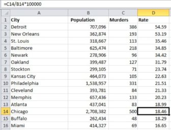
A rate is calculated by thinking of the number of incidents per population (which could mean people, number of vehicles if it’s traffic, and so on). In the case of murder rates, it would be number of murders divided by the city population. In this example, the US city with the most murders (Chicago) does not have the highest murder rate.
Calculating a Ratio
Ratios are extremely useful when writing about numbers. It can be much more concise to write that one number is double that of another, rather than it is 100% higher. It can be quite startling to find one group of people is jailed twice as often as another, or a pharmaceutical drug has a success rate three times higher than another.
For example, one ethnic group has 8,000 persons jailed each year. Another group has 4,000 persons jailed each year. By using the formula =8,000/4,000 the ration is determined to be 2 to 1, or double that. If the first ethnic group makes up only 10% of the total population, then a journalist has the beginning of an inquiry to answer why.
Conclusion
These basic functions and calculations allow journalists to overcome a fear of numbers and to leap into using math for stories. If the growth of data journalism is anything to go by, the adoption of these new skills benefits both the field and newsrooms, with inquiries that are more accurate, use better comparisons and give greater context. It all adds up to what every reporter strives for: meaningful and insightful journalism. And that is no laughing matter.
This article was originally published by DataJournalism.com on April 4, 2019. For more on using spreadsheets, check out their video courses Doing Journalism with Data: First Steps, Skills and Tools and Cleaning Data in Excel. You can also start a conversation in their forums.
 Brant Houston is co-founder and board chair of the Global Investigative Journalism Network. He is author of the guidebook Data for Journalists, now in its fifth edition. An investigative reporter for 17 years, he served as executive director of Investigative Reporters and Editors for over a decade, and is now Knight Chair of Investigative Reporting at the University of Illinois.

This work is licensed under a Creative Commons Attribution-NoDerivatives 4.0 International License
Republish our articles for free, online or in print, under a Creative Commons license.
Republish this article
This work is licensed under a Creative Commons Attribution-NoDerivatives 4.0 International License
Read Next

Data Journalism News & Analysis
Lessons Learned: 10 Common Mistakes in Data Journalism
GIJN asked speakers and attendees in the NICAR conference hallways for the data journalism gaps they see, and for under-covered topic areas and under-used skills that newsrooms can address.

Data Journalism
10 Outstanding Data Projects Win the 2024 Sigma Awards
There were 52 data journalism entries from 22 countries in shortlist for the 2024 Sigma Awards. Here are the top 10 winning projects.

Tipsheet Data Journalism Reporting Tools & Tips
Tipsheet for Using Ocean Data in Your Investigations
Investigations into what happens on, under, and around the ocean can often be answered thanks to the vast amount of data available online.

Data Journalism Reporting Tools & Tips
Best Practices for Working With Mass Shootings Data
There can be confusion among journalists about “mass shootings” data, which leads to wildly different numbers and deeper confusion among audiences.