
GIJN’s Data Journalism Top 10: Weak Passwords, Wolf Drama, Chart Chooser, London vs. England
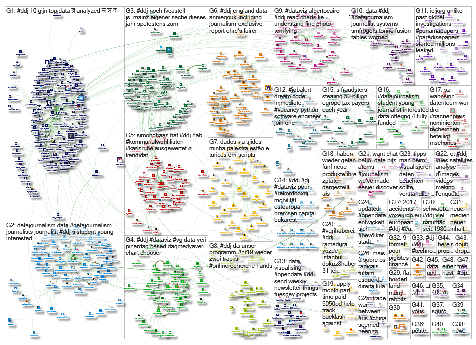
What’s the global data journalism community tweeting about this week? Our NodeXL #ddj mapping from May 6 to 12 finds @SteveFranconeri‘s chart chooser based on data formats instead of visualization functions, @daswasfehlt‘s look at Austrian politicians’ weak email passwords in the wake of a major data leak, @NZZ on whether wolves are really a nuisance to the Swiss, and @wihbey‘s research into the data competence and partisanship of journalists.
Chart Chooser
Need a chart? There are plenty to choose from, and plenty of guides to find the right one to communicate your data to readers (such as the Financial Times’ Visual Vocabulary or the DataViz Catalogue). But what if you don’t yet know what you’re looking for? Statistician Nathan Yau proposes a chart chooser based on data format created by Steve Franconeri.
Politicians’ Weak Passwords
Addendum looked into one of the biggest data leaks in history — about 2.2 billion email addresses (more than 900 GB of data) — and found that it included Austrian politicians among the victims, including Federal Minister for Digital and Economic Affairs Margarete Schramböck, whose password is rated as very weak. Those who have used Dropbox, Adobe, LinkedIn or Yahoo might be compromised too. Find out by contacting the Hasso Plattner Institute.
What Does the Wolf Say?
People are complaining about the growing numbers of wolves in Valais, a canton in southern Switzerland, and are calling for an end to wolf protection. Neue Zürcher Zeitung investigates just how many wolves there are in Switzerland and whether they are really a nuisance to the human population.
Data Competence and Partisanship
In his research for the book “The Social Fact: News and Knowledge in a Networked World,” media scholar and former journalist John Wihbey looked into the competence of journalists in reporting on numbers, data and research, as well as the correlation between the partisanship of a journalist’s follows on Twitter and the articles he or she produces.
EU Budget: Where Does It Go?
Deutsche Welle breaks down how €225 billion of the European Union’s budget for the years 2014 to 2020 have been allocated and spent in economically disadvantaged regions. German version here.
Belgian Arms in Yemen
An investigation by Le Soir and its partners shows that weapons made in Belgium and sold to Saudi Arabia were used in the conflict in Yemen. This follows on the heels of a similar investigation in France.
A Sheety API
Data Journalism Turkey recommends Sheety, a tool created by Phillip Caudell to help you turn Google spreadsheets into an API instantly, and free of charge.
London vs. England
London is a whole different beast from the rest of England, ranging from take-home pay to air pollution levels, according to this series of interactive visualizations by The Guardian. Find out how other areas fare compared to the capital.
https://twitter.com/helenpidd/status/1125322553281658882
Folha’s Data Journalism Under One Roof
Brazil’s daily Folha de S. Paulo now has a dedicated page for all of its data journalism stories, with topics ranging from sexual crimes to highway deaths, and even a comparison of search interest for Mothers’ Day versus Fathers’ Day. The paper’s latest is on a cool ideological GPS tool, which analyzes the behavior of political influencers and finds out where their ideologies lie. (In Portuguese.)
Building the #ImplantFiles Database
The cross-border #ImplantFiles investigation that examines the medical device industry started with zero data. But over the course of a year, the International Consortium of Investigative Journalists filed more than 1,500 public records requests and ended up gathering more than eight million records to kick-start its investigation.
Thanks, once again, to Marc Smith of Connected Action for gathering the links and graphing them. The Top Ten #ddj list is curated weekly.
 Eunice Au is GIJN’s program coordinator. Previously, she was a Malaysia correspondent for Singapore’s The Straits Times, and a journalist at the New Straits Times. She has also written for The Sun, Malaysian Today and Madam Chair.
For a look at Marc Smith’s mapping on #ddj on Twitter, check out this map.

Document of the Day: Visual Vocabulary

Tipsheet: Latest Tools for Investigating with Telegram

Investigating Elections: Threat from AI Audio Deepfakes

Updated GIJN Databases (Poverty, Crime, Corruption, and Terrorism)

Spill-Tracking Data Sources to Help Cover Hazmat Events and Environmental Disasters
Data Journalism Top 10: Gendered Street Names, Remote Work, Heating the US, Oscars History
Data Journalism Top 10: A Year of War in Ukraine, Russian Casualties, Trans Identities, Unexpected NBA Performances
Data Journalism Top 10: Russian Propaganda, India’s Cyber Mercenaries, Australian Flooding

This work is licensed under a Creative Commons Attribution-NoDerivatives 4.0 International License
Republish our articles for free, online or in print, under a Creative Commons license.
Republish this article
This work is licensed under a Creative Commons Attribution-NoDerivatives 4.0 International License
Read Next
Data Journalism Reporting Tools & Tips
Spill-Tracking Data Sources to Help Cover Hazmat Events and Environmental Disasters
Environmental journalists should check out the new database tool Spill Tracker, but should also bookmark these other resources for reporting on hazmat events.
Data Journalism Data Journalism Top 10
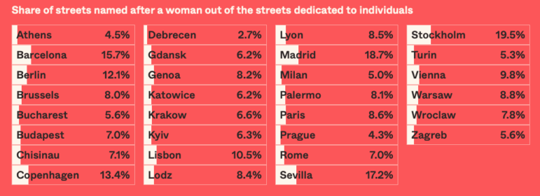
Data Journalism Top 10: Gendered Street Names, Remote Work, Heating the US, Oscars History
In the week in which International Women’s Day is celebrated worldwide, data teams around the world took the opportunity to explore issues related to women, whether mapping streets named after women in Europe, analyzing leisure spaces they are able to enjoy in Southeast Asia, or the distances needed to travel for abortion access in the US.
Data Journalism Data Journalism Top 10
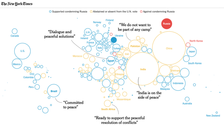
Data Journalism Top 10: A Year of War in Ukraine, Russian Casualties, Trans Identities, Unexpected NBA Performances
GIJN’s weekly look at the best in data journalism examines one year of war in Ukraine, Russian casualty totals, trans coverage in the French media, and the most unexpected performances in NBA history.
Data Journalism
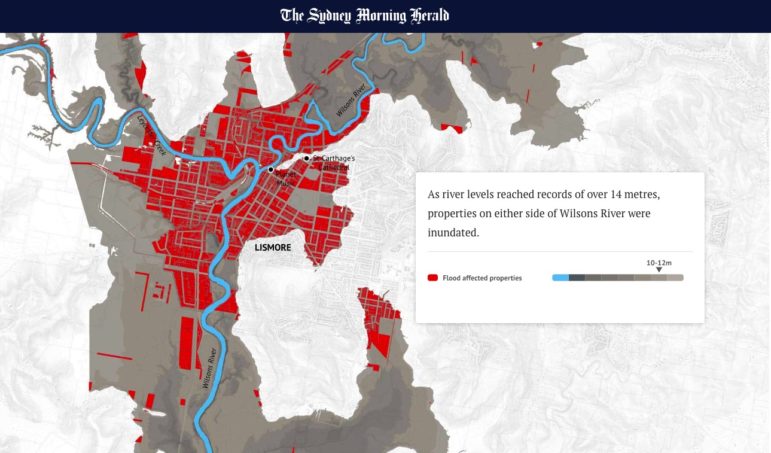
Data Journalism Top 10: Russian Propaganda, India’s Cyber Mercenaries, Australian Flooding
This week’s Top 10 in Data Journalism digs into noise pollution in megacities, the trade in stolen Ukrainian grain, Russian state propaganda about its invasion, abortion access in the United States, and devastating floods in Australia.