GIJN’s Data Journalism Top 10: Mapping Cholera, Tracking Trump and Canada’s Data Gaps


What’s the global data journalism community tweeting about this week? Our NodeXL #ddj mapping from January 28 to February 3 finds @sciam highlighting a curious case of mapping cholera, @nbarrowman arguing that raw data is not as perfectly objective as imagined, @BBC tracking Trump’s performance, and @VismeApp compiling a list of the best data visualizations on climate change.
The Curious Case of Cholera Mapping
John Snow — nope, not the Game of Thrones character, but a young English doctor — mapped out the homes of victims of the disease cholera in London back in 1854. By doing so, he traced nearly every case to a public water pump in the Soho district, which boosted his theory that cholera is a waterborne disease. But he didn’t receive recognition for his work until long after his death.
Is Raw Data Already Cooked?
People tend to think of data as the raw material of evidence. However, statistician Nick Barrowman presents his argument that the idea of “raw data” can be misleading, because data is always the product of cognitive, cultural and institutional processes that determine what to collect and how to collect it. These intentions, assumptions and choices that amount to a kind of pre-processing in the collection of data thus means that data may not be as perfectly objective as is sometimes imagined.
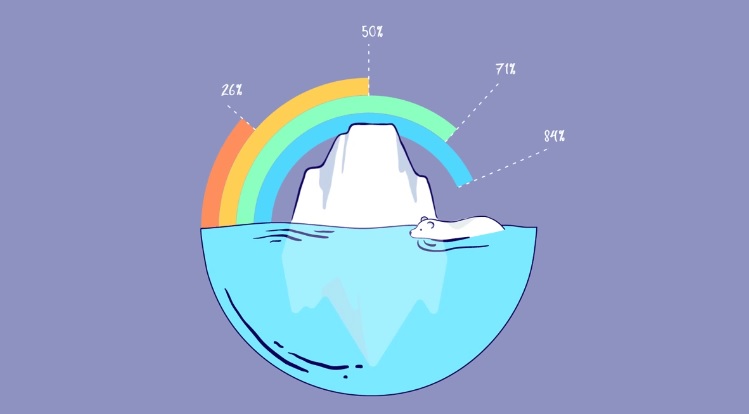
Best Climate Change Visualizations
Visme scoured the web to find the best visualizations on climate change in an attempt to shed light on the often misunderstood phenomenon of global warming. Here are the educational and eye-opening gems they found.
Canada Flying Blind With Data Deficiency?
Professor Arjuman Siddiqi, a public-health scholar at the University of Toronto, tried to replicate a US mortality study in Canada but failed as she found major gaps in the country’s public data. The Globe and Mail’s investigation into Canada’s data regime identified scores of serious data gaps which meant Canada and its leaders are possibly flying blind on a staggering range of issues. And even if data were available, researchers have to jump through many bureaucratic hoops before they can free that information from “little data jails.”
Tracking Trump
The BBC tracked and visualized US President Donald Trump’s performance and progress in his two years in office. Among the eight graphics, two show that Trump’s approval rating has barely changed since he was sworn in and the rate of turnover among senior level advisers in his administration is considerably higher compared to those of his predecessors.
How to Get to Congress
The New York Times took a look at the paths that the members of the US House of Representatives took to Congress, including major educational, career and political milestones. It shows a narrow but well-trodden path through prestigious schools, lucrative jobs and local political offices before landing at Capitol Hill.
BBC’s #Rstats Cookbook
Good news! BBC News’ visual and data journalism team has open-sourced the tools they use for making production-ready visuals with #rstats and #ggplot. The team’s R cookbook is easily reproducible and you can also modify some settings to suit your own chart. Create your own dumbbell charts, stacked bar charts, histograms and more! They also wrote a blog post to explain their process.
Data Visualization Hub
VizHub is an app for making data visualizations in your web browser. You can learn about CSS, SVG, HTML and Javascript with the video tutorials on its site. The hub is open source, so you can modify the existing visualizations on the site to create your own completely new visualization. Read about VizHub here (in Turkish).
Data Becoming a Global Field
“Journalists, generally comfortable dealing in the economy of words, now appear finally to have thrown aside their fear of math and numbers,” says Simon Rogers, Google News Lab data editor and director of the Data Journalism Awards. He predicts that data journalism will expand in 2019 to become a truly global field of work.
Call for Abstracts and Proposals
The third European Data and Computational Journalism Conference is now accepting submissions of both academic research-focused and industry-focused talks on the subjects of data journalism and information, data, social and computer sciences. Send in your abstracts and proposals by April 4, 2019.
Thanks, once again, to Marc Smith of Connected Action for gathering the links and graphing them.
 Eunice Au is GIJN’s program coordinator. Previously, she was a Malaysia correspondent for Singapore’s The Straits Times, and a journalist at the New Straits Times. She has also written for The Sun, Malaysian Today and Madam Chair.
For a look at Marc Smith’s mapping on #ddj on Twitter, check out this map.


This work is licensed under a Creative Commons Attribution-NoDerivatives 4.0 International License
Republish our articles for free, online or in print, under a Creative Commons license.
Republish this article
This work is licensed under a Creative Commons Attribution-NoDerivatives 4.0 International License
Read Next

Data Journalism News & Analysis
From Space to Story in Data Journalism
Over the past 10 years satellite imagery has become an important component of data journalism. In the next 10, it will likely evolve further, from a tool used primarily for illustrating stories to an integral part of research and investigative reporting.

Data Journalism
10 Outstanding Data Projects Win the 2024 Sigma Awards
There were 52 data journalism entries from 22 countries in shortlist for the 2024 Sigma Awards. Here are the top 10 winning projects.

Data Journalism Data Journalism Top 10
Trump’s Disappearing Donors, Tracking the Mars Rover, and the Ongoing Wars in Gaza and Ukraine
Our column of the best in data journalism also features stories on AI’s ability to forecast the weather, analyzing the Argentine president’s Tweetstorms, and apathetic EU voters.

Data Journalism
Updating the Inverted Pyramid of Data Journalism
Data journalist and instructor Paul Bradshaw has updated the Inverted Pyramid of Data Journalism — and brought together resources for every stage.