GIJN’s Data Journalism Top 10: Mapping Wildfires, Insuring Climate Risk, Data Viz for Kids


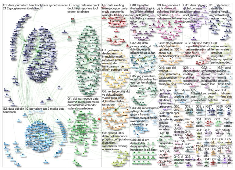
What’s the global data journalism community tweeting about this week? Our NodeXL #ddj mapping from December 3 to 9 finds @BuzzFeedNews mapping wildfire prone areas across America, @dwnews dissecting the value of insurance against climate change, the release of @infobeautyaward winners, and @jschwabish teaching fourth grade kids the wonders of data visualization in fun and inventive ways.
Two Decades of Wildfires
Buzzfeed News mapped US government wildfire data from 2000, revealing areas with the highest risk. Americans can input their address and see how close the nearest fire approached, when that was and the number of acres burned.
Insurance Against Climate Change
Climate risk insurance? The world’s poorest countries are being encouraged to take out insurance against climate-related disasters, but is it worth it? DW dives into how such a scheme works, digs into the data and analyzes its effectiveness.
DataViz for Kids
Economist Jonathan Schwabish taught his youngest group yet — his fourth-grade son’s elementary school class. He tried to teach them about data visualizations and entertain them at the same time. Statistician Nathan Yau liked Schwabish’s description of the experience so much that he blogged about it.
Winners: Information Is Beautiful
The Information is Beautiful Awards 2018 winners have been announced. The winners created inspiring data visualizations that “pushes the boundaries, illuminates the truth, and celebrates beauty.”
Data Journalism Handbook 2 Beta Release
The Data Journalism Handbook 2 (beta version) has been released online with an initial 21 chapters. The book, produced by the European Journalism Centre and Google News Initiative, covers a wide range of topics ranging from documenting land conflicts to data journalism by, about and for marginalized communities.
Open Data Worldwide
OpenDataSoft has a collection of more than 13,700 datasets. You can use the platform to store, manage, visualize, find, use and share any city’s data. And it also has a list of open data websites around the world.
Investigative Dashboard
Heard of the powerful platform Investigative Dashboard but have no idea how to get started? OCCRP’s Friedrich Lindenberg wrote a quick overview on how to use the data platform to background people and search for links between people and companies for your investigation.
Computation+Journalism Symposium 2019
The Computation+Journalism Symposium 2019 will be held on February 1 and 2 at the University of Miami. The two days will feature discussions on automation, information quality, algorithms, tools for reporting and storytelling and more. Keynote speakers will be Brian Hamman, Lisa Gibbs and Yphtach Lelkes.
Wrangling Messy Data
Data will often be messy and peppered with mistakes, typos and other problems. TuvaLab offers free data literacy training on how to wrangle messy data, clean and analyze it. (In English and Arabic).
Prison by the Numbers
The number of prisoners in Turkey’s penal institutions and child convicts increased in 2017. Dokuz8Haber breaks down the numbers according to age, level of education and type of crime committed. (In Turkish.)
Thanks, once again, to Marc Smith of Connected Action for gathering the links and graphing them.
 Eunice Au is GIJN’s program coordinator. Previously, she was a Malaysia correspondent for Singapore’s The Straits Times, and a journalist at the New Straits Times. She has also written for The Sun, Malaysian Today and Madam Chair.
For a look at Marc Smith’s mapping on #ddj on Twitter, check out this map.

This work is licensed under a Creative Commons Attribution-NoDerivatives 4.0 International License
Republish our articles for free, online or in print, under a Creative Commons license.
Republish this article
This work is licensed under a Creative Commons Attribution-NoDerivatives 4.0 International License
Read Next

Data Journalism News & Analysis
From Space to Story in Data Journalism
Over the past 10 years satellite imagery has become an important component of data journalism. In the next 10, it will likely evolve further, from a tool used primarily for illustrating stories to an integral part of research and investigative reporting.

Data Journalism
10 Outstanding Data Projects Win the 2024 Sigma Awards
There were 52 data journalism entries from 22 countries in shortlist for the 2024 Sigma Awards. Here are the top 10 winning projects.

Data Journalism Reporting Tools & Tips
Best Practices for Working With Mass Shootings Data
There can be confusion among journalists about “mass shootings” data, which leads to wildly different numbers and deeper confusion among audiences.
Data Journalism Methodology
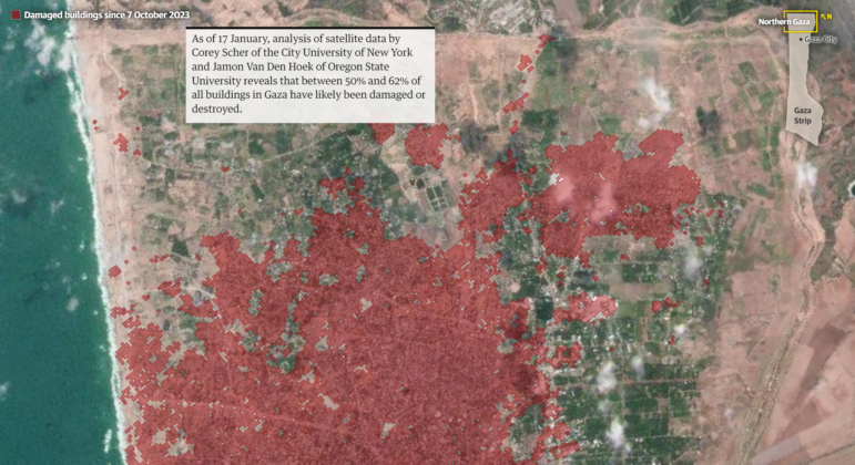
Mapping Conflict: Using Satellite Radar Data to Track the War Damage in Gaza
Gaza’s urban landscape has changed profoundly since the start of Israel’s military campaign. Researchers Jamon Van Den Hoek and Corey Scher have been mapping the impact.