
Picture: Screengrab from BBC
GIJN’s Data Journalism Top 10: World Cup, South Africa’s Pit Toilets and France’s Deadly Police Interventions


What’s the global data journalism community tweeting about this week? Our NodeXL #ddj mapping from June 11 to 17 finds three data stories about the World Cup from @BBCSport, @FT and @TspLeute, the @guardian looking at how urban cycling can change the world and @Bastamag with 40 years of deaths from police interventions in France.
And the Winner of the World Cup Is …
The BBC has bravely predicted which team will win this year’s World Cup in Russia. By looking at stats and trends from past tournaments it has come up with seven factors that will determine who will win the trophy (or not).
My favorite World Cup prediction so far is coming from the Beeb: https://t.co/g5yOLwBXfw
— Johan Vrancken (@Johan_Vrancken) June 15, 2018
Could This be the Worst Match Ever?
The Financial Times turned to data to answer the burning question: Is Russia vs Saudi Arabia “potentially the worst-quality World Cup opening match ever?”
In the first edition of @FT‘s World Cup Extra series of stats-y briefings, @muradahmed and I ask: as curtain-raisers go, just how underwhelming is Russia vs Saudi Arabia?https://t.co/0aQXcaD9YV pic.twitter.com/GOXVyVlRW7
— John Burn-Murdoch (@jburnmurdoch) June 13, 2018
Berlin: A World Cup in one City
Der Tagespiegel gave the World Cup a local flavor by creating a map that allows you to see the districts in Berlin where people who hail from all the World Cup countries live. It’s sorted by matches, so when Argentina plays Croatia, you can see which districts have the most expats from those two countries.
Wo leben die meisten Deutschen in Berlin? Und wo ist die Hochburg der Mexikaner? Die #WM2018 der Bezirke zum Spiel #GERMEX – hier geht’s zur interaktiven Karte: https://t.co/HUvsW6Glea pic.twitter.com/pQ1BPUkBFw
— Tagesspiegel Leute (@TspLeute) June 17, 2018
The Case for Urban Cycling
Cities tend to prioritize car drivers over people who walk, use public transport or cycle. The Guardian has published 12 graphs by urban designer Mikael Colville-Andersen who makes a case for “Copenhagenizing your city.”
Copenhagenize your city: These charts show that cycling around in the city is cheaper, faster, safer, and better for your health than driving a car. But too often cities are planned to prioritise car traffic at the expense of cyclists. #ddj https://t.co/RKGj7FSwQG via @TheDenNews pic.twitter.com/qa3zp2M16Y
— David Tvrdon (@davidtvrdon) June 12, 2018
France: 478 Deadly Police Interventions
Basta, a French independent journalism site, has made an impressive interactive data story about the number of people who have died in France since 1970 because of interventions by the police.
Bravo @Bastamag pour ce superbe travail sur les #violencesPolicières et les #crimes de la #police française. A faire circuler largement pour qu’on n’ait plus besoin demain de compter nos morts. https://t.co/3cC9xDJjM3 pic.twitter.com/ZAAzMO4wdC
— Nils (@NilsLRT) June 14, 2018
Data Visualization Catalogue Now in Turkish
Interested in data journalism, but wish there were more visualization tools in languages other than English? Instabul-based journalism lecturer Pınar Dağ has your back. She and a team of helpers have translated a data visualization resource into Turkish.
Türkçe #VeriGörselleştirme Kataloğu||Ağaç Harita Nedir?Nasıl kullanılır? Fonksiyonları nelerdir? #dataviz #ddj #tool #verigazeteciliği #verigörelleştirme https://t.co/NuH5EK9yBhhttps://t.co/WHBV5dx8Tn pic.twitter.com/DUR1vAAsMA
— Veri Gazeteciliği Platformu (@DagmedyaVeri) June 12, 2018
South Africa’s Dangerous School Toilets
A five-year-old girl died recently when she fell into a pit toilet. Using publicly available data, this story shows that thousands of South Africa’s schools have potentially dangerous toilets.
Would you allow your child to use this toilet? @DBE_SA Our children deserve better than this!! Release the #SanitationPlan #June16 #FixSanitationNow https://t.co/EZdVGJVnGj pic.twitter.com/tGESh6jx7S
— SECTION27 (@SECTION27news) June 14, 2018
Tips on How to Avoid Statistical Pitfalls
Do you know the difference between percent and percentage points? No? Fear not! Maarten Lambrecht made slides to help you avoid common mistakes with data.
great slides for #dataliteracy:
“Statistical pitfalls in the news” @maartenzam https://t.co/T6q8DhWoJN #ddj #EIJC18 #SoDS18 pic.twitter.com/oRf3tmF1LN— Mara Averick (@dataandme) May 27, 2018
Data Visualization as Art
Information designer Frederica Fragapane’s visualizations are being exhibited at the Wild Mazzini data art gallery in Turin until July 8.
Very happy about the inauguration of my #dataviz exhibition at @wildmazzini!! My visualizations for @La_Lettura will be exhibited in Turin until July 8th! #datavisualization #ddj pic.twitter.com/Xf9hP0WlD9
— Federica Fragapane (@fedfragapane) June 15, 2018
Graphics: A Daily Roundup
For people interested in what the data journalism community is up to, London-based Warning: Graphic Content publishes a daily roundup of links to data viz, data journalism and open data.
Today’s #ddj @risj_oxford @MeAndVan @GuardianVisuals @UpshotNYT @PostGraphics @apmreports @DCMS @owenboswarva @OrdnanceSurvey @ODIHQ @UKAuthority @opengovpart @benworthy1 @fedscoop @NZZStorytelling @FiveThirtyEight https://t.co/NkkzR5mkEU #dataviz #opendata
— /!\ Graphic Content (@WarningGraphicC) June 14, 2018
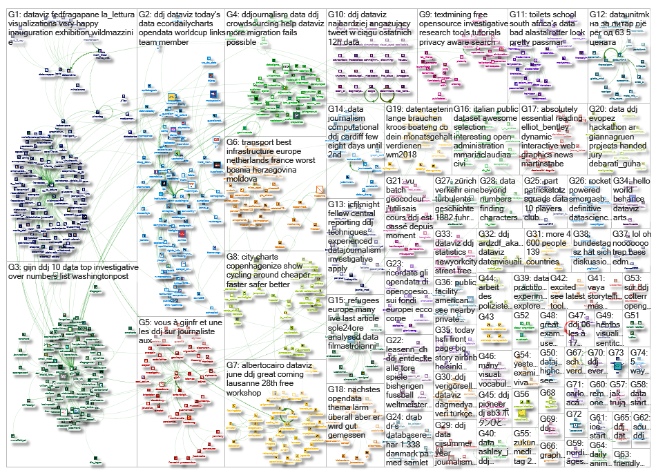
Thanks, once again, to Marc Smith of Connected Action for gathering the links and graphing them.
 Laura Grant is filling in for GIJN’s Eunice Au, while she is on leave. She is a managing partner of the Media Hack Collective, a Johannesburg-based digital journalism initiative, where she works on data-driven journalism projects. She is the former associate editor of digital and data projects at the Mail & Guardian and teaches digital journalism at the University of the Witwatersrand in Johannesburg.
Full disclosure: Laura Grant and Alastair Otter, GIJN’s IT coordinator, produced South Africa’s Dangerous School Toilets story that features on this week’s top-10 list. The fact that it made the list is entirely coincidence.
For a look at Marc Smith’s mapping on #ddj on Twitter, check out this map.

This work is licensed under a Creative Commons Attribution-NoDerivatives 4.0 International License
Republish our articles for free, online or in print, under a Creative Commons license.
Republish this article
This work is licensed under a Creative Commons Attribution-NoDerivatives 4.0 International License
Read Next

Data Journalism News & Analysis
Lessons Learned: 10 Common Mistakes in Data Journalism
GIJN asked speakers and attendees in the NICAR conference hallways for the data journalism gaps they see, and for under-covered topic areas and under-used skills that newsrooms can address.

Data Journalism News & Analysis
From Space to Story in Data Journalism
Over the past 10 years satellite imagery has become an important component of data journalism. In the next 10, it will likely evolve further, from a tool used primarily for illustrating stories to an integral part of research and investigative reporting.

Data Journalism
10 Outstanding Data Projects Win the 2024 Sigma Awards
There were 52 data journalism entries from 22 countries in shortlist for the 2024 Sigma Awards. Here are the top 10 winning projects.

Tipsheet Data Journalism Reporting Tools & Tips
Tipsheet for Using Ocean Data in Your Investigations
Investigations into what happens on, under, and around the ocean can often be answered thanks to the vast amount of data available online.