
Beyond Page Views: How to Use Metrics that Matter
Read this article in


There are lots of different tools to measure analytics in the newsroom, but Google Analytics is one of the most widely used — plus it’s free, which means that almost any newsroom can use it to measure performance on their site.
In the last newsroom I worked in — which was relatively small but internationally well-respected and in what US President Donald Trump would call a “shithole” country — the extent of the audience analytics shared with the staff was an email sent out once a week via Google Analytics with a list of the top 10 stories for the week ranked by page views. It was all a bit demoralizing for the people covering the unsexy beats like the environment and health. What renewable energy project or hospital medicine shortage or investigative report could compete for page views with a local celebrity’s Twitter spat with her cheating lover?
I’m not saying that page views aren’t important. They drive digital advertising revenue, which is currently priced according to number of impressions. And for nonprofit newsrooms, they also help donors figure out how much they are willing to spend in the next funding cycle. But page views shouldn’t be the only measure of your success.
Like Scott Galloway, professor of marketing at New York University’s Stern School of Business, said: “Only two firms can monetize traffic at scale, Facebook and Google. Everybody else needs to build a group of loyal followers, or, as we call it, an audience.”
Loyal followers spend time reading a story, they might even read more than one per visit and, importantly, they’re likely to return to your site to see what else you’ve got. They engage with your content and are more likely to pay for it. That’s why publications with paywalls, like the New York Times, The Washington Post and The Wall Street Journal in the US, and Shibsted in Norway, pay a lot of attention to engagement metrics.
But even if you’re a nonprofit, recent research indicates that your site’s audience engagement metrics may influence your ranking on Google searches more than key words or backlinks. So it’s worth focusing attention on metrics like time on site, pages per session and bounce rate.
Here are some ideas to help people working in organizations that don’t have access to data scientists and expensive audience monitoring services to use Google Analytics to move beyond page views to measure the success of their digital content.
Step 1: Decide What You Want to Measure
Choose a set of performance indicators that are measurable — because if they are measurable you can set targets. These should be things that you want to monitor because they allow you to see whether your website is achieving what you want it to achieve. “You need to have your goals and you need to know what you want to see as success in order to measure it,” said Julia Haslanger from Hearken in a Parse.ly webinar on audience engagement.
Do you want to be the biggest website in the country with the most page views and visitors? If that’s your goal, the big numbers like page views and unique users will be important to you. You’ll also want to know which referral sites are sending the most visitors your way so you can optimize that.
Maybe you’re more focused on producing in-depth, longer stories that you want people to pay to read. Or maybe you’re a nonprofit and bulk page views isn’t what you’re after — you’d rather know that your visitors are reading your content and returning to your site again and again. Sure, you want to know that your visitor numbers are increasing over time, but you also want to know how many of them return to your site, that they’re reading more than one story while they’re there and that when they click on a story, they’re not just glancing at the headline and heading back to Twitter or wherever they came from. For you, understanding where your readers come from is more about trying to work out where to find potentially loyal readers versus new readers, whether your social media is working, or if you should focus attention on an email newsletter rather than Facebook, for instance.
Step 2: Decide How to Measure Performance Indicators
- IS MY AUDIENCE GROWING?
The obvious metric to track here is users, or visitors to your site. You’ll want to know that the number of users coming to your site is increasing, or at least not decreasing. You’ll find this information in Google Analytics (GA) under Overview in the Audience menu. You can set the date (see top right corner) and GA will show you the total number of users who visited your site during that given period.
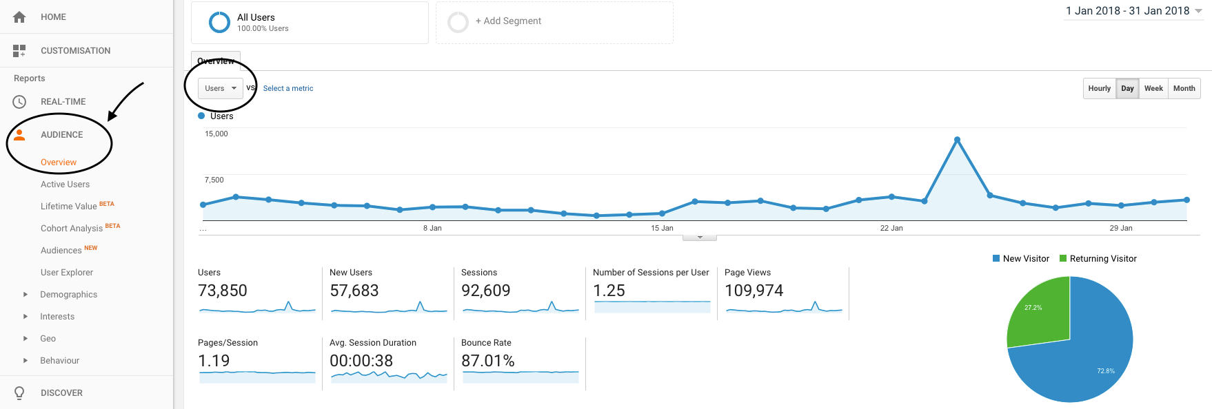
GA’s Audience Overview Report: This shows user numbers, but also includes engagement metrics such as pages/session, number of sessions per user, average session duration and bounce rate.
Google Analytics’ default is to show the number of users per day in the line chart. You can change that to weeks or months using the options below the date.
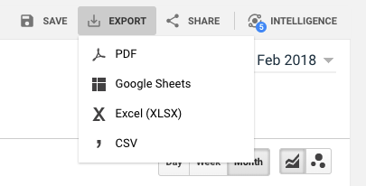
How To: Download a report in a spreadsheet.
To track your monthly user numbers over time, download the monthly numbers to a spreadsheet. To get this data, set the dates for the time period you want — for the past year, for example — then choose the Month option, go to the menu bar above the date, click on Export, and choose Google Sheets, Excel or .csv, whichever one you prefer working with.
You will receive a spreadsheet containing the total users per month for that time period which you can turn into any kind of chart you want. Do not be alarmed if your monthly users fluctuate up and down, sometimes quite dramatically. This is the nature of the internet. Some stories will attract flocks of visitors from social media, who flit in and out of your site never to return. You’re looking for steady growth over time. Keeping track of the average and median number of users per month can help keep you sane when your visitor numbers suddenly drop after a really good month.
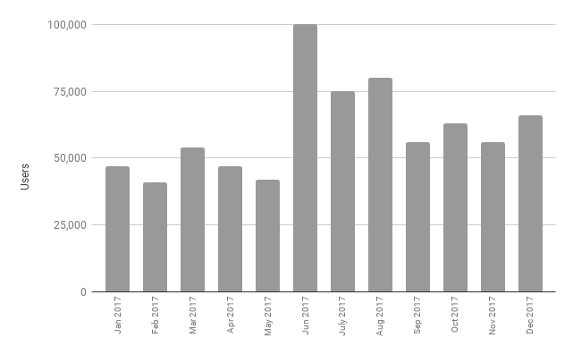
Tracking: Creating a bar chart of your site’s monthly user numbers is a simple way of keeping track of your visitor growth.
- ARE VISITORS RETURNING TO MY SITE?
Returning users, the people who come back to your site more than once, are potentially loyal readers of your content — and the people who may be willing to pay for your content. The Washington Post found that the users most likely to subscribe to their digital edition came to their site at least three times a month.
New and Returning visitors are displayed in a pie chart on Google Analytics’ Audience Overview screen. Knowing what proportion of your visitors are returning visitors is useful, but the actual numbers are better. To get this information, you can hover over the pie chart, or better still under the Audience menu, open the Behavior option, then select New vs. Returning. On the right below the line chart, where it says Advanced, click on the pie chart and you’ll get the screen below.
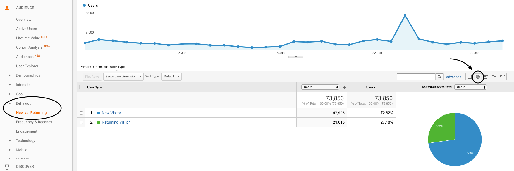
Old and New: Recording the number of new and returning visitors to your site over time helps you keep track of whether the number of returning visitors is increasing.
It’s also worth keeping track of your monthly returning user numbers in a spreadsheet so you can monitor whether they’re increasing over time in a chart, like the users bar chart above.
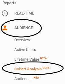
Where To: Cohort Analysis report.
I haven’t found a way of using GA to work out how many visitors return to a site three times a month — no doubt The Washington Post has something fabulous and custom-built for that. But there is a way to see what proportion of visitors are returning to your site over a period of up to three months using GA’s Cohort Analysis feature. The cohort is based on an acquisition date, ie, users you acquired during the same day, week or month — you can choose one of those three options. This gives you an idea of how well you’re retaining your visitors.
Keep Coming Back: If your Cohort Size is by month you can see what proportion of your audience you’ve managed to retain over a three month period.
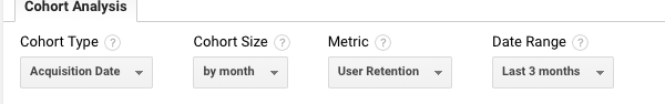
Under the Audience menu, select the Cohort Analysis option. There are menu options at the top of the page; choose by month for Cohort Size, User Retention for the Metric and Last 3 Months for the Date Range. You will get a report like the one below that will tell you that of the cohort of users that came to your site first in the month of January, 9.02 percent also visited in February — month 0 is January and that’s 100 percent, so Month 1 is February — and 6.46 percent of the January cohort also visited in March.
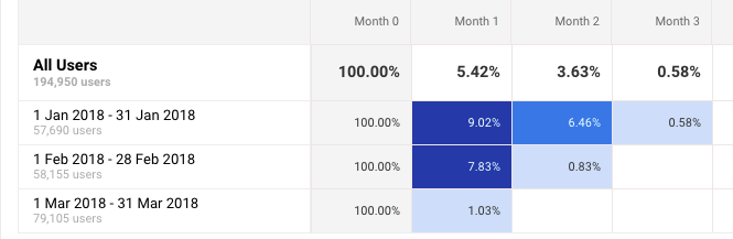
Retaining: Cohort Analysis tells you the percentage of visitors you retained up to two months after their first visit. In this example, 6.46 percent of visitors that came to the site for the first time in January, also visited in March.
If you really want to go down the rabbit hole with GA data, click on one of the blue blocks. You can read this post by Nikolaj Bomann Mertz to get a glimpse of the geeky delights you’ll find.
- WHERE ARE MY VISITORS COMING FROM?
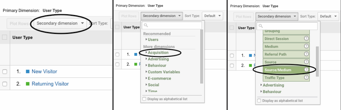
So you now know how many new and returning visitors you have, but you want to find out where they are coming from. For this you use GA’s Source/Medium data. This will give you an idea of whether your social media efforts are paying off and where to target your audience development efforts.
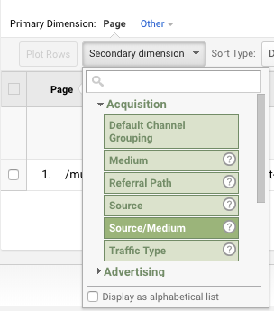
In the same New vs Returning report that you used above, select Source/Medium as a secondary dimension.
Another Dimension: Three steps to adding a secondary dimension to your new and returning visitors report.
Also where it says “advanced,” on the right side of the screen, select the Data option, ie, the square with the grid in it (see below).
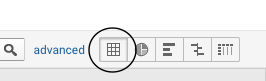
Don’t forget to select the data option.
You will get a list of where your traffic came from. Did it come to you directly, or was it referred by a social media site such as Twitter or Facebook? It’s ranked by number of users, and it contains other useful information such as sessions, bounce rate, pages/session and average session duration.
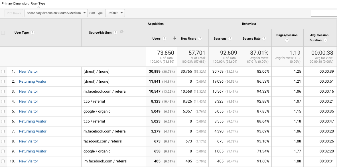
Visitors: This report shows you which sites refer the most new and returning visitors to your site.
From the data above you can see that the top source of both new and returning visitors is “(direct)/(none).” Having your visitors coming directly to your site is a good thing, but this “direct” traffic category is more complicated than that. “Google Analytics will report a traffic source of ‘direct’ when it has no data on how the session arrived at your website, or when the referring source has been configured to be ignored,” explains this post on Moz Blog, which is well worth reading if you want to know more about direct traffic.
Google (organic) and Bing (organic) show people who come via organic searches. And then there’s referral traffic, which is dominated by the social media sites Twitter (t.co) and Facebook (m.facebook.com).
You may also find it useful to export this information to a spreadsheet so you can explore it further and keep a look out for trends. For example, this idea from Christopher Penn, organizes new and returning visitors for each traffic source into pie charts, which allows you to see, for example, how useful Twitter has been during this period as a source of returning visitors. Note that Facebook is divided up into m.facebook, lm.facebook, facebook.com etc. To get total Facebook numbers add them all together.
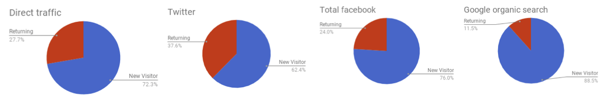
Easy as Pie: Creating charts with your traffic referrers data makes it easier to see where your new and returning visitors are coming from.
- WHAT ARE MY VISITORS READING?
This is where page views are important because they tell you which stories your visitors are clicking on. You’ll probably want to keep track of the total number of page views per month so you see if they’re growing, particularly if your business model is based on advertising.
But more important is understanding what individual stories your visitors are reading. It’s worth monitoring this over a relatively long period of time, ie, a month or more, rather than a just one week. Some stories generate a huge burst of page views over one or two days, often because they trend on social media, then are hardly ever clicked on again. Other stories don’t have quick spikes in traffic but generate a steady flow of visitors over a relatively long period of time. For news sites, these stories are often the longer features and investigations. Some of them can continue to generate traffic for many months, with a bit of promotion on social media every now and then if they aren’t time bound. If you’re only looking at the top 10 stories for the week, you’re likely to miss these slow-burning, evergreen stories.
You can get the data you need by selecting the Behavior menu, then Site Content, then All Pages. Set the date and your top 10 stories during that time period will be ranked by page views. You can increase the list up to 5,000 stories using the Show Rows option at the bottom left corner of the screen. It’s also worth downloading this data as a spreadsheet so you can monitor the performance of stories over time.
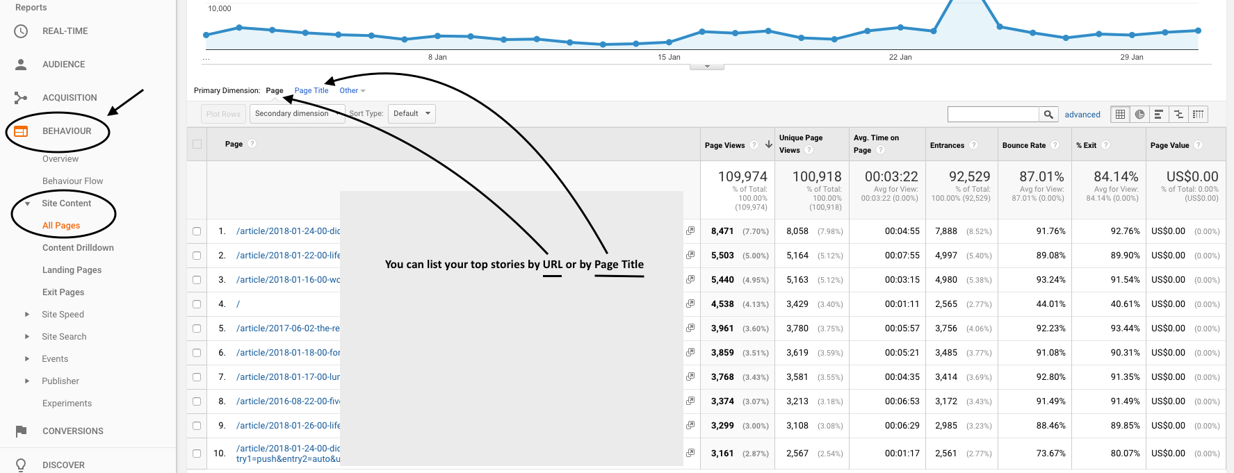
Besides page views, there’s a wealth of engagement data on the GA All Content report, like Average Time on Page, Bounce Rate and % Exits.
It’s useful to sort your stories according to topics. You may be able to extract data according to sections/topics in GA if your website’s URLs are set up that way. If they aren’t, you can always organize your stories manually in a spreadsheet after you’ve downloaded the data.
- ENGAGED TIME: ARE PEOPLE ACTUALLY READING YOUR STORIES?
What do people mean by engaged time? The average reading speed of an adult is around 275 words a minute. Based on that, Medium worked out the read time of a post from its total word count and added 12 seconds for each inline image. So, using this method a 600-word story with one inline image would have a read time of about two-and-a-half minutes. But most of the people who click on your story are not going to read the whole story.
An interesting analysis by web analytics company Parse.ly found that the top 50 percent of visits get between one and seven minutes of engagement. The top 2 percent get over five minutes and the top 1 percent get over seven minutes. According to Parse.ly, if your visitor spends more than 30 seconds reading your content you can consider them engaged. If they spend less time than that they’ve either misclicked or they’re just passing through. Obviously, the longer your visitors stay on your pages the better, not least because research has shown that engaged readers are more likely to return to your site.
Web analytics companies like Parse.ly and Chartbeat measure how long visitors are engaging with your content by pinging a page every few seconds to makes sure that your visitor’s mouse is moving on the page. GA doesn’t measure engaged time accurately. It records that a page was opened, not mouse activity, and calculates an average time spent on page. So you don’t know whether somebody scrolled down your page at all. But GA’s average time on page will give you a sense of which pages your users are spending the most time on and you can compare stories.
Bounce rate is another indicator of whether people are engaging with your content. Google defines it as “the percentage of single-page sessions in which there was no interaction with the page.” Basically, bounce rates tell you the proportion of visits to a page, or to your site, that are misclicks — people who came and went without interacting with your content. So the lower your bounce rate, the more likely it is that your visitors engaged with your content and went on to click on another story.
What’s a good bounce rate? That’s hard to say because it depends on the industry and other factors. But you can see how Google benchmarks your industry if you look under the Audience menu, select Benchmarking, then Channels, and at the top of the page you can choose and industry, country and size of daily sessions.
Another way to see how engaged your visitors are is to look at the session duration numbers for your site. Visitors can click on more than one story during a session. Go to the Audience menu, then select Behavior, and then Engagement. This screen will tell you the total number of page views and sessions during a time period you define. The Session Duration column is divided in categories (see screen grab below). If you add the number of sessions for the first two categories, 0-10 seconds and 11-30 seconds, then divide that total by the total number of sessions (circled in the screengrab below) and multiply by 100. You’ll get the percentage of sessions that roughly fall into the misclicks or people just passing through range.
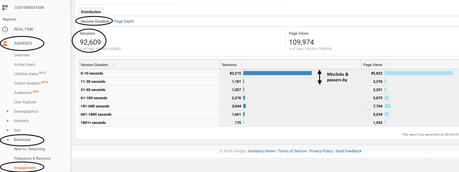
Screen Time: The session duration report lets you see how long your visitors are spending on your site per visit.
- ARE YOUR VISITORS READING MORE THAN ONE STORY?
Not only do you want people to read your stories, you want them to read more than one story when they do visit. These are the people that you hope will find your site interesting enough to become loyal readers — and potentially subscribers.
If you want general statistics for your site on the number of visitors during a certain period that clicked on more than one story, go to the Audience, Behavior, Engagement screen, but this time select Page Depth rather than Session Duration. The Page Depth column tells you how many pages were viewed per session. The screen grab below shows that 82,634 sessions of the total 93,334 (or 89 percent) comprised one page or less.

Going Deep: The Page Depth screen shows you how many pages your visitors clicked on during a visit to your site.
- WHERE ARE THE PEOPLE READING EACH STORY COMING FROM?
Referrals: How to choose a Secondary dimension on your All Content report that will show you all the referral sites for a story.
If you have a story that got a lot of traffic, you can find out where that traffic came from by clicking on the story’s URL on the Behavior, Site Content, All Pages screen. A screen with just that story’s URL will appear. In the secondary dimension menu, select Acquisition, then Source/Medium, and you’ll get data about where the traffic for this story originated.
To find out which referral sites your “most engaged” visitors are coming from go to the Acquisition menu, and select All Traffic, then Source/Medium. You’ll get a list of your traffic sources that includes columns showing Average Session Duration and Pages/Session. On the screengrab below, m.facebook.com (mobile facebook) has an average session duration of 25 seconds, an indication that a lot of the traffic coming from there is simply passing through without engaging.
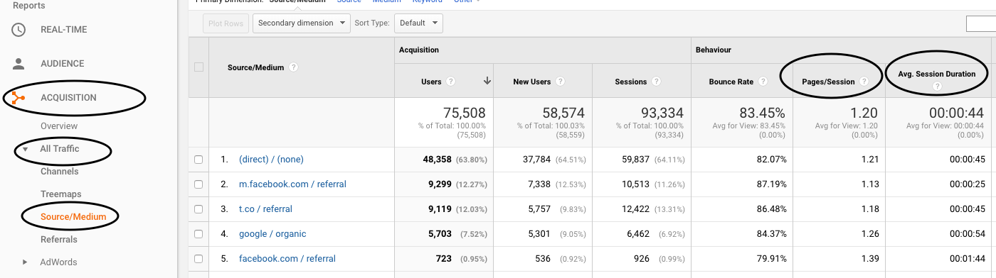
Individual Stories: The Source/Medium report for stories lets you see where traffic came from, how long on average its readers spent on the site (Avg Session Duration) and what proportion of the visits were likely to be misclicks (Bounce Rate).
Step 3: Set Realistic Targets
Once you’ve got numbers for the metrics you want to measure, you can establish a baseline to set realistic targets.
These are just a few GA metrics that I find useful. The important thing is defining what you’d consider to be success for your site and use that to choose the metrics you’ll measure. Sometimes chasing big numbers can distract you from what your really want to do.
 Laura Grant does performance monitoring for a donor-funded media organization in South Africa. She is also a managing partner of the Media Hack Collective, a digital journalism initiative, where she works on data-driven journalism projects. She is the former associate editor of digital and data projects at the Mail & Guardian.

This work is licensed under a Creative Commons Attribution-NoDerivatives 4.0 International License
Republish our articles for free, online or in print, under a Creative Commons license.
Republish this article
This work is licensed under a Creative Commons Attribution-NoDerivatives 4.0 International License
Read Next

Methodology News & Analysis Reporting Tools & Tips
Tips for Gamifying Your Next Investigation
Gaming and the news have a history, for decades they have been used to increase engagement and reach younger audiences. Here are some tips for getting started with gamification in your next investigation.

News & Analysis Reporting Tools & Tips
Gauging the Impact of Your Journalism
Is measuring reach, attention, and engagement the same as measuring the impact of your journalism? The model and technology are not yet there to measure the real impact of a story on behavior and policy.

Reporting Tools & Tips
12 Tips on Reaching More People and Getting Bigger Impact on Investigative Stories
In a GIJN webinar on audience engagement, editors and digital marketing experts shared tips and resources on how to reach and engage with audiences by maximizing the impact of stories, and by using carefully curated newsletters.

Reporting Tools & Tips
25 Ways Community Members Can Support Your Newsroom
Media outlets’ communities have a lot to offer — and often, they would like to help. Here are 25 jobs that community members can do to aid newsrooms and examples of how to best include them.