
This Week’s Top 10 in Data Journalism
 What’s the global data journalism community tweeting about this week? Our NodeXL #ddj mapping from February 12 to 18 finds @MattLWilliams discussing the ethics of publishing Twitter content, @MaryJoWebster explaining common “dirty data” problems, and MediaShiftOrg showcasing the powerful impact of small data teams in newsrooms. Plus: Ten Great Ideas About Chance, buses in Britain, and ages in Brittany.
Ethics of Using Twitter Data
Collecting and publishing data collected from social media sites such as Twitter are everyday practices for the data journalist. But is publishing Twitter content –without seeking some form of informed consent from users beforehand — ethical ?
To publish or not to publish? Use this flow chart to determine if publishing Twitter data is ethical. More considerations at: https://t.co/2AjgNz7bYu #ddj #ethics #journo #datajournalism @EJNetwork pic.twitter.com/bgGu8XE7dE
— DataDrivenJournalism (@ddjournalism) February 16, 2018
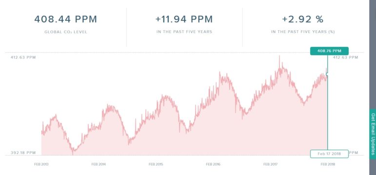
Carbon Doomsday
Check out this Carbon Doomsday chart which visualizes carbon dioxide levels in real-time using open Air Pollution Index data. The code is open source and was created by a team of eight people, including programmers, designers and marketers from the US, Ireland, Australia and Germany.
Wrestling with Dirty Data
More often than not data will show up on your doorstep with a problem… or two or three or more. In the data journalism world, it’s called “dirty data.” Data editor Mary Jo Webster breaks down common dirty data problems you might encounter.
You’ve got a great story idea. You requested the data. And it arrived. Time to start querying it, right? Wrong. @MaryJoWebster @jersey_janet @perryjg share stories about dirty data and how to find it: https://t.co/iSuk9gTswx #ddj #datajournalism #dirtydata #journo
— DataDrivenJournalism (@ddjournalism) February 15, 2018
Small Team, Big Impact
Turns out you don’t need a big newsroom to do award-winning data journalism. Mediashift interviews the heads of data teams from Berliner Morgenpost, Dossier and The Bureau Local to find out the advantages of having a small data team.
The data nerds in your newsroom might help you win a reporting award. See the story of @juliustroeger and @morgenpost. By @BettinaFigl https://t.co/C968sl9tPS @Megan_Lucero @bureaulocal @nicnewman pic.twitter.com/49PmKKj5Bl
— Mark Glaser (@mediatwit) February 17, 2018
Small Data for Investigative Projects
What’s the deal with big data, and how does it fit into journalism? The founder of Data Sketch explains basic data journalism terms, and gives tips for mastering small data sets for use in investigative projects.
#bigdata is for machines: how to use small #data sets for impactful stories – IJNet (blog): IJNet (blog) #bigdata is for machines: how to use small #data sets for impactful stories IJNet (blog) There is a lot of hype around #bigdata in every… https://t.co/O2LebJpmp8 #BigData pic.twitter.com/A3fu5FAVtP
— Saeed Valadbaygi (@SaeedBaygi) February 15, 2018
Offshore Leaks Database Updated
ICIJ recently added 85,000 entities and more than 110,000 officers to its Offshore Leaks Database. Here’s a comprehensive Twitter thread to guide you on how to start searching the database and finding stories in the data.
Yesterday, we added an extra 85,000 entities and more than 110,000 officers to our Offshore Leaks Database from #ParadisePapers. But with more than a 785,000 trusts, companies or funds to explore…. where do you start? And eliminate these moments? Here are some tips! /1 pic.twitter.com/vHq3SfoIva
— ICIJ (@ICIJorg) February 15, 2018
Frequency vs Probability
The New York Times reviewed the book Ten Great Ideas About Chance, a historical and philosophical tour of major insights in the development of probability theory.
Understanding “statistically significant” requires understanding probability, great review James Ryerson @nytimes https://t.co/w3eJAorO2m: the media can help communicate.. pic.twitter.com/y3dmA7XqKN
— Susan Holmes (@SherlockpHolmes) February 16, 2018
Scraping for Journalists
One of the most important skills for data journalists is scraping. Journocode explains three ways of scraping in this tutorial using import.io, Python, or R.
Scraping for everyone: Praktische Anleitung von @journocode zum Scrapen mit https://t.co/Uc9roumTaZ, #Python und #R https://t.co/biLiFCJR0o #ddj #scraping
— JournalistenTraining (@JT_Muenchen) February 16, 2018
Britain’s Bus Coverage
A BBC Shared Data Unit analysis revealed that Britain’s bus network has shrunk to levels last seen in the late 1980s. Rising car use and public funding cuts are being blamed for a loss of 134 million miles of coverage over the past decade.
BBC reporting big fall in bus miles nationally, but #Nottingham stands out with third highest bus usage per head of population & bus miles rising. Public ownership & investment makes a difference! https://t.co/xZCk42X2WM pic.twitter.com/C5TjGwRYCW
— Cllr Sam Webster (@cllrsamwebster) February 16, 2018
Brittany’s Average Age
Le Télégramme deciphers the average age of the inhabitants of the 1,250 municipalities of Brittany. (Hint: It’s 41.6 years, but varies widely from the coast to the cities.)
Votre commune est-elle en dessous ou au-dessus de la moyenne bretonne ? Réponse avec notre carte interactive. https://t.co/lclcqMvfq7
— LeTélégramme Morlaix (@TLGMorlaix) February 18, 2018
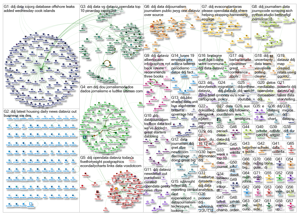
Thanks, once again, to Marc Smith of Connected Action for gathering the links and graphing them.
For a look at Marc Smith’s mapping on #ddj on Twitter, check out this map.

No Coding Required: A Step-by-Step Guide to Scraping Websites With Data Miner

Free, Game-Changing Data Extraction Tools that Require No Coding Skills

Document of the Day: Visual Vocabulary

Tipsheet: Latest Tools for Investigating with Telegram
No Coding Required: A Step-by-Step Guide to Scraping Websites With Data Miner
Data Journalism Top 10: Retracing a Migrant Tragedy at Sea, Nepotism in US Politics, and French Police Brutality
Why Dynamic Data Visualization Is Key to Covering Climate Change

Data Journalism Top 10: Climate Disasters, Olympic Running, Russian Healthcare, and Bulgarian Coal Plants

This work is licensed under a Creative Commons Attribution-NoDerivatives 4.0 International License
Republish our articles for free, online or in print, under a Creative Commons license.
Republish this article
This work is licensed under a Creative Commons Attribution-NoDerivatives 4.0 International License
Read Next
Tipsheet Data Journalism GIJC23
No Coding Required: A Step-by-Step Guide to Scraping Websites With Data Miner
Knowing where to look for data — and accessing it via scraping data from websites — can be a powerful force multiplier for investigative journalists.
Data Journalism Data Journalism Top 10
Data Journalism Top 10: Retracing a Migrant Tragedy at Sea, Nepotism in US Politics, and French Police Brutality
This week’s Top 10 in Data Journalism looks into a deadly migrant tragedy in the Mediterranean, nepotism in US politics, French police brutality, and record-breaking global warming.
Data Journalism
Why Dynamic Data Visualization Is Key to Covering Climate Change
As calls for change grow louder in light of the latest IPCC (Intergovernmental Panel on Climate Change) report and in the run up to COP26 conference in Glasgow this November, it’s time to focus on how data visualization can help people grasp the challenges that lie ahead.
Data Journalism
Data Journalism Top 10: Climate Disasters, Olympic Running, Russian Healthcare, and Bulgarian Coal Plants
Our weekly project that maps the most popular data journalism stories on Twitter found several environmental projects this week, including a climate disaster in Germany, air pollution in South Asia, and deforestation in Brazil. We also feature more data-driven coverage of the Tokyo Olympics, an investigation into Bulgarian coal plants, and a guide to creating appealing data visualizations based on simple charts.