How They Did It: Developing a Data-Driven Navigator on Gun Laws


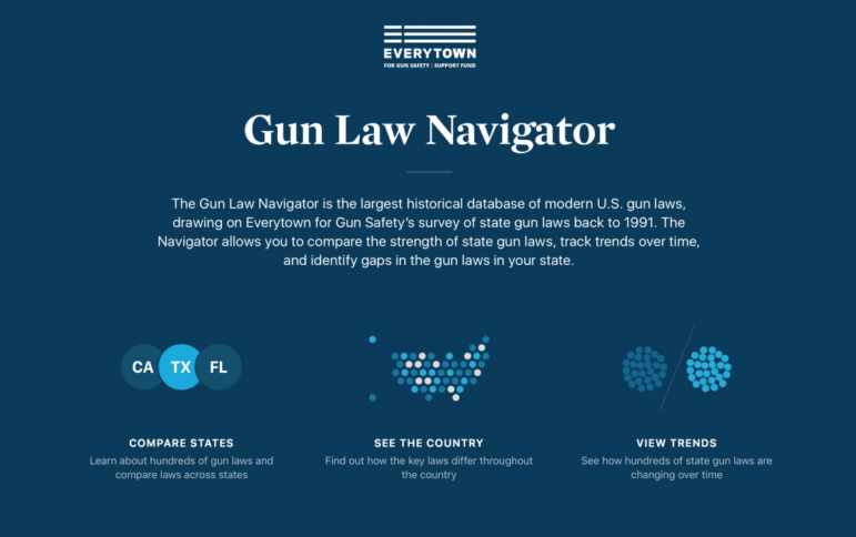
 Last August, Everytown for Gun Safety, a non-profit research and advocacy group for gun control, launched the Gun Law Navigator, an exploratory data visualization tool explaining how states in America regulate guns. The project, developed by the Boston-based creative digital studio Upstatement, received lots of attention not only for examining such a sensitive topic, but also for successfully telling a visual, data-driven story about a complex subject: legislation.
Storybench recently spoke to freelance designer and developer Andrew Garcia Philips and Upstatement’s Tito Bottitta and James Muspratt about what it takes to work with and visualize such a complex dataset.
“Massaging” the Data
The very first and most pressing challenge for the team was how to create compelling, meaningful visualizations from a dataset that was not made up of numbers.
All visualizations on the web app are based on a breakdown of the types of laws the organization deemed key for effective gun control. Users can browse through three different panels — compare states, visualize trends, and see an overview of the country — and see where states are in each of 67 pivotal topics, from minimum age requirements to background checks.

“You can’t quantify something that’s in language like that,” says Garcia Philips. “But what Everytown did with this dataset is really smart. They were able to turn these complex legal codes into yes and no answers.”
Even with the extensive legal survey conducted by the non-profit, the developers still had a lot of data wrangling to do. Several CSV and JSON file structures were tested. “The data ended up being a little trickier than we expected,” says Garcia Philips.
“We took this big dataset and we did somersaults and backflips to make it understandable for a general audience,” says Bottitta. “We took a lot of these binary yes and no questions and combined them into something that had more meaning.”
Telling a Story through Visuals
The data acrobatics didn’t always result in succinct takeaways.
“With some of the things that we sketched, when we actually applied the data to it, didn’t show us what we wanted,” explains Bottitta. “Not that we were trying to manipulate it to show something. It was more like it was showing us something that didn’t make the data clearer, didn’t tell a story.”
The team would build a visualization, learn from it, and then move on to build new ones, Bottitta explains. That included shooting down some attractive ideas.
“Early on, we were trying to show a grid of every state, but there was a visual overload,” says Garcia Philips. “You couldn’t really learn anything from that. In the end, the team decided to go with the three different panels combining tables, a map and bubble charts. We had to really simplify,”

Giving the User Control
One of the main goals for Everytown was to show the results of their research in a way that allowed users to compare state laws across the country. The organization was also concerned with being as neutral and non-partisan as possible.
The solution the team landed on actually combined both by making the Navigator an exploratory tool. By not relying on statements, analysis or correlations, the team opted to give users the ability to construct their own narratives with the tool. The piece also includes data going back as far as 1991, adding a historical perspective to the experience.
“Everytown wanted people to trust the data,” says Bottitta. “This data is available nowhere else. And so for us to just explain what it told us would hide the potential for other stories.”
The Navigator also attempts to court two separate audiences. For the average viewer, who wants to see “what’s happening in my state,” Garcia Philips points out, the piece uses geolocated information to show gun law specifics. Users can also compare their home states against others. For the researchers, journalists and lawmakers who can “go out and make a change,” as Bottitta puts it, there is a trends table showing how legislation in the country has changed over time.

Two Years in the Making
Upstatement was first approached by Everytown in late 2015 and the development officially started in February 2016. The Navigator was only just released in August last year.
“With projects like that, there’s a period of development and period of waiting on the client. We were active for about four months,” explains Garcia Philips, who programmed most of the visualization with D3.js, and remembers making a series of incremental changes along the year and a half of development.
A long timeframe is not necessarily a bad thing. First, the language needed to be clinical and reflective of the legal statutes. After all, the project wasn’t supposed to look like it was advocating for any particular position. Second, with the many data transformations made, everything was double- and triple-checked by the legal team that conducted the research. That may have slowed down the process but the product was better in the end for it.
“We were always excited for it to come out, but the most important thing was always for the product be accurate,” Bottitta says.
This post first appeared on the Storybench website and is reproduced here with permission.
 Felippe Rodrigues is a former law student turned sports writer and a big fan of the Olympics. He is currently a graduate student in Northeastern’s Media Innovation program. You can view his work on Storybench here.

This work is licensed under a Creative Commons Attribution-NoDerivatives 4.0 International License
Republish our articles for free, online or in print, under a Creative Commons license.
Republish this article
This work is licensed under a Creative Commons Attribution-NoDerivatives 4.0 International License
Read Next

Data Journalism News & Analysis
From Space to Story in Data Journalism
Over the past 10 years satellite imagery has become an important component of data journalism. In the next 10, it will likely evolve further, from a tool used primarily for illustrating stories to an integral part of research and investigative reporting.

Data Journalism
10 Outstanding Data Projects Win the 2024 Sigma Awards
There were 52 data journalism entries from 22 countries in shortlist for the 2024 Sigma Awards. Here are the top 10 winning projects.

Tipsheet Data Journalism Reporting Tools & Tips
Tipsheet for Using Ocean Data in Your Investigations
Investigations into what happens on, under, and around the ocean can often be answered thanks to the vast amount of data available online.

Data Journalism Reporting Tools & Tips
Best Practices for Working With Mass Shootings Data
There can be confusion among journalists about “mass shootings” data, which leads to wildly different numbers and deeper confusion among audiences.