This Week’s Top Ten in Data Journalism
 What’s the global data journalism community tweeting about this week? Our NodeXL #ddj mapping from October 9 to 15 has @RTSinfo looking into flight sharing platform @Wingly_UK, while @srfdata finds millions of fake @instagram followers, @jwyg charts the growth of all Internet sites, and @nytimes collaborates with @AmstatNews to promote critical thinking and data literacy.
Airbnb in the Skies
Wingly — the Airbnb equivalent in the skies — recently launched in Switzerland, where the potential is huge with more than 4,700 private aircraft pilots and 63 runways. RTSinfo scraped the flight sharing platform site to find out what it offers.
Idée de cadeau pour Noel – Wingly, le Airbnb du cockpit, décolle en Suisse https://t.co/7fwDFh0ecx
— gabor markus (@gabormarkus) October 13, 2017
Fake Followers
SRF Data built an algorithm to identify fake followers on Instagram. Results show that fake followers are indeed a widespread phenomenon — almost one-third of 7 million profiles are fake.
Using statistics and R to identify fake Instagram followers. https://t.co/czFoXSAj12#tech #instagram #science #datascience #R #marketing pic.twitter.com/EOxhyUmqDm
— Ryan Mansergh, PhD (@n3ur0) October 14, 2017
What’s Going On in This Graph?
New York Times is partnering with the American Statistical Association for a monthly feature: “What’s Going On in This Graph?”. It is an educational resource for students and the public to make sense of data visualizations.
What’s Going On in This Graph?, a monthly feature supporting science literacy. Try it with students! #secondary
https://t.co/AwMf6CNZ4w— TS Ms.Gardea (@ScienceTS) October 5, 2017
How Online Journalism Uses Data
The winners of the 2017 Online Journalism Awards have been announced. Here’s a list of five exceptional ways data was analyzed and presented in online journalism.
Best stories that used data tools https://t.co/nDfcsoCx5H Cc. @ICFJKnight @ICFJ @IJNet
— ?? Fabiola Torres (@fabiolatorres) October 9, 2017
Effective Data Visualization
Not all data visualizations are equal in their ability to communicate data effectively. Stephen Few discusses the criteria for assessing the effectiveness of data visualizations and proposes a way to graphically represent how well specific visualizations satisfy them.
To discuss: Data Visualization Effectiveness Profile https://t.co/yfXDCw0qbL #dataviz #ddj #infographics pic.twitter.com/rWo9boAt2H
— Alberto Cairo (@albertocairo) October 9, 2017
ddj: Revolution or Not?
To better understand the key components and development of the still young and fast evolving data-driven journalism genre, three journalism researchers investigate what the field itself defines as its ‘gold-standard’. Their findings challenge the widespread notion that [data-driven journalism] ‘revolutionizes’ journalism in general by replacing traditional ways of discovering and reporting news.
“Our results demonstrate, for instance, only a few consistent developments over the years [in Data Journalism]”https://t.co/ty1Lfh13wL
— chainsawriot (@chainsawriot) October 17, 2017
Website Growth 1991-2015
Using the Datawrapper tool and data compiled by InternetLiveStats.com, Jonathan Gray visualized the growth of the total number of websites online from 1991 to 2015.
What’s the total number of websites? Nice graph by @jwyg. Striking, that apparently, peak was in 2014. 2016, anyone? https://t.co/k3rMpWfct7 pic.twitter.com/6LJoBzHIre
— Ilja (@fubits) October 10, 2017
Scraping Data from PDFs
Hacks/Hackers Nairobi demonstrated some simple tools for journalists and researchers who want to liberate data from locked in PDFs.
“Never Run Away from Data in ‘Ugly’ PDF Files Again” @saweelar https://t.co/VlJqKSawyE S/o @andkamau for the presentation #StoryLabAcademy
— Muthoni Wanyoike (@_tabbz) October 9, 2017
Catalonian Independence
According to El Pais’s data analysis, support for Catalonia’s independence is greater among the well-to-do and among those with university or postgraduate qualifications.
El vínculo entre independencia, renta y origen. ¿Los más partidarios? Rentas altas, con padres y abuelos catalanes https://t.co/vTcXW2aglY
— Kiko Llaneras (@kikollan) September 28, 2017
German Election Analysis
Berliner Morgenpost‘s interactive team prepared a script in the statistical programming environment R for their analysis of German election data. It includes the preprocessing — cleaning and structuring the raw data — and the analysis.
R code for ⭐️ maps:
“Small multiples for ?? elections 2017”https://t.co/Pl6uAJec1z via @juliustroeger & @datentaeterin #rstats #dataviz pic.twitter.com/cbMIQvaviS— Mara Averick (@dataandme) October 5, 2017
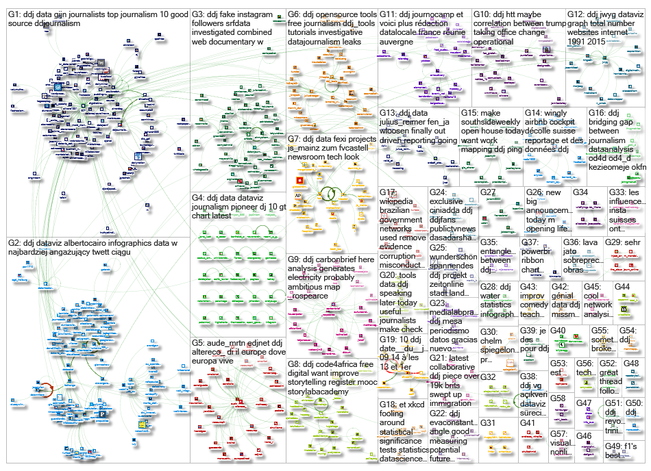
Thanks, once again, to Marc Smith of Connected Action for gathering the links and graphing them.
For a look at Marc Smith’s mapping on #ddj on Twitter, check out this map.
Improve Your Data Literacy: 16 Blogs to Follow in 2016

Tipsheet: Latest Tools for Investigating with Telegram

Investigating Elections: Threat from AI Audio Deepfakes

Updated GIJN Databases (Poverty, Crime, Corruption, and Terrorism)

4 Common Angles Data Journalists Use to Tell Stories
Data Journalism Top 10: A Year of War in Ukraine, Russian Casualties, Trans Identities, Unexpected NBA Performances
4 Things Data Journalists Need to Know about Standard Deviation

5 Things Journalists Need to Know About Statistical Significance

This work is licensed under a Creative Commons Attribution-NoDerivatives 4.0 International License
Republish our articles for free, online or in print, under a Creative Commons license.
Republish this article
This work is licensed under a Creative Commons Attribution-NoDerivatives 4.0 International License
Read Next
Data Journalism News & Analysis
4 Common Angles Data Journalists Use to Tell Stories
At the Online Journalism Blog, data journalism expert Paul Bradshaw analyzed 100 pieces of data that journalists use and found that there are several common story angles.
Data Journalism Data Journalism Top 10
Data Journalism Top 10: A Year of War in Ukraine, Russian Casualties, Trans Identities, Unexpected NBA Performances
GIJN’s weekly look at the best in data journalism examines one year of war in Ukraine, Russian casualty totals, trans coverage in the French media, and the most unexpected performances in NBA history.
Data Journalism
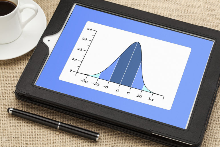
4 Things Data Journalists Need to Know about Standard Deviation
Data journalists often encounter the term “standard deviation” when reading research, from climate change studies to social science papers. This tipsheet explains how researchers use this measure, and how reporters can benefit from the context it provides.
Data Journalism Reporting Tools & Tips
5 Things Journalists Need to Know About Statistical Significance
This tipsheet helps journalists avoid some of the most common errors related to statistcal significance in academic studies, which even trained researchers sometimes make.