Data Journalism’s Top Ten


 What’s the global data journalism community tweeting about this week? Our NodeXL #ddj mapping from August 28 to Sept 3 has the most amusing memes you’ll read all day from @xocasgv, a trip with @stuartathompson to the New York Times‘ morgue to discover fascinating graphics from the 50s and 60s and crowdsourcing flooded roads by @HoustonChron.
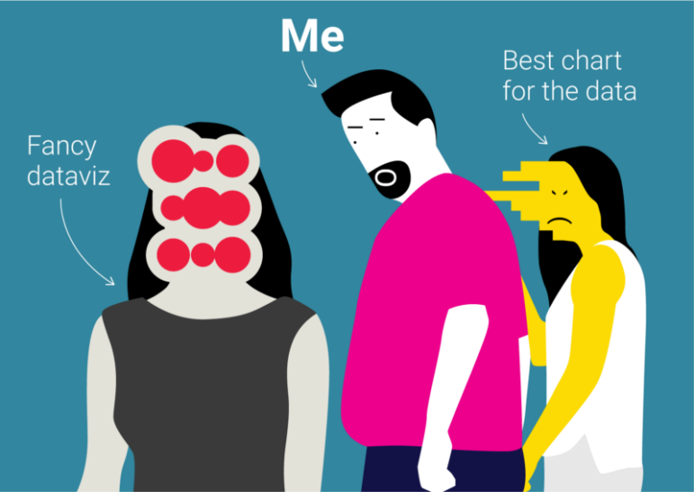
#DistractedBoyfriend Memes
Data journalist Xaquín González Veira illustrated his professional sins in 10 hilarious #DistractedBoyfriend styled memes. From flirting with last minute ideas despite looming deadlines to choosing fancy dataviz over the right chart for the data, this is one list that will have you in stitches.
Some next-level memes from @xocasgv here https://t.co/KGMIEKT0t9 pic.twitter.com/S44b2G476L
— Aaron Mendelson (@a_mendelson) September 3, 2017
A Trip to the Dataviz Morgue
The New York Times Opinion graphics director Stuart A. Thompson, together with his colleagues Jessie Ma and Jeff Roth, took a trip to the “morgue” — the paper’s archives. Here’s the cool graphics they found from between 1950 and 1962.
Sequential art explaining #Apollo missions! @stuartathompson shares 1960s graphic journalism from @nytimes “morgue” https://t.co/tFoxYpU5Qc pic.twitter.com/dvXDZkaRdq
— Jordan Wirfs-Brock (@jordanwb) August 31, 2017
Next Up: Hurricane Irma
On the heels of Hurricane Harvey, The Washington Post’s Capital Weather Gang has turned its attention to the next possible threat, Hurricane Irma.
https://t.co/pUAB8bQMMx
Hurricane Irma remains potential threat to the East Coast, possibly matching Harvey’s strength#climate #hurricane pic.twitter.com/r2CQBpMCEW— Fred Bentler (@Bentler) September 3, 2017
Crowdsourcing Houston
The Houston Chronicle crowdsourced a map of street closures and flooded streets in and around Houston due to Hurricane Harvey.
Great work, @HoustonChron! These are the roads that are closed in Houston: https://t.co/bs4pxG8T1J #ddj #HarveyHouston pic.twitter.com/ZWnc9FDy2G
— Alex Howard (@digiphile) August 29, 2017
The Broken US Economy in One Chart
NYT depicts the soaring of income inequality in the US in a chart. The affluent have received significant raises in recent decades compared to the poor and middle class. This overwhelming flow of the country’s economic bounty to a small share of the population, the super-rich, is creating a huge gap between them and everyone else.
Watch how income gains in the US have shifted to the rich, 1980-2014 https://t.co/UoGvOUTcWX #DDJ pic.twitter.com/lahA4kuBXg
— Max Galka (@galka_max) August 30, 2017
Pictorial or Abstract Dataviz?
Data visualization expert Alberto Cairo discusses presenting data in pictorial comparisons versus abstract graphics. He believes no visualization is ever perfect, or useful, in every case or every purpose; the key to a successful data presentation is to not limit yourself to just one graph, map or diagram but to combine different kinds.
New post: Shock and precision in #dataviz #infographics: https://t.co/rYdXIBBy25 #ddj pic.twitter.com/skjPOr63PE
— Alberto Cairo (@albertocairo) August 28, 2017
How Cohesive are German Parties?
Berliner Morgenpost analyzed the responses of 32 parties in the German election. The analysis shows which parties are closest and most consistent in terms of party stands and which have huge differences. You can read their how-to process in calculating the political proximity between the parties here.
Wir haben analysiert, wie nah sich die Parteien wirklich stehen #btw https://t.co/e8z52MrMuT pic.twitter.com/1mNeWKRCgv
— Berliner Morgenpost (@morgenpost) August 30, 2017
#StateOfObesity
As at August 31, 2017, adult obesity rates in the US now exceed 35 percent in five states, 30 percent in 25 states and 25 percent in 46 states. West Virginia has the highest adult obesity rate at 37.7 percent and Colorado has the lowest at 22.3 percent.
New data just released > How healthy is your state? #stateofobesity https://t.co/TaqBsJMeWF pic.twitter.com/5J0YLxdbui
— Tamara Dull (@tamaradull) August 31, 2017
Data Best Practices
Communications specialist Rebekah McBride lists five best practices and ethical guidelines for data journalists and journalism educators. It touches on minimizing the potential for inaccuracy and ensuring that data is not misrepresented.
Giving data soul: Best practices for ethical data journalism https://t.co/2TuBAWLMmO pic.twitter.com/UgMRlcIDEQ
— CMPF (@CmpfEui) September 1, 2017
Data Journalism Handbook Callout
The European Journalism Centre and Google News Lab seeks help to shape, write, use and share the second edition of the Data Journalism Handbook. Fill in the form if you’d like to get involved.
What would you like to see in the next edition of the Data Journalism Handbook? Suggestions welcome: https://t.co/CJ0zIg5eqV #ddj #dataviz pic.twitter.com/h2HAAKzdtN
— Jonathan Gray (@jwyg) August 29, 2017
Thanks, once again, to Marc Smith of Connected Action for gathering the links and graphing them.
For a look at Marc Smith’s mapping on #ddj on Twitter, check out this map.

This work is licensed under a Creative Commons Attribution-NoDerivatives 4.0 International License
Republish our articles for free, online or in print, under a Creative Commons license.
Republish this article
This work is licensed under a Creative Commons Attribution-NoDerivatives 4.0 International License
Read Next

Data Journalism News & Analysis
From Space to Story in Data Journalism
Over the past 10 years satellite imagery has become an important component of data journalism. In the next 10, it will likely evolve further, from a tool used primarily for illustrating stories to an integral part of research and investigative reporting.

Data Journalism
10 Outstanding Data Projects Win the 2024 Sigma Awards
There were 52 data journalism entries from 22 countries in shortlist for the 2024 Sigma Awards. Here are the top 10 winning projects.

Data Journalism Data Journalism Top 10
Trump’s Disappearing Donors, Tracking the Mars Rover, and the Ongoing Wars in Gaza and Ukraine
Our column of the best in data journalism also features stories on AI’s ability to forecast the weather, analyzing the Argentine president’s Tweetstorms, and apathetic EU voters.

Data Journalism
Updating the Inverted Pyramid of Data Journalism
Data journalist and instructor Paul Bradshaw has updated the Inverted Pyramid of Data Journalism — and brought together resources for every stage.