Data Journalism’s Top Ten


 What’s the global data journalism community tweeting about this week? Our NodeXL #ddj mapping from August 21 to 27 has useful digital forensics tools from @bellingcat, mathematician Cathy O’Neil warning us about blind faith in big data and an analysis of Delhi’s insane dowry demands by @htTweets.
The Era of Blind Faith in Big Data Must End
Cathy O’Neil stresses in this illuminating Ted Talk that algorithms don’t make things fair if you just blithely, blindly apply them. “Algorithms repeat our past practices, our patterns. They automate the status quo.”
“We need to demand accountability for our algorithmic overlords.” –@mathbabedotorg Wonderful TED Talk: https://t.co/coV5QObSTi
— Jared Helton (@jared_helton) August 23, 2017
Digital Forensics Tool
Bellingcat compiled a useful list of open source verification and investigation tools and methods. It includes platforms and tools for mapping, geobased searches, images/metadata and archiving.
Here’s a great gift from @bellingcat “bellingcat’s digital forensics tools” – always up to date! Now with link: https://t.co/JsR9E7K23S pic.twitter.com/3ABTeV64kM
— ʜᴇɴᴋ ᴠᴀɴ ᴇss (@henkvaness) August 22, 2017
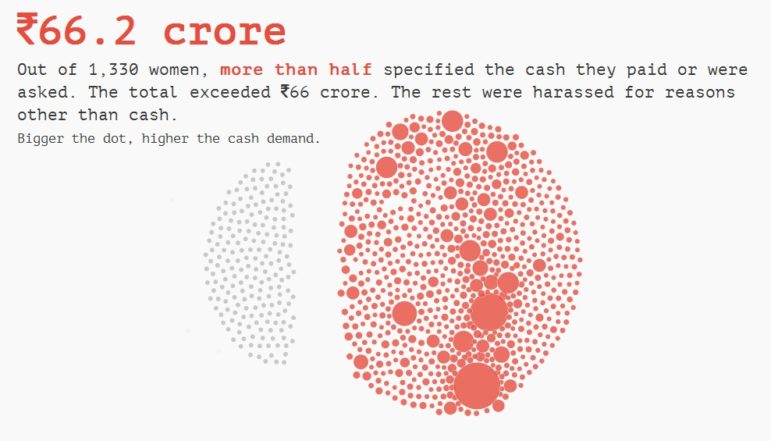
Delhi’s Dowry Dilemma
Hindustan Times analyzed 1,331 dowry cases registered in Delhi during the first half of 2017. It found that women were allegedly being harassed for almost everything from cash, cars, motorcycles, LED TVs to property and — in one case — a kidney. Also, Honda City was the most sought after car in Delhi weddings.
This Hindustan Times analysis of dowry crimes in Delhi is really powerful https://t.co/mLzGxAMk7N
via @GurmanBhatia pic.twitter.com/5koHn4R8fF— Chris Hagan (@chrishagan) August 16, 2017
Words Emmanuel Macron No Longer Speaks
Paris Match analyzed speeches by Emmanuel Macron and found that Macron has totally abandoned some words since being elected as president. Words such as “zero tolerance” (tolérance zéro) and “criminal” (pénale) have disappeared from his speeches.
.@ParisMatch a comparé les mots d’ @EmmanuelMacron depuis son investiture à ceux de sa campagne https://t.co/ssdGqgiJuq @GoogleTrends pic.twitter.com/7oiLLymqFf
— David Dieudonné (@DavidDieudonne) August 22, 2017
From Journalist to Data Analyst
Ross Gordon, a Northwestern University Medill School of Journalism graduate, had a turning point in his career pursuit when he realised he was more interested in learning about what he was reporting on than actually reporting the story itself.
READ How and Why a Journalist Learned to Code — My Story of Transformationhttps://t.co/uDbf2Kk2LV #ddj
— Maria Crosas (@mcrosasb) August 25, 2017
Crafting Data Stories Online Course
The Knight Center is presenting a six-week Big Online Course (BOC) on “Crafting Data Stories: A Hands-on, Step-by-step Workshop Building Real Data Narratives,” taught by data scientist Heather Krause. The course will run from September 18 to October 29 and students will learn how to build a data story from scratch using analysis and narrative techniques.
Sign up for the online course “Crafting Data Stories,” get your backstage pass to the data journalism process #ddj https://t.co/CewmjNTSPl pic.twitter.com/6wjCLzGm6k
— Rosental (@Rosental) August 26, 2017
YourDataStories
YourDataStories (YDS) is a platform that helps make sense of open and social data. It collects pertinent data from a variety of sources and, where useful, across borders. You can explore and pick elements that stick out, visualize them, develop an explanation and publish directly on the YDS platform.
Find, explore and visualise #opendata in one place with @YDS_EU: https://t.co/dydsS4GuzD @ejcnet #ddj #data #journo pic.twitter.com/COoarLQop8
— DataDrivenJournalism (@ddjournalism) August 26, 2017
One Dot, One Candidate
Berliner Morgenpost visualized 2,559 candidates of the 2017 German polls using cosine similarity and multidimensional scaling. The data visualization informs readers of the candidates’ profession, origin and political proximity.
A @morgenpost #dataviz of the 2559 direct candidates for the German federal electionhttps://t.co/cPqsZ1VsqU pic.twitter.com/5UxIxsO380
— Evangeline (@edebourgoing) August 24, 2017
Where Scientists Meet Data Journalists
The SciCAR conference, where science meets computer assisted reporting, will be held in Dortmund from September 6 to 8. There will be workshops on R, Carto, scraping data, GIS and SQL. Sessions in English have been added to the schedule and major sessions will be translated.
Workshops zu #R,#D3, #Carto, #scraping, #GIS und #SQL online auf https://t.co/I5SoUjhnjv #scicar #ddj mit @grssnbchr @nicolaskb @kappuchino
— scicar (@scicar17ff) August 25, 2017
When to Use Stacked Graphs
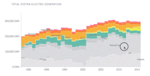 Data visualization expert Alberto Cairo writes on his blog: “Stacked graphs show both the total and its components, but they emphasize the former, not the latter. When the total is more relevant than the parts, a stacked graph may be an appropriate choice.”
Thanks, once again, to Marc Smith of Connected Action for gathering the links and graphing them.
For a look at Marc Smith’s mapping on #ddj on Twitter, check out this map.


This work is licensed under a Creative Commons Attribution-NoDerivatives 4.0 International License
Republish our articles for free, online or in print, under a Creative Commons license.
Republish this article
This work is licensed under a Creative Commons Attribution-NoDerivatives 4.0 International License
Read Next

Data Journalism News & Analysis
From Space to Story in Data Journalism
Over the past 10 years satellite imagery has become an important component of data journalism. In the next 10, it will likely evolve further, from a tool used primarily for illustrating stories to an integral part of research and investigative reporting.

Data Journalism
10 Outstanding Data Projects Win the 2024 Sigma Awards
There were 52 data journalism entries from 22 countries in shortlist for the 2024 Sigma Awards. Here are the top 10 winning projects.

Data Journalism Data Journalism Top 10
Trump’s Disappearing Donors, Tracking the Mars Rover, and the Ongoing Wars in Gaza and Ukraine
Our column of the best in data journalism also features stories on AI’s ability to forecast the weather, analyzing the Argentine president’s Tweetstorms, and apathetic EU voters.

Data Journalism
Updating the Inverted Pyramid of Data Journalism
Data journalist and instructor Paul Bradshaw has updated the Inverted Pyramid of Data Journalism — and brought together resources for every stage.