Top Ten Developments in Data Visualization This Year


![]() Editor’s Note: To mark each mid-year and end-of-year milestone, Andy Kirk takes a reflective glance over the previous six-month period in the data visualization field and compiles a collection of some of the most significant developments. These are the main projects, events, new sites, trends, personalities and general observations that have struck him as being important to the development of this field — or are things he simply likes — between January and June 2017.
Editor’s Note: To mark each mid-year and end-of-year milestone, Andy Kirk takes a reflective glance over the previous six-month period in the data visualization field and compiles a collection of some of the most significant developments. These are the main projects, events, new sites, trends, personalities and general observations that have struck him as being important to the development of this field — or are things he simply likes — between January and June 2017.
And so, as ever, in no particular order…
1. Hannah Fairfield, NYT Climate Editor
 Hannah Fairfield has been a celebrated graphics editor with the New York Times for over a decade but I share the belief of many that her appointment as the Times’ Climate Editor is the perfect choice to lead on what is surely the most important and urgent topic of our time. One could argue Fairfield potentially holds one of the most influential positions in this industry. The quantity and quality of output (see: Antarctic Dispatches, Impact on Southern Statues, 95 Degree Days) already emerging, mobilizing the NYT‘s existing graphic talent, is hugely encouraging and I wish her and her team continued success.
2. Elijah Meeks on State of Data Viz
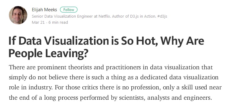 Elijah Meeks has been a particularly prominent voice over the past six months — ever since his tweet questioned the state of the data visualization industry. This was a timely, perhaps contrary, view that snapped a few of us out of complacency and triggered a wide-ranging discussion about the health and prospects of the data visualization field. A huge survey designed by several contributors, but initiated by Meeks, took place and was followed up by his provocative articles “If Data Visualization is So Hot, Why Are People Leaving?” and “Strategic Innovation in Data Visualization Will Not Come From Tech.”
This triggered several further articles in response — some supportive, others more countering — from people like Moritz Stefaner , as well as a collection of contributions curated by Eric Socolofsky, Lynn Cherny and Jorge Camoes, to name but a few. Meeks went on to articulate his thoughts in two excellent Data Stories and PolicyViz podcast episodes. It is perhaps the most widespread, helicopter-viewed introspection of the data visualization field since the landmark and laminate-worthy Information Visualization Manifesto of 2009!
3. Engaging Data Viz at Hindustan Times
![]() Though they have been established for much longer than the window of time covered by this collection of developments, it is only really over the past six months that I’ve become increasingly aware of the outstanding work being done by the Hindustan Times data team of journalists and developers (here’s the team members’ list of Twitter accounts). Not only is their portfolio of work demonstrating excellence in visualization design, the topics covered represent contemporary societal, educational and political issues that are relevant to the varied nature of their readership. It is wonderful to see the team making this information so accessible and engaging to consume.
Though they have been established for much longer than the window of time covered by this collection of developments, it is only really over the past six months that I’ve become increasingly aware of the outstanding work being done by the Hindustan Times data team of journalists and developers (here’s the team members’ list of Twitter accounts). Not only is their portfolio of work demonstrating excellence in visualization design, the topics covered represent contemporary societal, educational and political issues that are relevant to the varied nature of their readership. It is wonderful to see the team making this information so accessible and engaging to consume.
4. Mona Chalabi: Breaking Down Barriers
Mona Chalabi hardly needs any introduction. She is an established and talented data journalist who has worked for organizations like FiveThirtyEight and is currently the data editor for The Guardian US. Over the past few years Chalabi has created a influential niche in this field and this is the right time to acknowledge the significance of her achievements. This is not only through her role at The Guardian — particularly with her wonderfully creative hand-drawn data sketches — but also through her writing and presenting roles in video documentaries and on television, including an appearance on the UK’s Channel 4’s Alternative Election Night program. Chalabi is breaking down more barriers in the pursuit of making data accessible to a mainstream audience.
5. Susie Lu’s D3-Annotation
 A second inclusion for a member of the Netflix visualization team, Lu’s release in March of her d3-annotation library very noticeably struck a chord with developers. I’m not a d3.js developer so I am speaking purely as an observer, but everything I have seen and read about this development is that it is a super neat, super welcome solution to what is an under-appreciated and often neglected but vital aspect of good visualization design. Incidentally, aside from checking out this library, you should also take time to look through all the other good stuff Lu has worked on.
6. Draw What You Think
 It is well over three years ago that I profiled a branch of interactive visualization developments that I termed “participative,” where you go beyond just interacting to taking part through contribution. Since then there has been a steady growth in examples where users are invited to draw their thoughts or estimates about a given subject, perhaps originating (in exposure terms) with The New York Times’ “You Draw It: How Family Income Predicts Children’s College Chances.”
“Explaining the Gap: Visualizing One’s Predictions Improves Recall and Comprehension of Data,” the recently published paper by Yea-Seul Kim, Katharina Reinecke and Jessica Hulman of the University of Washington (as well as the accompanying article), confirms my hunch that these types of experiences can really enrich the learning process through directly challenging one’s perceptions about a subject. This offers significant empirical evidence that might now see the increased adoption of this technique going forward.
7. Periscopic Emotions
 There’s not much to say here other than I loved this pair of complementary pieces by Periscopic to visualize the emotion of the 10 most recent inauguration speeches and the “Emotional Highs and Lows of Donald Trump,” deploying innovative methods for the capturing and categorizing of video-based data using clever visual representation approaches and then, in the final works, demonstrating such respect for the importance of transparency in describing the methods used and statements of accuracy. Wonderful projects from start to finish.
8. Statistical and Data Literacy
 In the previous “10 most significant…” posting I noted there would need to be a reaction to the apparent deficit that existed in trust and literacy with numbers, data or statistics (however you wish to box it), especially in the aftermath of the US election and the UK’s EU referendum. Over the past six months I have seen a number of examples of people or groups looking to help create relevant resources and knowledge more widely accessible including: “Calling Bullshit” and the “Seeing Theory” websites; Alberto Cairo’s “Visual Trumpery” lecture tour; articles such as “How to Spot Visualization Lies” from Nathan Yau; and “Does Your Data Visualization Say What You Think It Says?” by Martha Kang. While these are all important contributions, these are just the start, of course.
9. Statics Don’t Exist
 I found this article by Dominikus Baur really compelling and quite thought-provoking. I expected to disagree with it profoundly. But by the end of the read, I was genuinely reconsidering my understanding of what it is to interact with a visualization work. I continue to think that the reader — rather than maker — side of visualization literacy is still under-researched, and articles like this are really important to stimulate fresh thinking in the relationship between the reader and visualization work.
10. The Rise of the Datagif
And for those of you with less time on your hands, here’s the speedy version ?: pic.twitter.com/SJzqVEiFmP
— John Burn-Murdoch (@jburnmurdoch) May 21, 2017
Many of you will have seen Ed Hawkins’ animated radial plot of temperature changes that went viral last year. This was an example of how important the gif has now become to accompany, display or indeed market the publishing of a new visualization work. Datagifs are certainly not new in 2017 — Lena Groeger has been speaking about and collecting examples of them for a few years at least — but they have now become a quite ubiquitous and, I would concede, an appealing option to provide a taster or to package up your visual work.
Special Mentions…
Here are the other highlights or notable developments from the first half of 2017 that deserve a special mention:
Hans Rosling | We sadly lost Professor Rosling earlier in the year but it is quite clear that the inspiration and legacy of his work will continue to echo in significance for generations to come.
Forma Fluens | A fascinating project exploring “abstraction, simultaneity and symbolization in drawings.”
![]() Axios Visuals | This is a one-to-watch inclusion. Axios is a relatively new news and information website founded by several former members of Politico. Given the appointments made to the visuals team, I anticipate increasing growth in prominence to build on a very solid first few months.
Axios Visuals | This is a one-to-watch inclusion. Axios is a relatively new news and information website founded by several former members of Politico. Given the appointments made to the visuals team, I anticipate increasing growth in prominence to build on a very solid first few months.
Conflict Urbanism | An excellent project mapping and visualizing 30 years of crimes in Colombia in the hopes of better understanding the patterns and ramifications of the conflict.
 Cracking the Mystery of Egg Shape | Love the synthesis of imagery, animation and visual analysis in this investigation into why egg shapes are so different from one bird to the next.
Kim Rees at Capital One | The recruiting of Rees by Capital One was a huge coup and continues a recent trend of commercial organizations appointing or acquiring visualization designers.
This post originally appeared on Andy Kirk’s Visualising Data blog and is reproduced here with permission. Here’s the full compilation of his collections.
 Andy Kirk is a UK-based freelance data visualization specialist, and a design consultant, training provider, author, editor of visualisingdata.com, speaker and researcher.

This work is licensed under a Creative Commons Attribution-NoDerivatives 4.0 International License
Republish our articles for free, online or in print, under a Creative Commons license.
Republish this article
This work is licensed under a Creative Commons Attribution-NoDerivatives 4.0 International License
Read Next

Data Journalism News & Analysis
Lessons Learned: 10 Common Mistakes in Data Journalism
GIJN asked speakers and attendees in the NICAR conference hallways for the data journalism gaps they see, and for under-covered topic areas and under-used skills that newsrooms can address.

Data Journalism News & Analysis
From Space to Story in Data Journalism
Over the past 10 years satellite imagery has become an important component of data journalism. In the next 10, it will likely evolve further, from a tool used primarily for illustrating stories to an integral part of research and investigative reporting.

Data Journalism
10 Outstanding Data Projects Win the 2024 Sigma Awards
There were 52 data journalism entries from 22 countries in shortlist for the 2024 Sigma Awards. Here are the top 10 winning projects.

Data Journalism Data Journalism Top 10
Trump’s Disappearing Donors, Tracking the Mars Rover, and the Ongoing Wars in Gaza and Ukraine
Our column of the best in data journalism also features stories on AI’s ability to forecast the weather, analyzing the Argentine president’s Tweetstorms, and apathetic EU voters.