
Top Ten #ddj: The Week’s Most Popular Data Journalism Links
<!– Here are the top data journalism tweets for Feb 13-19, per our NodeXL mapping: France’s capital of celibacy (@LeTelegramme); tribute to Hans Rosling (@ddjournalism); Portugal’s tax-free Madeira (@BR_Recherche); Love/hate pie charts (@storywithdata); Dutch ddj guide (@henkvaness); & more.
–>
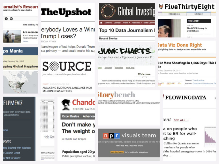
Improve Your Data Literacy: 16 Blogs to Follow in 2016
Top Ten #ddj: The Week’s Most Popular Data Journalism Links
Top Ten #ddj: The Week’s Most Popular Data Journalism Links

Top Ten #ddj: The Week’s Most Popular Data Journalism Links
Data Journalism Top 10: Social Distancing Interactive, Epidemic Modeling, Germany’s Low Death Rate, and Zuckerburg TikTok Video

Earthquakes, Floods, Vanishing Schools & Missing Kids: The Year’s Top Data Journalism from China

GIJN’s Data Journalism Top 10: Pollution in China, Visualizing Punctuation and the World Cup

GIJN’s Data Journalism Top 10: What to Ask Google, Gerrymandering California and Dwindling Doctors

This work is licensed under a Creative Commons Attribution-NoDerivatives 4.0 International License
Republish our articles for free, online or in print, under a Creative Commons license.
Republish this article
This work is licensed under a Creative Commons Attribution-NoDerivatives 4.0 International License
Read Next
Data Journalism
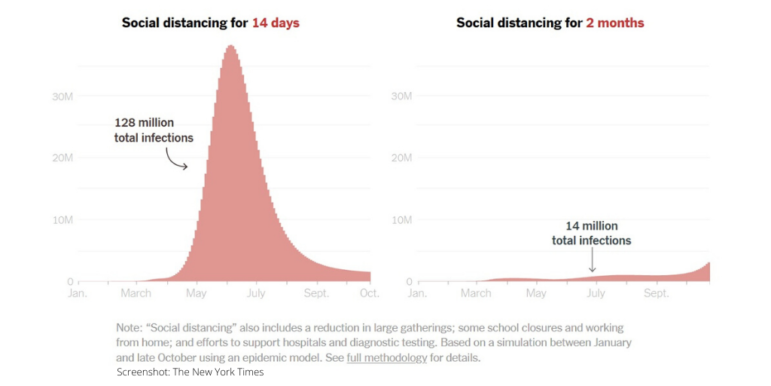
Data Journalism Top 10: Social Distancing Interactive, Epidemic Modeling, Germany’s Low Death Rate, and Zuckerburg TikTok Video
The coronavirus pandemic has resulted in the production of various interactives, charts, and simulations by data journalists and citizens around the world. This week’s NodeXL #ddj mapping from March 23 to 29 finds The New York Times explaining the dangers of ending social distancing measures by Easter, Germany’s Der Spiegel and Der Tagesspiegel measuring traffic levels and COVID-19 cases respectively, the Tampa Bay Times monitoring the situation in Florida, Kevin Simler making an interactive simulation to explain how general epidemics unfold, and Mona Chalabi creating a viral TikTok video on Mark Zuckerberg’s donation to advance coronavirus research.
Data Journalism
Earthquakes, Floods, Vanishing Schools & Missing Kids: The Year’s Top Data Journalism from China
GIJN invited data scientists and experts who have been focusing on data journalism in China for years to select the most noteworthy data news of 2018. Here’s what they told us.
Data Journalism
GIJN’s Data Journalism Top 10: Pollution in China, Visualizing Punctuation and the World Cup
What’s the global data journalism community tweeting about this week? Our NodeXL #ddj mapping from June 25 to July 1 finds @FinancialTimes’ timelapse map of pollution over China, @mcrosasb’s choice of five interesting World Cup 2018 visualizations and @Internews’ overview of its data journalism projects in developing country newsrooms.
Data Journalism
GIJN’s Data Journalism Top 10: What to Ask Google, Gerrymandering California and Dwindling Doctors
What’s the global data journalism community tweeting about this week? Our NodeXL #ddj mapping from June 18 to 25 finds a visual story about fixing household stuff by @xocasgv and @GoogleNewsInit, another about fixing political stuff by @Washingtonpost and @paulbradshaw on teaching data journalism.