Accessibility Settings

color options

monochrome muted color dark

reading tools

isolation ruler

Tag

open data

59 posts

Data Journalism

Data Journalism Top 10: Measuring Mask Use, Parental Interruptions, Childbirth Woes, India’s Low Death Rate

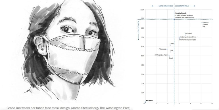
How widespread is mask use in your country? Our NodeXL #ddj mapping from July 13 to 19 finds The New York Times mapping the odds of people encountering other mask wearers in the United States, two university professors quantifying the number of interruptions a parent suffers on average every hour while working from home, the Committee to Protect Journalists talking to data journalists about the struggles of reporting on COVID-19, and openDemocracy documenting cases of mistreatment of women in labor around the world since the pandemic started.

Member Profiles

Powering Up Geo-Journalism for Investigative Environmental Reporting

The South African investigative site Oxpeckers uses a combination of data analysis, collaboration, and interactive data visualization tools to tell the most compelling stories about the land and those accused of damaging it. From mining to environmental crimes and wildlife trafficking, it has brought investigative techniques to beats like mining that were once the preserve of business reporters.

Reporting Tools & Tips

My Favorite Tools with Cuban Data Journalist Barbara Maseda

For our series about journalists’ favorite tools, we spoke with Barbara Maseda, the founder and editor of Proyecto Inventario, an open data platform for journalists reporting on her native Cuba. She told GIJN about the investigative tools she uses to overcome the difficulties of data reporting in and about Cuba.

Data Journalism

Data Journalism Top 10: Bill Gates Conspiracies, COVID-19 Excess Mortality, Home Deaths Spike, Test Kits

Misinformation has grown ubiquitous during the COVID-19 pandemic, so much so that World Health Organization Director-General Tedros Adhanom Ghebreyesus proclaimed: “We’re not just fighting an epidemic; we’re fighting an infodemic.” Microsoft co-founder Bill Gates has emerged as a favorite target of disinformation actors, according to The New York Times, that we discovered through our NodeXL #ddj mapping from April 13 to 19. We also found The Economist and ProPublica examining the true impact of the pandemic by looking into “excess mortalities” such as home deaths, the Associated Press releasing and updating a coronavirus public dataset for the United States.

Data Journalism

Data Journalism Top 10: Viral Dataviz, DIY Masks, Breaking the Wave, China and US Response to COVID

From “flattening the curve” to “social distancing,” and now “breaking the wave,” the global data journalism community is using new terminology in its attempts to explain the intricacies of COVID-19 to the masses. Our NodeXL #ddj mapping from April 6 to 12 finds Reuters Graphics explaining their “breaking the wave” chart, The Washington Post helping readers figure out the best material to use to make their own masks, the Financial Times comparing the response of China and the United States in handling the pandemic, and Press Gazette highlighting the huge appetite for data-driven visual journalism about COVID-19.

Data Journalism

GIJN’s Data Journalism Top 10: Women and the Oscars, February’s Sad Songs, Hollywood’s Franchises, Moscow’s Elite Owners

What’s the global data journalism community tweeting about this week? Our NodeXL #ddj mapping from February 3 to 9 finds UOL highlighting the lack of gender equality among Oscar winners and G1 looking into problems of ageism in the Best Actress category. This edition also has The Economist analyzing Spotify data to find the most depressing month for listeners, Proekt Media investigating property owners in a prestigious residential area in Russia, and The Financial Times spotlighting the lack of innovation in the movie industry.

Data Journalism

GIJN’s Data Journalism Top 10 for 2019: People Are The Story, Pirates vs. Princesses, Open Source Journalism, How Charts Lie, UN Votes

Throughout this year, we’ve brought you weekly “snapshots” of the Twitter conversation surrounding data journalism. But this week, we look at what the global data journalism community tweeted about the most during all of 2019. Below you’ll find links to stories from Brazil, Germany, Switzerland, the UK, the US, and elsewhere.

Data Journalism

GIJN’s Data Journalism Top 10: Visualizing Climate Change, Numbers from Phrases, Democratic Donors, Moscow Money

What’s the global data journalism community tweeting about this week? Our NodeXL #ddj mapping from July 29 to August 4 finds a number of articles related to the climate crisis, including the BBC’s piece on tree planting and its interactive tool on temperatures across the world, as well as Alberto Cairo’s blog post on misleading charts created by climate deniers. We also found useful tips and tools: a data GIF maker by Google News Initiative, Datajournalism.com’s strategies for teaching data journalism, and Paul Bradshaw’s tutorial on how to extract numeric data from phrases.

Data Journalism

GIJN’s Data Journalism Top 10: European Election, Data via Audio, Tax Fraud & Parserator

What’s the global data journalism community tweeting about this week? Our NodeXL #ddj mapping from May 27 to June 2 finds immense buzz around the recent European Parliament elections, with @SZ explaining the EU political landscape, @morgenpost looking at the results in Berlin, and @journocode collecting data journalism pieces related to the election. There’s also @datajournalism’s tips on presenting data through audio and @BIRNSrbija’s data investigation into major corporate tax fraud in Serbia.