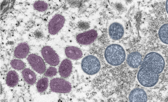
Accessibility Settings

color options

monochrome muted color dark

reading tools

isolation ruler

Tag

health reporting

35 posts

Data Journalism

Data Journalism Top 10: National Geographic Maps, Capitol Riots, Flu vs. Coronavirus, Happiness Index, Black Market Data

Scenes of supporters of outgoing President Donald Trump storming the US Capitol building dominated news headlines and filled social media feeds last week. Our NodeXL #ddj mapping from January 4 to 10 found Reuters producing a play-by-play summary of what happened, and FiveThirtyEight examining the stark difference in reaction by the authorities to the Capitol mob compared to Black Lives Matter protesters. Also in this edition, we feature National Geographic’s cartography archive, Data Crítica’s investigation into under-counting of Indigenous COVID-19 infections, and The Markup’s analysis of the impact of Facebook’s political ads.

Data Journalism

Data Journalism Top 10: Chocolate Box Audit, Vaccine Lineup, COVID-19 Antigen Testing, Scraping Is Not a Crime

As the United Kingdom begins its rollout of the first COVID-19 vaccine this week, the world is watching with bated breath. Our NodeXL #ddj mapping from November 30 to December 6 found Bloomberg tracking the development of nine of the most promising vaccines around the world, The New York Times creating an interactive for Americans to establish where they are in the line before they can get vaccinated, and Spain’s El Pais examining the advantages of using antigen testing for COVID-19 infections. Meanwhile, ITV News’ Stephen Hull did a fun data analysis of the assorted chocolates in a Quality Street tin.

Data Journalism

Data Journalism Top 10: Thanksgiving Dangers, Vaccine Tracker, Crosswords Diversity, Golf Swings, Facebook Fact-checks

Around the world, people are toning down their celebrations in a bid to mitigate spread of the coronavirus. The latest casualty: Thanksgiving. Our NodeXL #ddj mapping from November 16 to 22 found FiveThirtyEight’s timely piece explaining the risk of COVID-19 transmission from even small Thanksgiving dinner gatherings. Also popular: The New York Times tracking the status of all vaccine trials in progress, and The Pudding analysis of race and gender in crossword puzzles from five major US news publications.

GIJN Webinar — Investigating the Pandemic: Behind the COVID-19 Vaccine Race

GIJN’s webinar “Behind the COVID-19 Vaccine Race” is the second event to mark the publication of our new guide, “Investigating Health and Medicine.” In this webinar, we are pleased to present a noted physician specializing in vaccine development and an award-winning health journalist. Together, they will cut through the fog to show what red flags to look for both before and after a vaccine is approved.

Reporting Tools & Tips

GIJN Webinar — Investigating Health and Medicine: Strategies and Tips for Better Reporting

This GIJN webinar, “Investigating Health and Medicine,” open to everyone and free, is produced as part of the Misinformation in Medicine Summit, a two-day event convened by DataLEADS and hosted by the Google News Initiative as a part of the APAC Trusted Media Summit 2020. At the session, GIJN will also launch a major new reporting guide, “Investigating Health and Medicine.”

Data Journalism

Data Journalism Top 10: Animating COVID Masks, Mapping US Campaign Cash, Homeless Arrests, Berlin Protests

Research shows that masks are an essential defense against the coronavirus. Our NodeXL #ddj mapping from October 26 to November 1 finds The New York Times using animation and augmented reality to show just how masks work to filter and trap air particles that may carry the virus. This edition also includes several pieces on the United States presidential election: FiveThirtyEight founder Nate Silver talks to Vox about polling errors and uncertainties, freelance journalist Betsy Mason explains common shortcomings of US election maps, and NYT analyzed more than 25 million donations to Trump and Biden’s presidential campaigns.

Data Journalism

Data Journalism Top 10: A Stunning COVID Data Blunder, Beautiful News, Arctic Fires, Eviction Abuses, Isolating Students

The advancement of technology and availability of complex data tools has been a real boon to society, but utilizing the wrong tools for the job can have dire consequences. Our NodeXL #ddj mapping from October 5 to 11 finds British media organizations the BBC and the Guardian reporting on a blunder by the English national health authority: it used the wrong Excel file format to store data, resulting in the loss of thousands of COVID-19 test data results. Meanwhile, German television news program ZDF heute highlighted how the Arctic has reached record high temperatures this year, DCist and Spotlight DC examined problems in the process of evictions, and we find Information is Beautiful offering a daily feed of uplifting news among the gloom of 2020’s news cycle.

Data Journalism

Data Journalism Top 10: Black Voter Suppression, K-Pop, Data Privacy Rights, and Global Coronavirus Deaths

Personal data is big business, and not only for private firms. Our NodeXL #ddj mapping from September 21 to 27 finds a number of troubling investigations: Channel 4 News revealed that Donald Trump’s 2016 presidential campaign used personal data from Facebook and Cambridge Analytica to deter Black voters from casting their ballot; Consumer Reports found that companies were making it difficult for people to opt out of having their data sold despite a landmark California law that protects individual data rights; and Noteworthy and The Business Post highlighted a concerning lack of clear regulation surrounding access to, and use of, genetic and patient data by private firms.

New GIJN Online Series Starts September 2020

Since the start of the pandemic, GIJN has produced more than 40 free webinars in 7 languages designed for journalists covering the COVID-19 crisis. Come September, GIJN will expand its online offerings on a range of new topics, with continued coverage of the pandemic.