Accessibility Settings

color options

monochrome muted color dark

reading tools

isolation ruler

Tag

data literacy

12 posts

Data Journalism Reporting Tools & Tips

Interpreting Data: Tips to Make Sure You Know How to Read the Numbers

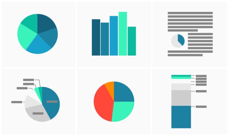
When using data for investigative stories, it is important to learn how to obtain and clean the information. But it is also vital that you interpret your findings correctly and extract the right conclusions from the numbers, filters, and spreadsheets. If you do the math correctly but fail to read the answers properly, you may end up misleading your audience.

Data Journalism

GIJN’s Data Journalism Top 10: Tarantino’s Swearing, TheyDrawIt Tool, Climate Crisis

What’s the global data journalism community tweeting about this week? Our NodeXL #ddj mapping from August 5 to 11 finds Spiegel Online analyzing the typical features in Quentin Tarantino’s films, MU Collective releasing an interactive “TheyDrawIt” tool to engage and educate readers, and the conversation on the climate crisis heating up — with 101 East Al Jazeera looking into Cambodia’s deforestation, Neue Zürcher Zeitung analyzing Switzerland’s forest fires, and the Financial Times digging into the impact of jet streams on the climate.

Data Journalism

GIJN’s Data Journalism Top 10: ICIJ’s Datashare, Visualization Talkies, Kyrgyzstan Labor

What’s the global data journalism community tweeting about this week? Our NodeXL #ddj mapping from February 4 to 10 finds exciting releases with a document analysis tool by @ICIJorg and an audio-driven visualization tool by @f_l_o_u_r_i_s_h, while @kloopnews highlights domestic labour imbalance in Kyrgyzstan and @davidottewell emphasizes that data journalism is not just for nerds in a corner.

Data Journalism

GIJN’s Data Journalism Top 10: Pirates vs. Princesses, Buenos Aires Crime, Awards & Fellowships

What’s the global data journalism community tweeting about this week? Our NodeXL #ddj mapping from January 7 to 13, 2019 finds @SZ’s analysis revealing how children’s books perpetuate gender stereotypes, @A24COM mapping the hottest crime spots and times in Buenos Aires, @dw_akademie offering a data journalism fellowship opportunity, and great chances to win awards from @WorldGovSummit and @GENinnovate’s Data Journalism Awards.

Data Journalism

GIJN’s Data Journalism Top 10: Forecasting Elections, Counting Fast Food, Kampala’s Swamp City, Gasping for Air

What’s the global data journalism community tweeting about this week? Our NodeXL #ddj mapping from October 22 to 28 finds @NateSilver538 talking about election forecasting, @BBCNews highlighting the prevalence of fast food outlets in the UK, @washingtonpost comparing how tough it is for Americans to vote by state, and @business and @HowWeGetToNext on battling for fresh air in India and Europe.

Data Journalism

GIJN’s Data Journalism Top 10: Egyptian Bots, Pocket Inequality, Loner Jobs and Knife Emergencies

What’s the global data journalism community tweeting about this week? Our NodeXL #ddj mapping from Aug 13 to 19 finds @puddingviz proving that women’s pockets are inferior to men’s once and for all, @vizzuality pondering the impact cartographers have on our understanding of the world by presenting nocturnal activity in daytime maps, @InfoTimes_ discovering the bots behind the political debate in Egypt and @hnrklndbrg’s visualizations on everything from loner jobs to knife emergency room visits.

Data Journalism

This Week’s Top 10 in Data Journalism

What’s the global data journalism community tweeting about this week? Our NodeXL #ddj mapping from February 26 to March 4 finds @morgenpost setting Germany’s poll data to music, @A_agadjanian showing Google Trends data on people’s general interest in gun control a week after deadly shootings in the US and @puntofisso rounding up an interesting list of #ddj and #opendata newsletters.

Data Journalism

This Week’s Top 10 in Data Journalism

What’s the global data journalism community tweeting about this week? Our NodeXL #ddj mapping from January 1 to 7 has data journalism and data visualization roundups by @ddjournalism and @flowingdata, podcasts by @datastories and @fabrider, as well as an analysis on prices corresponding with ski resort altitudes by @duc_qn.

Data Journalism

This Week’s Top Ten in Data Journalism

What’s the global data journalism community tweeting about this week? Our NodeXL #ddj mapping from October 9 to 15 has @RTSinfo looking into flight sharing platform @Wingly_UK, while @srfdata finds millions of fake @instagram followers, @jwyg charts the growth of all Internet sites, and @nytimes collaborates with @AmstatNews to promote critical thinking and data literacy.

Data Journalism

Top Ten Developments in Data Visualization This Year

Data visualization specialist Andy Kirk took a look at the most significant developments in the field so far this year and found the rise of the datagif, impressive work at the Hindustan Times and some beauties over at Periscopic. Here’s his top ten list in data visualization from January to June 2017.