Accessibility Settings

color options

monochrome muted color dark

reading tools

isolation ruler

Tag

Algorithm

7 posts

Data Journalism

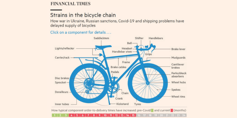
Data Journalism Top 10: Russia’s Achilles’ Heel, Baby Names, Bike Shortage, Dataviz Color Guide

Our weekly look at some of the most popular data journalism stories on Twitter examines the logistical Achilles’ heel of the Russian invasion, ongoing gaps in the sanctions of Russian oligarchs, Europe’s selective support for refugees, a historical analysis of Scottish baby names, and a deep dive into how organizations should choose their data visualization color palettes.

Satellite imagery of the Amazon forest

Investigative Techniques Reporting Tools & Tips

Journalists’ Guide to Using AI and Satellite Imagery for Storytelling

Satellite imagery provides information that can enhance the ability to write compelling narratives about the state of our planet, cutting across multiple beats. But such a tool tends to be complex and out of the reach for many journalists, so this guide offers a process that reporters interested in covering the climate crisis can use for story projects.

Data Journalism

Data Journalism Top 10: Tokyo Olympics, Sand Mining, Elder Care, Russia’s Forests, TikTok’s Algorithm

Our NodeXL mapping from July 19 to 25, which tracks the most popular data journalism stories on Twitter each week, found imaginative data-driven coverage of the Olympics by The Washington Post, The New York Times, and other major outlets. In this edition, we also feature a piece by Reuters Graphics on how a Chinese lake has been decimated by sand mining, a cross-border investigation into the billion Euro business of elder care, and a deep dive into TikTok’s secretive algorithm by The Wall Street Journal.

News & Analysis

What Investigative Journalism Will Look Like in 2020

GIJN asked investigative journalists around the world to look ahead at what’s in store for 2020. Here are the trends, key forces, and challenges they expect will affect investigative and data journalism in the coming year, as well as the new skills and approaches we should be thinking about.

Data Journalism

GIJN’s Data Journalism Top 10: Sad Tunes Algorithm, Fragapane’s Beautiful Dataviz, African Pay Gap, Euro-Xenophobia

What’s the global data journalism community tweeting about this week? Our NodeXL #ddj mapping from Sept 10 to 16 finds @miriamquick analyzing @Spotify data to rank the top five saddest songs, @Code4Africa creates a tool to measure gender pay gap in African countries, @fedfragapane shares beautiful illustrations on Instagram, #edjnet finds Italy, Turkey and Greece topping the list of Europe’s xenophobic countries, and @TaylorMirf highlights the low rates of immunizations in Washington state.

Data Journalism Methodology

Investigating Uber Surge Pricing: A Data Journalism Case Study

The story published in the Washington Post’s Wonkblog ended up being about race, but it didn’t start out that way. Nick Diakopoulos, who leads the lab, wrote for the Wonkblog last year with a story on how surge pricing motivates Uber drivers to move to those surging areas, but does not increase the number of drivers on the road as Uber claims.