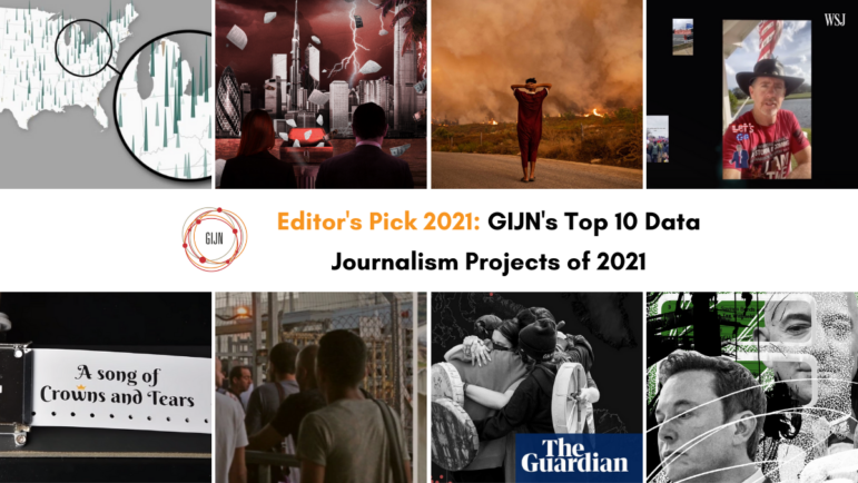
GIJN’s Top 10 Data Journalism Projects of 2021


 Vaccines and the ongoing effort to curb the spread of the coronavirus have sparked a number of debates around the world during the past 12 months. But global attention has also been captured by other important issues such as climate change, the impact of technology on civil society, conflict, and major investigations into offshore companies and tax evasion.
Throughout 2021, data journalism projects have covered these and many other topics, offering new perspectives and helping readers grasp complex matters through interactive storytelling.
Our weekly Top 10 in Data Journalism columns highlight the best data-driven stories, using NodeXL analysis of the most popular data stories on Twitter — and a healthy dose of human curation. To mark the end of the year, we have selected our top 10 projects of 2021, featuring the Pandora Papers, reports on climate change, a sonification of COVID-19, and more.
Pandora Papers
The Pandora Papers investigation — said to be the largest-ever journalistic collaboration — was led by the International Consortium of Investigative Journalists (ICIJ) and involved more than 600 journalists from 150 media outlets, many of them members of GIJN. Dubbed an “offshore data tsunami” by the team, the leaks include 6.4 million documents, millions of images and emails, and almost 500,000 spreadsheets. Here’s an explainer on the global effort and how it compares to previous leaks.
Climate Disaster
The UN climate talks at the COP26 summit in Scotland offered governments around the world a chance to work together to manage the global climate crisis. Ahead of the meeting in October, the Guardian published an interactive deep dive looking at how new weather patterns are already leading to heatwaves, floods, wildfires, crop failures, and other anomalies across the planet.
Mapping Palestinian-Israeli Conflict
The Palestinian-Israeli conflict made headlines once again after an outbreak of violence in May, which was then followed by a ceasefire. Al Jazeera published a series of maps and graphics to explain the history and “human cost” of a conflict that dates back to the 1940s and which has seen thousands of people, mostly Palestinians, killed and tens of thousands of people injured.
Inside TikTok’s Secretive Algorithm
If you are curious about how TikTok seems to know your most intimate thoughts, you’re not alone. Users on the social platform are consistently surprised by its ability to provide content perfectly tailored to their personalities. To investigate the platform’s algorithm, The Wall Street Journal created dozens of automated accounts. Reporters found that, for TikTok, the most important piece of information is the amount of time you spend watching a particular video.
Secret Tax Files
Some of the wealthiest businessmen on the planet, including Jeff Bezos and Elon Musk, have paid little to no federal income taxes in the United States in recent years, according to an investigation by ProPublica. Reporters obtained a vast cache of data from the Internal Revenue Service (IRS) on the tax returns of thousands of the richest people in the country, going back more than 15 years. The Secret IRS Files story quickly led to calls to rewrite the tax code but also raised privacy concerns.
The Sounds of COVID-19
Creative storytelling about the pandemic often relies on charts and graphics, but journalist Simon Huwiler took a different approach. Huwiler made a unique sound visualization of two COVID-19 waves in Switzerland using a music box and a four-meter (13 foot) punch card. Each hole punched into the card represents either a day of the pandemic, or a victim. You can listen to Huwiler’s entire “Song of Crowns and Tears” on YouTube.
Changing Patterns in Rainfall and Drought
The weather has become more extreme, causing flash floods, devastating wildfires, and other catastrophes. But the scale of this phenomenon is so enormous that many people struggle to comprehend its significance. Numbers help paint a clearer picture. A team of USA TODAY reporters examined 126 years of federal climate data to look for patterns and the reasons behind the changing weather, and then created a tool to look up variation in rainfall and drought based on US zip codes.
Hidden Deaths in Canada’s Residential Schools
Earlier this year, hundreds of unmarked graves were discovered at the sites of former residential schools in the Canadian provinces of Saskatchewan and British Columbia. The bodies belonged to Indigenous children, sent to the schools as part of a decades-long program to eradicate their native culture and languages. The Guardian analyzed data on residential schools, Indigenous land claims, and historical treaties, creating an interactive map to dive deeper into this issue and to shed light on a shameful chapter of Canadian history.
Chinese Propaganda Campaign
Thousands of videos circulating on social media show members of the Uighur community in Xinjiang defending the Chinese Communist Party, even as international condemnation of the country’s mistreatment of the Uighurs grows. The videos are meant to look like genuine accounts. But an investigation by ProPublica and The New York Times, in which reporters analyzed more than 3,000 videos, found evidence of an influence campaign orchestrated by the Chinese government.
Data Journalism Handbook: 2nd Edition
Finally, 2021 also saw the release of the second volume of “The Data Journalism Handbook.” The book includes 54 chapters from 74 leading practitioners of data journalism, including GIJN’s own Eunice Au, who, with Connected Action’s Marc Smith, co-authored a short history of the #ddj hashtag (and this column). The book also examines data infrastructure, and the production of data stories in newsrooms, media organizations, startups, and civil society groups.
Thanks again to Marc Smith and Harald Meier of Connected Action for gathering the links and graphing them. The Top Ten #ddj list returns in January 2022.
 Peter Georgiev is GIJN’s social media and engagement editor. Previously, he was part of NBC News’ investigative unit in New York. He also worked as a correspondent for Bulgarian National Television and his reporting has been published by the Guardian, Deutsche Welle, and other international outlets.
 Eunice Au is GIJN’s program manager. Previously, she was a Malaysia correspondent for Singapore’s The Straits Times, and a journalist at the New Straits Times. She has also written for The Sun, Malaysian Today, and Madam Chair.

This work is licensed under a Creative Commons Attribution-NoDerivatives 4.0 International License
Republish our articles for free, online or in print, under a Creative Commons license.
Republish this article
This work is licensed under a Creative Commons Attribution-NoDerivatives 4.0 International License
Read Next

Data Journalism News & Analysis
From Space to Story in Data Journalism
Over the past 10 years satellite imagery has become an important component of data journalism. In the next 10, it will likely evolve further, from a tool used primarily for illustrating stories to an integral part of research and investigative reporting.

Data Journalism
10 Outstanding Data Projects Win the 2024 Sigma Awards
There were 52 data journalism entries from 22 countries in shortlist for the 2024 Sigma Awards. Here are the top 10 winning projects.

Tipsheet Data Journalism Reporting Tools & Tips
Tipsheet for Using Ocean Data in Your Investigations
Investigations into what happens on, under, and around the ocean can often be answered thanks to the vast amount of data available online.

Data Journalism Reporting Tools & Tips
Best Practices for Working With Mass Shootings Data
There can be confusion among journalists about “mass shootings” data, which leads to wildly different numbers and deeper confusion among audiences.