GIJN’s Data Journalism Top 10: Sad Tunes Algorithm, Fragapane’s Beautiful Dataviz, African Pay Gap, Euro-Xenophobia


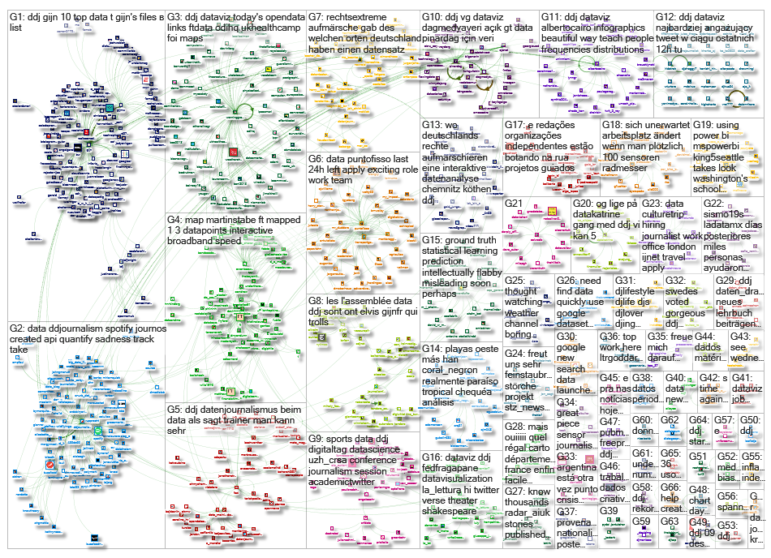
What’s the global data journalism community tweeting about this week? Our NodeXL #ddj mapping from Sept 10 to 16 finds @miriamquick analyzing @Spotify data to rank the top five saddest songs, @Code4Africa creates a tool to measure gender pay gap in African countries, @fedfragapane shares beautiful illustrations on Instagram, #edjnet finds Italy, Turkey and Greece topping the list of Europe’s xenophobic countries, and @TaylorMirf highlights the low rates of immunizations in Washington state.
Saddest Songs on Spotify
Spotify built an algorithm that aims to quantify the amount of sadness in a music track. Data journalists poring over the data have developed interesting stories — a ‘gloom index’ of Radiohead songs, the most depressing Christmas song, and which European countries prefer sad songs. Data journalist Miriam Quick did her own analysis to find the saddest pop songs to top the charts.
Gender Pay Gap Tool
GenderGap.AFRICA is a tool designed by Code for Africa to help users calculate the average gender pay gap in any African country. It uses estimated earned income data from the World Economic Forum’s Global Gender Gap Report 2017.
Beautiful Visualizations
Award winning information and visual designer Federica Fragapane’s instagram account is a thing of beauty. It is full of her beautiful illustrations and data visualizations.
Community Immunization in Washington
A KING 5 analysis of school-reported data revealed that a majority of schools in Washington are failing to meet the state’s target rates for vaccinations. Nearly half of the 1,425 schools have immunization completion rates that were too low to effectively prevent the spread of whooping cough, and hundreds fell below the herd immunity levels for other diseases, too, like measles and rubella.
Mapping 1.3 Million Data Points
David Blood and Ændrew Rininsland describe how Financial Times mapped 1.3 million postcode-level datapoints using Mapbox and overcame several limitations to make an interactive broadband speed map.
https://twitter.com/jdoneill/status/1040377418744098816
Algorithm Course
Computational journalist Jonathan Stray posted a course on algorithms used in journalism, for beginning Python programmers, on Github. There are seven weeks of material from 13 classes. Dig in!
Xenophobia
OBC Transeuropa analyzed the evolution of European nations’ attitude towards foreigners from 2009 to 2015. On average, the most negative opinions on the presence of foreigners were recorded in Italy, Turkey and Greece. (In French)
Right-Wing Rallies in Germany
Berliner Morgenpost’s interactive map shows where right-wing extremists have marched in the streets since July 2013. Most right-wing demonstrations have taken place in Thuringia over the past five years, with a total of 323 demonstrations and 51,662 participants. In contrast, the north of Germany has remained largely immune to such demonstrations. (In German)
Elvis Visualization Tool
Elvis is a tool to help journalists visualize raw and dirty public spending data. You can also explore relationships between government and companies. It is still in beta so they welcome feedback.
Turkish Open Science Summit
The Turkish Open Science Summit was broadcast live on the Sabanci University Facebook site. Speakers included Ilkay Holt, Prof. Dr. Şebnem Burnaz, Prof. Dr. Şirin Tekinay, Oguzhan Öztürk and İsmail Gülle. (In Turkish)
Thanks, once again, to Marc Smith of Connected Action for gathering the links and graphing them.
 Eunice Au is GIJN’s program coordinator. Previously, she was a Malaysia correspondent for Singapore’s The Straits Times, and a journalist at the New Straits Times. She has also written for The Sun, Malaysian Today and Madam Chair.
For a look at Marc Smith’s mapping on #ddj on Twitter, check out this map.

This work is licensed under a Creative Commons Attribution-NoDerivatives 4.0 International License
Republish our articles for free, online or in print, under a Creative Commons license.
Republish this article
This work is licensed under a Creative Commons Attribution-NoDerivatives 4.0 International License
Read Next

Data Journalism News & Analysis
From Space to Story in Data Journalism
Over the past 10 years satellite imagery has become an important component of data journalism. In the next 10, it will likely evolve further, from a tool used primarily for illustrating stories to an integral part of research and investigative reporting.

Data Journalism
10 Outstanding Data Projects Win the 2024 Sigma Awards
There were 52 data journalism entries from 22 countries in shortlist for the 2024 Sigma Awards. Here are the top 10 winning projects.
Data Journalism Methodology
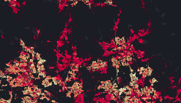
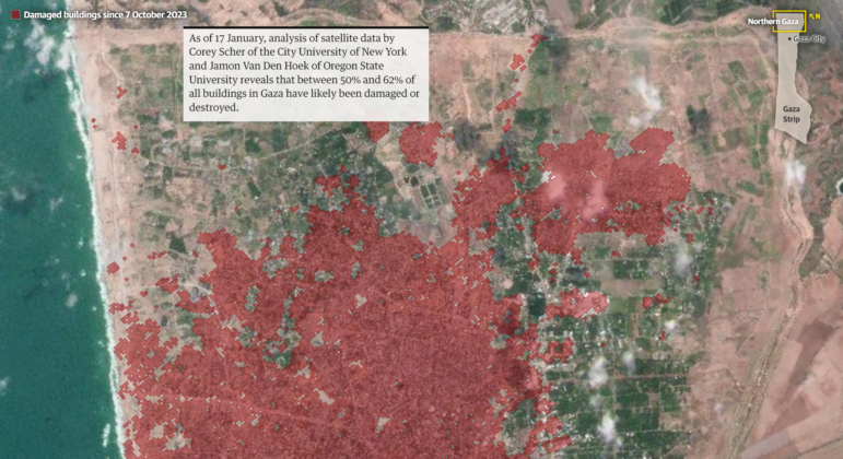
Mapping Conflict: Using Satellite Radar Data to Track the War Damage in Gaza
Gaza’s urban landscape has changed profoundly since the start of Israel’s military campaign. Researchers Jamon Van Den Hoek and Corey Scher have been mapping the impact.

Data Journalism Data Journalism Top 10
Trump’s Disappearing Donors, Tracking the Mars Rover, and the Ongoing Wars in Gaza and Ukraine
Our column of the best in data journalism also features stories on AI’s ability to forecast the weather, analyzing the Argentine president’s Tweetstorms, and apathetic EU voters.