
Data Journalism’s Top Ten


What’s the global data journalism community tweeting about this week? Our NodeXL #ddj mapping from August 14 to 20 has @Forbes mapping six years of American television news, the looming Kantar @infobeautyaward‘s submission deadline and @sarahslo‘s list of women in the field of data visualization.
Mapping Six Years of American Television News
Forbes mapped six years of American television news, and it is clear that the coverage heavily emphasized Russia, China and the Middle East. Central Africa is poorly represented, as is Central Asia, while Eastern Europe, Latin America, Northern Africa and South Asia are also relatively sparsely discussed.
Which countries get the most mentions on American TV news (2009-2016)? https://t.co/kflvi2KFMD #ddj via @kalevleetaru pic.twitter.com/c9OXcU4kOc
— Max Galka (@galka_max) August 16, 2017
Data is Not Beautiful
Stephen Few argues that data visualization creators should not squander the potential of informing with data. He says: “Many data visualizations that are labeled “beautiful” are anything but. Instead, they pander to the base interests of those who seek superficial, effortless pleasure rather than understanding.”
How do humans respond to #data? “We can do this, in part, both through #datavisualization and data art.” https://t.co/SyeEnv9zbm pic.twitter.com/bMKgPCeW0I
— George Danner (@ScienceProfits) August 21, 2017
Kantar Information is Beautiful Awards
Submit your entries by Friday 15 September, 11:59pm PST. The awards are open to infographics, data visualizations, data journalism, maps, interactives, information art/design and any data-centric video, animation, app, site or even artwork and sculpture. But it must be based on data/information with some sort of visual component.
You can now submit your work to the @infobeautyaward: https://t.co/o8Ur0Mfjq0 #dataviz #infographics #ddj pic.twitter.com/fE4SAqBj65
— Alberto Cairo (@albertocairo) August 15, 2017
Women in Dataviz
Quartz Things editor Sarah Slobin compiled a public Twitter list of women working with and creating data visualizations. The list now stands at 207 women, including @FiveThirtyEight‘s Ella Koeze, @GuardianUS‘s Mona Chalabi and @politico‘s Sarah E. Frostenson.
181 member as of this morning https://t.co/8Qe61ohX7x Women in DataViz pic.twitter.com/NriPrmhjAP
— sarah slobin (@sarahslo) August 19, 2017
Data Resources
Looking for data on who owns a company, government spending or political influence? Journalism.co.uk has compiled a list of 18 useful data platforms and resources to help you get started, including OCCRP’s Investigative Dashboard and NICAR’s data library.
Ever wonder where to begin your story? 18 data sources for investigative journalists @journalismnews #journalism https://t.co/jSXFfM1dXJ
— Storybench (@storybench) August 16, 2017
Interactive: India-Pakistan Partition Borders
In July 1947, Sir Cyril Radcliffe, a British lawyer, was commissioned to draw the borders that would divide British India into two countries — Muslim-majority Pakistan and Hindu-majority India. Al Jazeera created this interactive for you to draw lines on the map based on how you think Radcliffe drew the borders.
Draw lines on this interactive map to see how the India-Pakistan partition borders were demarcated https://t.co/3H5yB6t47I #PartitionAt70 pic.twitter.com/uB3VUJNC0s
— Al Jazeera English (@AJEnglish) August 18, 2017
German Election 2017
Tagesspiegel prepared data on all key candidates for the upcoming German election this year. Filter them by party, sex or age, or look for candidates according to postal code.
Die @tagesspiegel KandiDATENbank. #btw17 Kandidierende schon heute entdecken. Wer tritt für Ihren Ort an? https://t.co/B7G2I5OZXw #ddj pic.twitter.com/eIl07KTfB5
— Severin (@se_verin) August 11, 2017
International Congress of Visual Communication
The first InfoVis congress, dedicated to infographics and visualization, will be held on October 30 and 31 in Mexico City. Speakers include @PostGraphics‘ Kat Downs Mulder, @NatGeo‘s Kaitlin Yarnall and @LaVanguardia‘s Jaime Serra.
This @INFOVIS_ conference in Mexico DF is looking good: https://t.co/a0pPhbcsms #dataviz #infographics #ddj #dataJournalism pic.twitter.com/AieZwdteSK
— Alberto Cairo (@albertocairo) August 20, 2017
A Typical #ddj Workflow in R
Berliner Morgenpost‘s data trainee Marie-Louise Timcke wrote a tutorial describing the process for each new data-driven project at the Morgenpost, from loading the packages and data, to cleaning, preprocessing and analysis.
This is how we do #ddj in #rstats at @morgenpost‘s Interactive Team https://t.co/Q5OuHCre3b pic.twitter.com/fpgiwImMVL
— journocode (@journocode) August 16, 2017
Resources for Data Journalism with R
SRF Data’s Timo Grossenbacher compiled a guide through the thick jungle of countless R packages to help you to do all sorts of data-driven journalism.
Great #ddj resources curated by @grssnbchr ???:
“.Rddj – Resources for doing data journalism w/ R” https://t.co/Pda0xs5qSE #rstats #SoDS17 pic.twitter.com/IY31ieVbZt— Mara Averick (@dataandme) August 16, 2017
Thanks, once again, to Marc Smith of Connected Action for gathering the links and graphing them.
For a look at Marc Smith’s mapping on #ddj on Twitter, check out this map.


This work is licensed under a Creative Commons Attribution-NoDerivatives 4.0 International License
Republish our articles for free, online or in print, under a Creative Commons license.
Republish this article
This work is licensed under a Creative Commons Attribution-NoDerivatives 4.0 International License
Read Next

Data Journalism News & Analysis
From Space to Story in Data Journalism
Over the past 10 years satellite imagery has become an important component of data journalism. In the next 10, it will likely evolve further, from a tool used primarily for illustrating stories to an integral part of research and investigative reporting.

Data Journalism
10 Outstanding Data Projects Win the 2024 Sigma Awards
There were 52 data journalism entries from 22 countries in shortlist for the 2024 Sigma Awards. Here are the top 10 winning projects.
Data Journalism Methodology
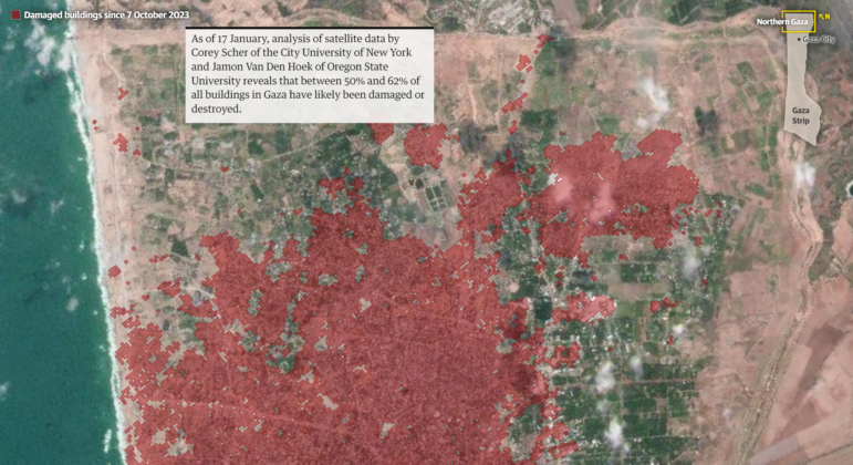
Mapping Conflict: Using Satellite Radar Data to Track the War Damage in Gaza
Gaza’s urban landscape has changed profoundly since the start of Israel’s military campaign. Researchers Jamon Van Den Hoek and Corey Scher have been mapping the impact.

Data Journalism Data Journalism Top 10
Trump’s Disappearing Donors, Tracking the Mars Rover, and the Ongoing Wars in Gaza and Ukraine
Our column of the best in data journalism also features stories on AI’s ability to forecast the weather, analyzing the Argentine president’s Tweetstorms, and apathetic EU voters.