
Data Journalism’s Top Ten
 What’s the global data journalism community tweeting about this week? Our NodeXL #ddj mapping from July 31 to August 6 has @nytimes charting increasingly hot summers, @qz on Wannacry ransomware hackers cashing out their ill-gotten gains, and @tagesanzeiger mapping lightning prone areas in Switzerland.
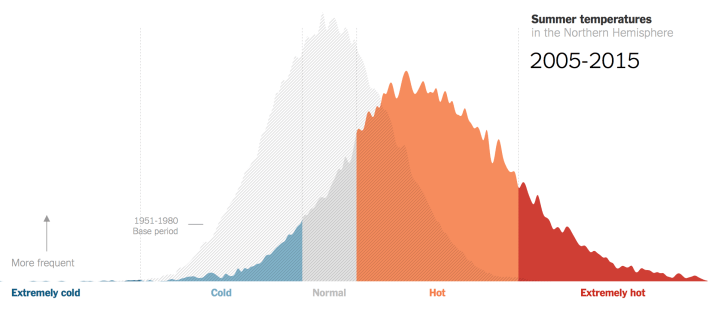
Hot, Hotter, Extremely Hot
Climate scientist James Hansen and his team looked at summer temperatures over several decades. They found that summer temps have shifted drastically since 1980, with a new category — extremely hot — created.
Hotter and hotter summers, extremely hot https://t.co/MYQ3QEGr3E pic.twitter.com/76wZhVeA24
— Paul Banks (@PaulBanks84) August 1, 2017
WannaCry Hackers Cash Out
The WannaCry ransomware attack infected computers across the globe, encrypting their files and charging their owners $300 to $600 for the keys to get them back. In total, the hackers made about $140,000 in bitcoin from the operation. Last week, after 12 weeks of dormancy, a Twitter bot set up by Quartz to monitor the accounts found that the hackers cashed out the entire sum in six withdrawals.
What’s next? #WannaCry update: The #hackers behind #ransomware attack finally cashed out about $140,000 in bitcoin https://t.co/6CjnOx9Ezh
— Black Duck Software (@black_duck_sw) August 6, 2017
Swiss Lightning
Tages-Anzeiger‘s interactive map shows which municipalities in Switzerland experienced above-average lightning strikes from 2005 to 2016.
Lightnings in Switzerland over eleven years brought down to a simple #heatmap ? https://t.co/ZEWm87zIeI @TA_Interaktiv #ddj #heatmap #meteo pic.twitter.com/IX9Xpinvy0
— Marc Fehr (@mrcfhr) August 5, 2017
Visualizing U.S. State Dept. Briefings
Using the U.S. State Department’s web archives, The New York Times created a calendar of daily press briefings spanning five presidential administrations. It shows that the press briefings are at their most infrequent levels in decades under President Donald Trump and his secretary of state, Rex Tillerson.
Nice way to visualize the lack of press briefings done by the Trump administration. https://t.co/5JWEHAbUP5 #ddj #dataviz pic.twitter.com/nXBnP5sDGe
— Sascha Venohr (@venohr) August 2, 2017
Tips for Communicating Complexity
We encounter complex systems every day that we find difficult to comprehend. Erica Gunn shares some tips for communicating complexity, including making the abstract tangible and connecting it to people’s lives.
Tips for communicating complexity: Make the abstract tangible & connect to people’s lives https://t.co/OPyp6dMB25 #ddj #dataviz @storybench pic.twitter.com/H3vWuE73ID
— Stephanie Neal (@StephanieJNeal) August 1, 2017
The Case for Country-by-Country Reporting
In 2011, an investigation into the tax affairs of several UK multinationals and banks showed how Barclays Bank had made a prolific use of tax havens. The public scrutiny resulted in Barclays liquidating many of its subsidiaries in tax havens. Transparency International stressed that this demonstrates that public country-by-country reporting has a strong deterrent function.
Great preliminary work from @TI_EU looking at Barclays’ use of tax havens: https://t.co/HWtTCNjKeZ #ddj #opendata pic.twitter.com/75nhDXrjxc
— Jonathan Gray (@jwyg) August 3, 2017
Global State of Data Journalism
The first insights are out from the Global Data Journalism Survey conducted by Bahareh R. Heravi and Mirko Lorenz, which saw 206 participants from 43 countries take part. Ninety percent of respondents agreed somewhat (21 percent) or strongly agreed (69 percent) that data journalism adds rigor to journalism, with only 5 percent expressing the opposite.
Here I have written a short post on initial insights into the Global Data Journalism survey https://t.co/biwrVsxZRb. #ddj #datajournalism pic.twitter.com/lHDgzgUn9x
— Bahareh R. Heravi (@Bahareh360) August 1, 2017
Highcharts: A Charting Tool
Journalists can create beautiful, engaging charts in a short period of time with Highcharts. It has been used by The Telegraph, ESPN, the World Health Organization and Al Jazeera, among others.
Want to create charts like this one from @espn? Try @Highcharts: https://t.co/OY6VXoYtkD @ejcnet #ddj #dataviz #journo pic.twitter.com/lfVQpt5wGP
— DataDrivenJournalism (@ddjournalism) August 3, 2017
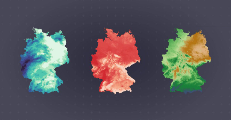
Mini-Jobs in Germany
More than 7.5 million people in Germany are mini-jobbers — workers who are typically low-wage contractors without benefits. In this interactive map, Correctiv shows in which regions these jobs are particularly widespread and who is doing these jobs.
nice german #ddj on mini-jobs by @correctiv, I especially like the map’s #ux ^mlt https://t.co/KpdeXhomld pic.twitter.com/bAJuPfII0Y
— journocode (@journocode) August 1, 2017
Data Journalism Handbook
The Data Journalism Handbook, by now downloaded over 150,000 times, offers readers an overview of the ever-evolving field of data journalism. A new second edition is being produced by the European Journalism Centre, in partnership with Google News Lab, and will be available in four languages in 2018.
The Data Journalism Handbook https://t.co/uTWvEgrMR2 pic.twitter.com/WaTu8vjTv0
— Boris Loukanov (@az_sum) August 1, 2017
Thanks, once again, to Marc Smith of Connected Action for gathering the links and graphing them.
For a look at Marc Smith’s mapping on #ddj on Twitter, check out this map.

Document of the Day: Visual Vocabulary

Tipsheet: Latest Tools for Investigating with Telegram

Investigating Elections: Threat from AI Audio Deepfakes

Updated GIJN Databases (Poverty, Crime, Corruption, and Terrorism)

4 Things Data Journalists Need to Know about Standard Deviation
Data Journalism Top 10: Gun Violence, Xinjiang Police Files, Therapy Wait Times, Russian War Looting
Why Dynamic Data Visualization Is Key to Covering Climate Change
Data Journalism Top 10: Climate Disasters, Olympic Running, Russian Healthcare, and Bulgarian Coal Plants

This work is licensed under a Creative Commons Attribution-NoDerivatives 4.0 International License
Republish our articles for free, online or in print, under a Creative Commons license.
Republish this article
This work is licensed under a Creative Commons Attribution-NoDerivatives 4.0 International License
Read Next
Data Journalism
4 Things Data Journalists Need to Know about Standard Deviation
Data journalists often encounter the term “standard deviation” when reading research, from climate change studies to social science papers. This tipsheet explains how researchers use this measure, and how reporters can benefit from the context it provides.
Data Journalism News & Analysis
Data Journalism Top 10: Gun Violence, Xinjiang Police Files, Therapy Wait Times, Russian War Looting
This week’s Top 10 in Data Journalism column looks at schools shootings in the US, the faces from China’s Uyghur detention camps, heat records in the US, migrants at the Polish-Belarus border, the parcels sent by the Russian troops back home or the suicide toll in European jails.
Data Journalism
Why Dynamic Data Visualization Is Key to Covering Climate Change
As calls for change grow louder in light of the latest IPCC (Intergovernmental Panel on Climate Change) report and in the run up to COP26 conference in Glasgow this November, it’s time to focus on how data visualization can help people grasp the challenges that lie ahead.
Data Journalism
Data Journalism Top 10: Climate Disasters, Olympic Running, Russian Healthcare, and Bulgarian Coal Plants
Our weekly project that maps the most popular data journalism stories on Twitter found several environmental projects this week, including a climate disaster in Germany, air pollution in South Asia, and deforestation in Brazil. We also feature more data-driven coverage of the Tokyo Olympics, an investigation into Bulgarian coal plants, and a guide to creating appealing data visualizations based on simple charts.