Data Journalism’s Top Ten
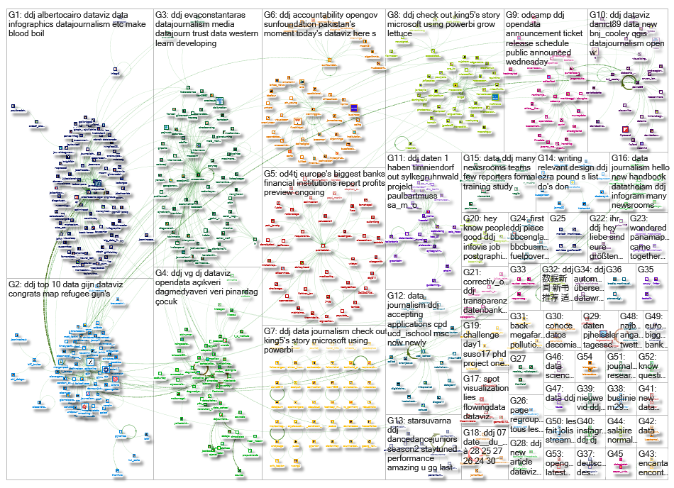
What’s the global data journalism community tweeting about this week? Our NodeXL #ddj mapping from July 24 to 30 has @qz comparing the cost of Trump’s golf trips to transgender healthcare, @visualisingdata sharing a chart-making directory and graphics guru @EdwardTufte applying Ezra Pound’s 23 “don’ts” for writing poetry to design.
Trump’s Golf Trips vs. Trans-Soldier Healthcare
Quartz pointed out a flaw in the conservative argument that letting transgenders serve in the military was a tremendous medical cost burden and disruption. It highlighted that Trumps’s six months of Mar-a-Lago trips is likely to cost more than a year of U.S. military transgender health care.
Cost of trips to Mar-a-Lago & Bedminster golf course: estimated $29m
Trans troops’ healthcare: $2.4m – $8.4m https://t.co/pHYOH1El9a
— ProPublica (@ProPublica) July 27, 2017
Data Literacy Activity Matrix
Staff at the School of Data realized their expectations of — and the actual value of — data literacy events were mismatched. They came up with a matrix that shows the benefits of each short term or long term activity.
Rethinking #dataliteracy: how useful is your 2-day training? . @SchoolOfData https://t.co/F8zQyfbvsC #ddj #vg #dj #dataviz #research pic.twitter.com/KMp3poaX5K
— Pınar DağⓋ (@pinardag) July 29, 2017
The Chartmaker Directory
Which tool do you need to make that chart? Andy Kirk answers that question in his directory. It’s Kirk’s attempt to gather a catalog of references of what charts can be made using which tools and, where necessary, how.
If you missed it yesterday, THE CHARTMAKER DIRECTORY was released https://t.co/zCyf0ALKMv & here’s the launch post https://t.co/iRFbdJV4nv pic.twitter.com/tQbguwvTFM
— Andy Kirk (@visualisingdata) July 26, 2017
All-in-One: Writer, Coder, Designer
Digital journalist Benjamin Cooley shares tips and the lessons he learned from writing, coding and designing his own longform data-driven feature story.
From @bnj_cooley, fascinating account from my perspective of teacher assessing students on this!https://t.co/woR8HeJh6Y
— Basile Simon (@basilesimon) July 31, 2017
Digging into Data Journalism
The Associated Press recently updated its AP Stylebook with a new data journalism chapter. Interactive Newsroom Technology editor Troy Thibodeaux explains how data journalism has evolved and why data skills are essential for every reporter.
Digging into data journalism. Q&A with @AP Interactive Newsroom Technology Editor @tthibo on our blog: https://t.co/6NpXVK9nDc
— AP CorpComm (@AP_CorpComm) June 26, 2017
Q&A on Dataviz
ProPublica’s Lena Groeger shares her favorite data visualization challenges and her data toolkit. This Q&A by Columbia Journalism Review is the second of a series of interviews with visual journalists who write code and work with data.
Another excellent interview by @jonkeegan: @ProPublica‘s @lenagroeger https://t.co/Q6z3cF9LPm #dataviz #infographics #ddj pic.twitter.com/9b9SkzqCMQ
— Alberto Cairo (@albertocairo) July 24, 2017
Using Data to (Re)build Trust in Media
Data journalist Eva Constantaras writes on data journalism as a powerful force in developing countries — by revealing inequalities in health, education and justice journalists can not only inform citizens but also rebuild trust in the media.
Western #datajournalism missed chance to restore faith in media. What we can learn from #ddj in developing countries https://t.co/LMKYv7rBDe pic.twitter.com/L8tJeOxjj8
— Eva Constantaras (@EvaConstantaras) July 28, 2017
What Is Quality Open Data?
Data Journalism Turkey (Veri Gazeteciliği Türkiye) lists seven key characteristics of good quality open data — including consistency and having a policy.
İyi Kalite Açık Veri Nedir? #açıkveri #opendata #vg #dj #ddj #dataviz #gooddata https://t.co/SGcQ3py7VG pic.twitter.com/T67y28J788
— Veri Gazeteciliği TR (@DagmedyaVeri) July 28, 2017
Ezra Pound’s “Don’ts” For Writing Poetry
Does Ezra Pound’s list of 23 “don’ts” for writing poetry relate to design thinking? Graphics guru Edward Tufte thinks so. The rules state that each verse should be lean and purposeful, with no frills or filler to provide padding.
A+
relevant to #writing #design #ddj Ezra Pound’s List “Do’s” + “Don’ts” For Writing #Poetry https://t.co/WInTl8X9Sj #designthinking— Edward Tufte (@EdwardTufte) July 23, 2017
Digital Humanities + Data Journalism
This symposium at the University of Miami, held from September 14-16, 2017, will see plenty of lectures and tutorials about shared data types, visualization methods and data communication. There will also be opportunities for casual conversation and networking.
Designing the print program for #digitalHumanities+#dataJournalism #ddj Symposium (https://t.co/0R8f4jd5aw) So many great speakers! pic.twitter.com/NpRfyoU8hX
— Alberto Cairo (@albertocairo) July 27, 2017
Thanks, once again, to Marc Smith of Connected Action for gathering the links and graphing them.
For a look at Marc Smith’s mapping on #ddj on Twitter, check out this map.
Improve Your Data Literacy: 16 Blogs to Follow in 2016
A Call for Debate: Taking Open Data and Government to the Next Level

Tipsheet: Latest Tools for Investigating with Telegram

Investigating Elections: Threat from AI Audio Deepfakes
Data Journalism Top 10: US Anti-Trans Bills, Russia’s Convict-Conscripts, French Same-Sex Marriages, and Less Snowy Alps
Data Journalism Top 10: Bitcoin’s Energy Impact, LGBTQ Rights in Africa, Pensions & Lattes, Taylor Swift’s Big Tour
Data Journalism Top 10: A Year of War in Ukraine, Russian Casualties, Trans Identities, Unexpected NBA Performances
Data Journalism Top 10: China’s Fishing Fleet, Queer Cinema, Hurricane Ian, Iran Protests

This work is licensed under a Creative Commons Attribution-NoDerivatives 4.0 International License
Republish our articles for free, online or in print, under a Creative Commons license.
Republish this article
This work is licensed under a Creative Commons Attribution-NoDerivatives 4.0 International License
Read Next
Data Journalism Data Journalism Top 10
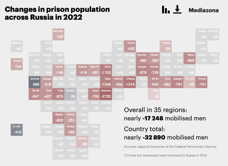
Data Journalism Top 10: US Anti-Trans Bills, Russia’s Convict-Conscripts, French Same-Sex Marriages, and Less Snowy Alps
This week’s data journalism roundup digs into the wave of legislation across the US targeting trans rights, Russia’s prison-to-front lines pipeline, French same-sex marriages 10 years after legalization, and the dearth of snow across the Alps this past winter.
Data Journalism Data Journalism Top 10
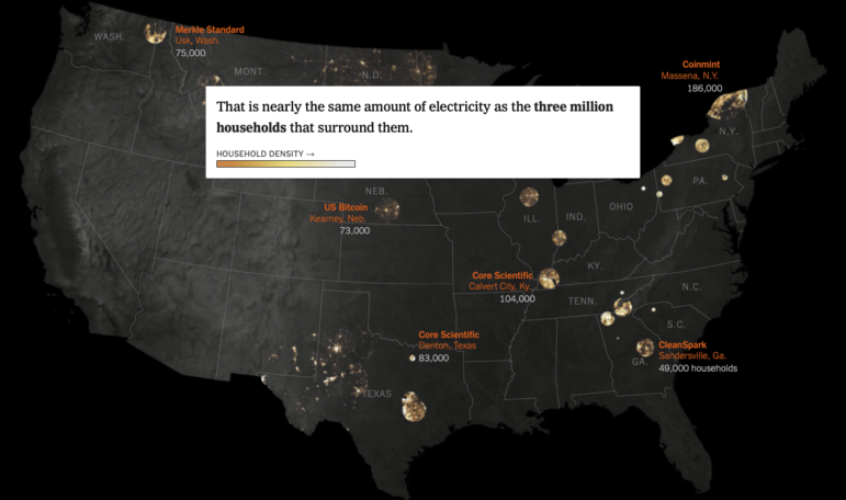
Data Journalism Top 10: Bitcoin’s Energy Impact, LGBTQ Rights in Africa, Pensions & Lattes, Taylor Swift’s Big Tour
This week’s data journalism roundup highlights a New York Times investigation into the energy and environmental impacts of bitcoin mining, Reuters’ look at anti-homosexuality laws across the African continent, mapping of Switzerland’s residential density, and a visualization of Lionel Messi’s decorated football career.
Data Journalism Data Journalism Top 10
Data Journalism Top 10: A Year of War in Ukraine, Russian Casualties, Trans Identities, Unexpected NBA Performances
GIJN’s weekly look at the best in data journalism examines one year of war in Ukraine, Russian casualty totals, trans coverage in the French media, and the most unexpected performances in NBA history.
Data Journalism
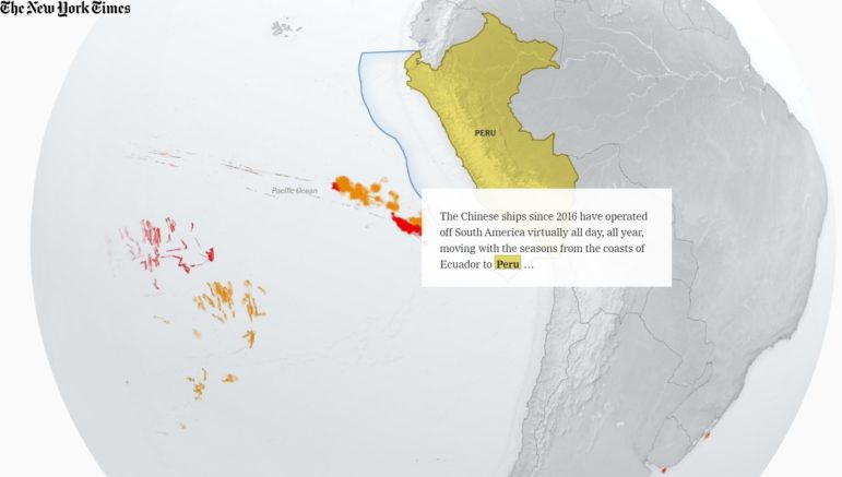
Data Journalism Top 10: China’s Fishing Fleet, Queer Cinema, Hurricane Ian, Iran Protests
China’s global fishing operation is prompting concerns about overfishing and destruction of marine life and ecosystems and The New York Times mapped its global reach. Our weekly NodeXL and human curation of the most popular data journalism stories on Twitter also highlights the queer cinema history in the Southeast Asian region, charted Hurricane Ian’s destructive path through the US, Iran’s protests for womens’ rights, and the social housing issues in Canada.