
Top Ten #DDJ: This Week’s Top Data Journalism


What’s the global #ddj community tweeting about? Our NodeXL mapping from July 3 to July 9 has @paulbradshaw with his top picks for data journalism stories for audio, @br_data and @BR_Recherche with a podcast on the tax haven of Madeira, and @EngnRoom with an introductory guide to investigative web research.
Let’s Hear It for Data Journalism
Paul Bradshaw from Birmingham City University lines up his greatest hits for data journalism on audio and radio from his MA in Data Journalism.
#DataJournalism on radio, audio and podcasts https://t.co/rFmS4vTu2M by @paulbradshaw pic.twitter.com/6vCZ3RxKPQ
— BW Intl Media (@BWIntlMedia) July 6, 2017
Money Island
The podcast Money Island explores the remote Atlantic island of Madeira, a tax haven. It’s a project of BR Data and BR Recherche .
#ddj at its best https://t.co/WzYHoY8PL0 tax havens in the EU financed by #ESIF that is the reason why we need more financial transparency!
— Michael Peters (@miguelitoj89) July 5, 2017
Stacked or Unstacked?
Geoff McGhee‘s series of interactive graphs and maps about California’s move toward renewable energies shows, according to Alberto Cairo, that when the total is more relevant than the parts, a stacked graph may be the best choice.
Stack and unstack, about a graph by @mcgeoff: https://t.co/3CClxMMpMl #dataviz #infographics #ddj #dataVisualization #dataJournalism pic.twitter.com/T04bmNH8i9
— Alberto Cairo (@albertocairo) July 6, 2017
Infographics for the People
In Graphics, a showcase of information graphics, is preparing to launch its tenth issue. The publication is the vision of Jan Schwochow, head of Infographics Group (formerly Golden Section Graphics), based in Berlin.
New post: In Graphics (1)https://t.co/XksbyYch33 pic.twitter.com/ZG5qUwFVWC
— John Grimwade (@johngrimwade) July 3, 2017
Investigative Web Research Guide
The Engine Room just launched an introductory guide to investigative web research. The guide is designed for researchers, activists and journalists who collect online information about people, entities or events.
? ! @EngnRoom launches new #guide to investigative web #research https://t.co/cQSFCV5XvW #socialchange #dataliteracy #nptech
— Tech Tribes (@TechTribesOrg) July 8, 2017
The Problem with Data Teams
The first Global Data Journalism survey studied the current state of data journalism in newsrooms across the globe, quizzing 181 respondents from 43 countries. It found young reporters had little training in data-oriented fields like statistics and coding and that only 11 percent of them had worked for over 20 years as journalists.
Many newsrooms have data teams but few reporters have formal data training, study finds https://t.co/wczWR7vFPk #ddj pic.twitter.com/Mlo7iZ68uB
— Journalism.co.uk (@journalismnews) July 7, 2017
The Guardian’s Data Team
Here’s an inside look at how the “aggressively collaborative” data team at The Guardian worked recent elections in the UK, the Panama Papers, knife crimes and the cost of housing.
Data journalism: from information to insight in unpredictable times https://t.co/wpjqQKmMAz pic.twitter.com/eLroxO7vuk
— JournalistWorks (@journalistworks) July 9, 2017
The Times During Election Time
The Times’ Basile Simon gives a breakdown on how they worked the elections – and what they’ll do differently next time around.
#GE2017 at @TimesDevelops: what we built and howhttps://t.co/IpZ6exGcDg#ddj #dataviz #react pic.twitter.com/qO9oNRMNlk
— Basile Simon (@basilesimon) July 6, 2017
Dublin Data Conference
If you didn’t make it to Dublin for the Data and Computational Journalism Conference earlier this month, here’s a peek at the conference proceedings.
Read the published version of academic papers in the our proceedings: https://t.co/2t26Rby06J. #datajconf #ddj
— DataJ Conf (@datajconf) July 6, 2017
Global Refugee Flow
The creative folks at Explorables made a hypnotic graph of the UNHCR data of refugee movement from 2000 to 2015.
Timelapsing the global refugee flow, from 2000 ’till 2016. https://t.co/Jnp8BJyXrP pic.twitter.com/0slMq3LPdf
— Anneleen Ophoff (@anneleenophoff) July 6, 2017
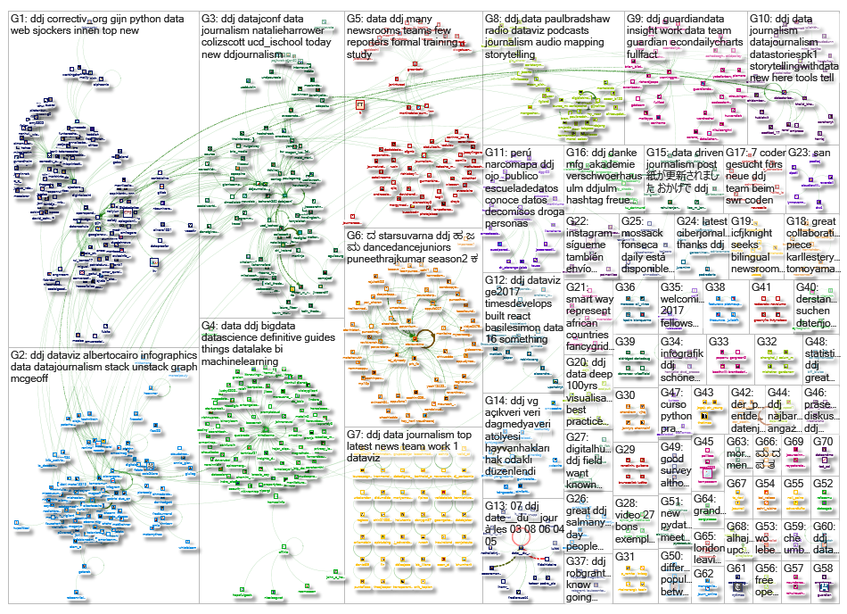
Thanks, once again, to Marc Smith of Connected Action for gathering the links and graphing them.
For a look at Marc Smith’s mapping on #ddj on Twitter, check out this map.

This work is licensed under a Creative Commons Attribution-NoDerivatives 4.0 International License
Republish our articles for free, online or in print, under a Creative Commons license.
Republish this article
This work is licensed under a Creative Commons Attribution-NoDerivatives 4.0 International License
Read Next

Data Journalism
10 Outstanding Data Projects Win the 2024 Sigma Awards
There were 52 data journalism entries from 22 countries in shortlist for the 2024 Sigma Awards. Here are the top 10 winning projects.

Tipsheet Data Journalism Reporting Tools & Tips
Tipsheet for Using Ocean Data in Your Investigations
Investigations into what happens on, under, and around the ocean can often be answered thanks to the vast amount of data available online.

Data Journalism Reporting Tools & Tips
Best Practices for Working With Mass Shootings Data
There can be confusion among journalists about “mass shootings” data, which leads to wildly different numbers and deeper confusion among audiences.

Data Journalism Data Journalism Top 10
Trump’s Disappearing Donors, Tracking the Mars Rover, and the Ongoing Wars in Gaza and Ukraine
Our column of the best in data journalism also features stories on AI’s ability to forecast the weather, analyzing the Argentine president’s Tweetstorms, and apathetic EU voters.