
A Data Journalism Expert’s Personal Toolkit

Tipsheet for Using Ocean Data in Your Investigations

No Coding Required: A Step-by-Step Guide to Scraping Websites With Data Miner

What Washington is Doing in Your Country: A Tipsheet for Investigating US Influence Around the World

Basic Data Journalism Tips for Editors
People regularly ask what tools to use or what programming language to learn for data-driven journalism (ddj). There is no right answer for it, especially considering that technology and tools available are evolving quickly in the field.
Nathan Yau from FlowingData recently described how he works in data visualization. His post applies perfectly to data-driven journalism tools:
“What tool should I learn? What’s the best?” I hesitate to answer, because I use what works best for me, which isn’t necessarily the best for someone else or the “best” overall.
If you’re familiar with a software set already, it might be better to work off of what you know, because if you can draw shapes based on numbers, you can visualize data.
I was interested to review my own toolkit. Spoiler alert — this post is code-centric and will mention R a lot. This is just because I am familiar with it. I do not think everybody should necessarily use my workflow. I will not discuss much Excel, Python, Javascript, … I am well aware, however, that they are more typically used in ddj.
Before I dive into my typical workflow and tools for 2016 so far, I should mention that I work as the sole data journalist in my newsroom. It is more common in news outlets to have data/visual journalism teams, with people specialized in specific sub-areas of data-driven journalism. My workflow is pretty much data journalism on a shoe string.
Also, by ideology and because I am a nerd, I use (nearly) solely open-source free tools. Again, it is just because these are what I am more familiar with. But if there was a proprietary framework with which I can do things faster and better, I would switch in a heartbeat.
Data Acquisition, Cleaning, Formatting
Tabula: Sometime you have to deal with a data journalist’s worst enemy: data trapped in a PDF. This simple tool, no coding required, makes the process of getting a data table out of a PDF less painful.
Open Refine: I usually work with raw data directly from R. But if your data are too messy, cleaning it by scripting or manually in a spreadsheet can get tedious. Open Refine makes data cleaning interactive and reproducible. It brings the best of both worlds of scripting and manual cleaning.
LibreOffice/Google sheet/MS Excel: The less I use a spreadsheet software, the happier I am. Excel is unfortunately still a standard format to distribute data. I typically use it to inspect data and for basic data cleaning or reshaping.
R: I will come again later to my beloved Swiss-Army knife language R. R is a free open-source statistical computing language. A statistical framework sounds like overkill to publish stories for the masses? Just think of it as one of the most popular programming languages to deal with data. There are heaps of packages to extend its functionality and it has a large helpful user community.
You can scrape data with R (with rvest for instance, similarly as with Python’s Beautiful Soup) or get data directly from open data portals’ APIs (World Bank, Eurostat, …). But R really shines to shape your data (merge, subset, aggregate, etc.) with packages such as tidyr & dplyr.
Analysis

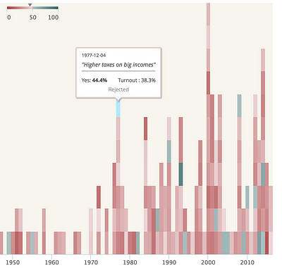
A random ggplot2 example from “Cookbook for R”.
In data-driven journalism, it is critical to explore your data rapidly. This means querying your data with questions you have or looking for patterns or outliers in your data.
Data exploration is typically an iterative process where new questions or ideas arise as you dig into your data. To me, nothing beats R for exploratory data-analysis. You can quickly reshape your data and produce a vast array of different graphics suited to address any questions you might have. The R package ggplot2 is particulary helpful for that.
Furthermore, with R markdown you can create sleek PDF or HTML reports mixing code and the resulting graphics. This is a great feature to document your work, but also to publish your complete methodology along with your story. Similarly, as with scientific papers, the methods used in data-driven journalism should be explicit, transparent and reproducible.
Production Graphics
Static Data Visualizations
R (ggplot2 + Inkscape/Illustrator): Default graphics produced with R might only appeal to engineers… With a few lines of code, though, you can greatly improve and template the chart’s look. (Check, for instance, this ggplot2 graphic.)
It is often important to add text and explanation to your graphic. This can be done, of course, programmatically in R, but if you have a lot of annotations it can get tedious. R graphics can be saved as a PDF or as SVG and manually edited in Inkscape (free & open-source)/Adobe Illustrator to add an “annotation layer.” This is, for instance, how I created the graphic below.
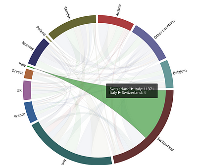
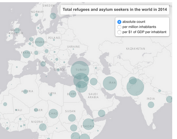
I aim to produce in the future more static graphics using only R, though. If you are pursing some kind of mobile-first strategy, you may want to use parsimoniously large interactive graphics and produce more “responsive” vector graphics. Vector (SVG based) because you want your graphics to look crisp and pixel perfect on any screen size. Responsive design to handle different device also sizes elegantly but in terms of layout. For instance, this graphic made with R shows multiple maps. Depending on you screen size, you will have many map boxes on one row, and if it is small it will have fewer.
Interactive Data Visualizations

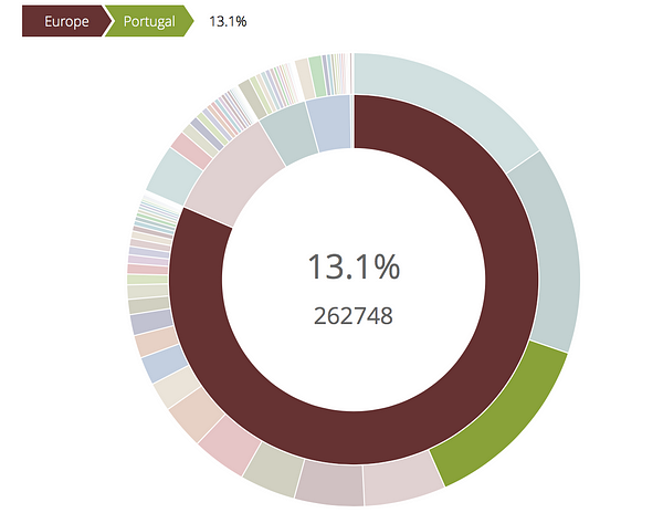
Example of a choropleth map of Switzerland made with datawrapper
datawrapper: Data-driven journalism ≧ fancy dataviz. I suppose people should know that data-driven journalism is much more than fancy data visualizations. Data stories do not always need innovative graphics to best convey a message. Standard bar or line charts often work best to make a point. For that, I am fond of the charting tool datawrapper. It is open-source but offers cheap paying options for hosting responsive interactive charts. It is used across our newsroom by all journalists. We got a datawrapper-chart layout fitting our website, so I am not tempted to spend time on minor design tweaks as I typically do when I code a graphic. And it recently extended its chart options: choropleth, bubble map, faceted bar charts, bullet chart, etc.
R + rCharts / htmlwidgets: d3.js is hands-down THE programming language for interactive data visualizations. For me, though, who is not proficient in javacript/d3.js and the fact that I have to create graphics in ten languages for the media I work for (including right-to-left Arabic), coding data visualizations from scratch in d3.js is too time-consuming.
In my case, I found that creating interactive data visualizations from R using bindings to javascript (with packages such as rCharts or htmlwidgets) is a great alternative. Of course, this doesn’t offer the same visualization freedom as coding with d3.js. But I consider the limited possibilities/customizations can be worth the time saved. And a workflow advantage is that your data analysis and production graphic code can be in one script based on the same underlying data. This makes reproducibility and updating graphics a breeze.
Binding from R to leaflet.js (map) or Highchart (charting library) to name only two packages, offer a wealth of interactive graphic possibilities. Here are some examples (click on the thumbnails to see the interactive graphics):

That’s about it. This post is longer than I expected, but I feel my workflow is more complicated to explain than to use. I would be curious to know how other ddj people/teams work or any tips to do things faster or better.
This story originally appeared on Medium and is reprinted with permission.
 Duc Quang Nguyen is a data journalist and project manager at swissinfo.ch. A data scientist turned data-journalist, he’s enthusiastic about data mining, open-data, open-source tools, and data-driven journalism. He holds a Ph.D. in computational biology from Oxford University.
Tipsheet for Using Ocean Data in Your Investigations
No Coding Required: A Step-by-Step Guide to Scraping Websites With Data Miner
What Washington is Doing in Your Country: A Tipsheet for Investigating US Influence Around the World
Basic Data Journalism Tips for Editors

This work is licensed under a Creative Commons Attribution-NoDerivatives 4.0 International License
Republish our articles for free, online or in print, under a Creative Commons license.
Republish this article
This work is licensed under a Creative Commons Attribution-NoDerivatives 4.0 International License
Read Next

Data Journalism
10 Outstanding Data Projects Win the 2024 Sigma Awards
There were 52 data journalism entries from 22 countries in shortlist for the 2024 Sigma Awards. Here are the top 10 winning projects.
Tipsheet Data Journalism Reporting Tools & Tips
Tipsheet for Using Ocean Data in Your Investigations
Investigations into what happens on, under, and around the ocean can often be answered thanks to the vast amount of data available online.

Data Journalism Reporting Tools & Tips
Best Practices for Working With Mass Shootings Data
There can be confusion among journalists about “mass shootings” data, which leads to wildly different numbers and deeper confusion among audiences.

Data Journalism Data Journalism Top 10
Trump’s Disappearing Donors, Tracking the Mars Rover, and the Ongoing Wars in Gaza and Ukraine
Our column of the best in data journalism also features stories on AI’s ability to forecast the weather, analyzing the Argentine president’s Tweetstorms, and apathetic EU voters.