
Top Ten #ddj: The Week’s Most Popular Data Journalism Links
What’s the data-driven journalism crowd tweeting? Here are the top ten links for July 16 to 23: 2490 D3 Visualizations (@d3visualization); corrupt techniques on evidence presentation (@edwardtufte); examples of fiscal data visualization (@OKFN); Australia’s mining footprint (@ICIJorg); and more.
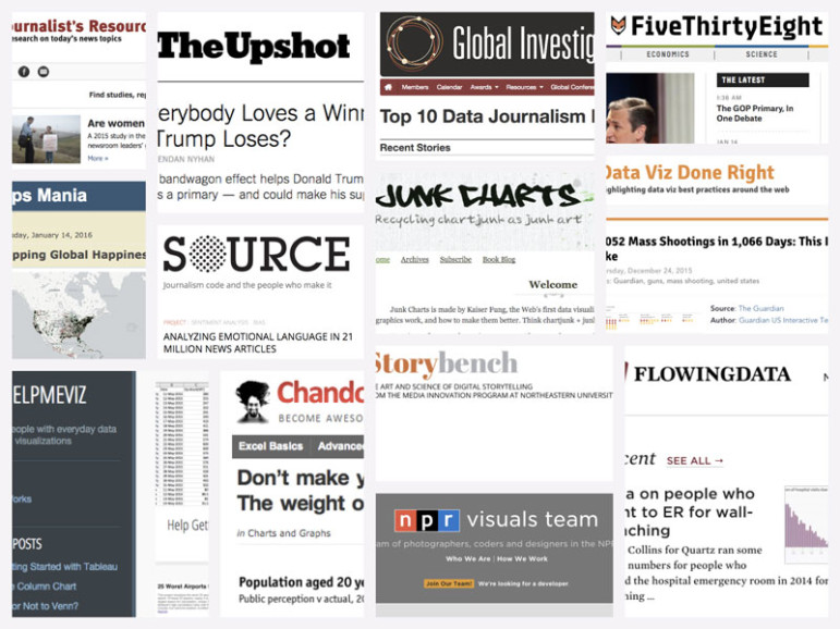
Improve Your Data Literacy: 16 Blogs to Follow in 2016

Tipsheet for Using Ocean Data in Your Investigations

No Coding Required: A Step-by-Step Guide to Scraping Websites With Data Miner

Basic Data Journalism Tips for Editors

Earthquakes, Floods, Vanishing Schools & Missing Kids: The Year’s Top Data Journalism from China

GIJN’s Data Journalism Top 10: Pollution in China, Visualizing Punctuation and the World Cup

GIJN’s Data Journalism Top 10: What to Ask Google, Gerrymandering California and Dwindling Doctors

Top Ten #ddj: The Week’s Most Popular Data Journalism Links

This work is licensed under a Creative Commons Attribution-NoDerivatives 4.0 International License
Republish our articles for free, online or in print, under a Creative Commons license.
Republish this article
This work is licensed under a Creative Commons Attribution-NoDerivatives 4.0 International License
Read Next
Data Journalism
Earthquakes, Floods, Vanishing Schools & Missing Kids: The Year’s Top Data Journalism from China
GIJN invited data scientists and experts who have been focusing on data journalism in China for years to select the most noteworthy data news of 2018. Here’s what they told us.
Data Journalism
GIJN’s Data Journalism Top 10: Pollution in China, Visualizing Punctuation and the World Cup
What’s the global data journalism community tweeting about this week? Our NodeXL #ddj mapping from June 25 to July 1 finds @FinancialTimes’ timelapse map of pollution over China, @mcrosasb’s choice of five interesting World Cup 2018 visualizations and @Internews’ overview of its data journalism projects in developing country newsrooms.
Data Journalism
GIJN’s Data Journalism Top 10: What to Ask Google, Gerrymandering California and Dwindling Doctors
What’s the global data journalism community tweeting about this week? Our NodeXL #ddj mapping from June 18 to 25 finds a visual story about fixing household stuff by @xocasgv and @GoogleNewsInit, another about fixing political stuff by @Washingtonpost and @paulbradshaw on teaching data journalism.
Data Journalism
Top Ten #ddj: The Week’s Most Popular Data Journalism Links
Here are the top data journalism tweets for Feb 20-26, per our NodeXL mapping: risky extrapolation (@albertocairo); US Congress Facebook analysis (@pewresearch); keys to good data stories (@ddjournalism); data journalism’s potential (@jburnmurdoch); Venezuela minimum wage (@CamburYMedio); & more.