Satellite Images as Proof
In the past week, three stories on three very different issues showed once again how satellite images, until recently confined to the weather report, are now the stuff of front-page news. All three are important stories with wide-ranging implications on public policy. But they also raise questions about the reliability of satellite imagery as proof and the ability of journalists – and their audiences – to make sense of them. Just like photographs, satellite images without context can distort the truth. And like photography, interpreting satellite imagery is as much art as it is science.
In recent years, there have been a number of journalistic projects that made good use of the wealth of satellite imagery, which is increasingly freely available. The 2006 project Vanishing Wetlands by the St. Petersburg Times, is a good, early example. Comparing satellite photos taken in the late 1980s and in 2003, the report showed how 84,000 acres of wetlands in Florida had vanished in the previous 15 years right under the noses of regulators tasked with protecting them. But the learning curve for using satellite images is steep, and for the most part, journalists have lagged behind other users, including NGOs, in making full use of them.
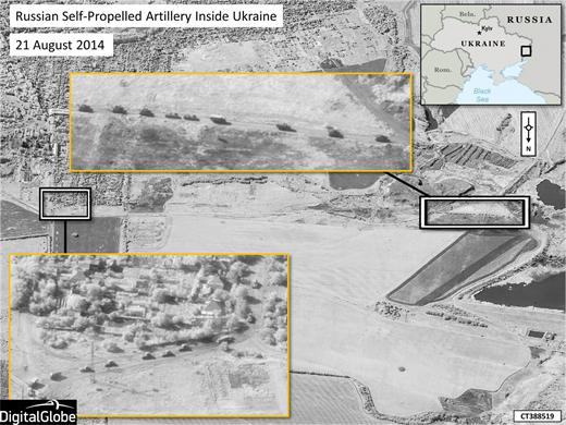
On Thursday, NATO released five satellite photos from an independent company called Digital Globe that purport to show Russian combat troops and artillery crossing into the Ukrainian border, contradicting Russian and Ukrainian separatist claims that no such incursions had taken place. The images are dated August 21, 2014, and they appear authentic, but most news reports published the photographs from the NATO press release without independently verifying their provenance or the reliability of the NATO interpretation. The best roundup was from the Washington Post, which pieced the images together with reports, videos and photos from the field in a story that asks a question without giving a definitive answer, “Has Russia invaded Ukraine? Here’s what we know.”
On the same day, August 28, the ninth anniversary of Hurricane Katrina, ProPublica and the New Orleans nonprofit news site The Lens unveiled “Losing Ground,” an interactive map using satellite imagery that showed how nearly 2,000 square miles of coastal land in southeastern Louisiana had disappeared in the past 80 years as levees, canals and oil wells and pipelines were built. Given the current rate that the sea is rising and land sinking, the story said, most of southeastern Louisiana would be under water in 50 years.
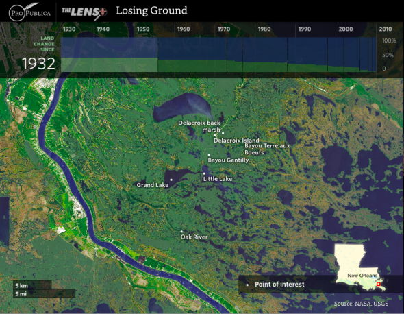
Using 40 years worth of images from NASA’s Landsat satellites, the report dramatized the scale and severity of the problem. Two ProPublica developer-journalists worked six months to process the LandSat sensing data and used maps and aerial photography from the US Geological Survey dating back to the 1920s. The resulting news app visualized how much the land had changed in 80 years.
As described in a blog post by Columbia’s Tow Center for Digital Journalism:
The opening scene of the app has eight layers. The top one uses scanned copy of a 1922 survey map owned by the USGS and scanned by the Louisiana State University library. Jacobs pulled it into his mapping software to match the geographic features with GIS location data and used photoshop to prepare it for online display; cutting out the water and normalizing the color.
The bottom layer displays the 2014 coastline – stitched together from six Landsat 8 tiles, including many steps of processing. Jacobs picked out images from satellite passes when the skies were free from cloud cover. After pulling in the image tiles from the infrared and true-color bands and merging them together, Jacobs normalized the distortions and color differences so the separate images would mosaic consistently.
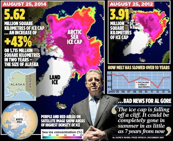
The third story using satellite imagery this past week came from the Daily Mail and it says that contrary to the claims made by Al Gore and climate-change scientists, the Arctic sea ice cap has expanded since 2012. It’s a rehash of a story the Mail published at around this time last year and was widely excoriated by science blogs and the Guardian for peddling “Arctic sea ice delusions.”
The Daily Mail didn’t say exactly where the satellite images came from, what dates they were taken, and what changes, if any, were made on those images. The original images were not shown; instead what appeared to be one image was made part of a graphic and readers were not told whether this image was a photoshopped version of the original. More importantly, even if the images were reliably true, year-by-year changes in sea ice are not an indication of global warming. “The Arctic has lost 75 percent of its summer sea ice volume over the past three decades primarily due to human-caused global warming,” said the Guardian, “but in any given year the weather can act to either preserve more or melt more sea ice. Last year the weather helped melt more ice, while this year the weather helped preserve more ice.”
Stories like this make it seem that satellite images are the next frontier in a high-stakes propaganda war being fought in the media. It’s true that there have been a few examples of innovative and sophisticated use of satellite imagery, but journalists have not always been helpful in providing context, in verifying the provenance and meaning of the images and in assessing their reliability.
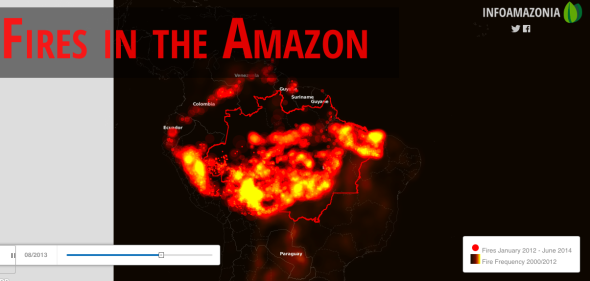
They’ve also been behind the curve in terms of constructing platforms that allow the audience to examine satellite images and data and to contribute to the existing body of knowledge. In this category, two examples stand out: Global Forest Watch, which uses satellite photos to track deforestation in real time and urges users to check them out and do something about them, and InfoAmazonia, where a group of nonprofits and journalists share maps, stories and data about nine countries making up the Amazon region.
Global Forest Watch analyzes imagery from NASA satellites to find likely forest clearing activity every 16 days and sends out alerts that provide the latitude and longitude of the areas where the clearing was believed to have taken place. One can search by country – say Indonesia or Brazil – and see how the forest cover has changed since 2006 and check the most recent alerts about forest clearing.
As anyone who has been in a rainforest or a timber concession knows, keeping track of where the forests have been cut is nearly impossible if all you have are forest guards, especially in places where those guards are often subjected to harassment and violence. Obtaining high-resolution imagery is a more efficient way to track tree-cutting but it is expensive. Global Forest Watch, however, uploads the images for free. ” You don’t need a PhD in remote sensing to use the data,” its website says. “You can browse the maps for free.”
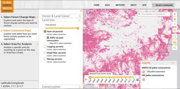
Run by the World Resources Institute and 40 partners including Google and the University of Maryland, Global Forest Watch lists all its data sources and has easy-to-follow tutorials that allow users to make full use of the information — whether they are environmental activists or local communities or companies interested in the timber supply chain. The site has data on palm oil plantations in Southeast Asia and a user can, for example, choose to overlay the map with forest fires, changes in forest cover, etc. Wired has raved about the interface in, “How a New Map of Palm Oil Plantations Could Help Save Rainforests.”
Similarly, Info Amazonia makes available maps and datasets. A recent project visualized two years of forest fires in the Amazon using NASA satellite data.
One may not need a PhD to use the maps, but it can be a hard slog and the interfaces are not always intuitive. Still, NGO use of satellite mapping has come a long way in the past decade. In the beginning, they were mainly used to corroborate information that came from elsewhere. In 2007, for example, the American Association for the Advancement of Science used before-and-after satellite photos to show the destruction of Karen villages in Myanmar and verify reports of human rights violations there. In 2005, AAAS found satellite images that corroborated eyewitness accounts of the demolition of settlements in Zimbabwe and in 2006, the destruction of villages in Darfur in 2005.
In satellite imagery as elsewhere, our capacity to aggregate, analyze and interpret is outstripped by the quantity and speed of information being produced and made freely available. If anything, all these projects demonstrate the need for a new literacy in satellite imagery, not just for journalists or others in the information space, but also for citizens who are likely going to be served more and more of these images as part of their daily diet of news.
 Sheila Coronel is dean of academic affairs at the Columbia Journalism School, where she founded the Stabile Center for Investigative Journalism. She is co-founder and former executive director of thePhilippine Center for Investigative Journalism. This is reprinted from her blog, Watchdog Watcher.

Tipsheet: Latest Tools for Investigating with Telegram

Investigating Elections: Threat from AI Audio Deepfakes

Updated GIJN Databases (Poverty, Crime, Corruption, and Terrorism)

Updated Resources on Corruption
Tips for Using Satellite Imagery in Forensic Investigations, from Amnesty International’s Evidence Lab

Lessons Learned: 10 Common Mistakes in Data Journalism

Best Practices for Election Coverage Using YouTube

How Alexey Navalny Was Inspired by — and Inspired — Investigative Journalism in Russia

This work is licensed under a Creative Commons Attribution-NoDerivatives 4.0 International License
Republish our articles for free, online or in print, under a Creative Commons license.
Republish this article
This work is licensed under a Creative Commons Attribution-NoDerivatives 4.0 International License
Read Next
Methodology News & Analysis
Tips for Using Satellite Imagery in Forensic Investigations, from Amnesty International’s Evidence Lab
When the Myanmar military started conducting airstrikes on its citizens, researchers at Amnesty International began a forensic investigation into the supply chain, using satellite imagery to find out how aviation fuel was getting into the country, and who was supplying it.
Data Journalism News & Analysis
Lessons Learned: 10 Common Mistakes in Data Journalism
GIJN asked speakers and attendees in the NICAR conference hallways for the data journalism gaps they see, and for under-covered topic areas and under-used skills that newsrooms can address.
Reporting Tools & Tips Teaching & Training
Best Practices for Election Coverage Using YouTube
At the recent International Symposium on Online Journalism (ISOJ), one workshop offered suggestions on how journalists and media outlets can better use YouTube in their election coverage.
Getting the Story Out Press Freedom
How Alexey Navalny Was Inspired by — and Inspired — Investigative Journalism in Russia
Anti-corruption campaigner Alexey Navalny proved that anyone, after investigative training and practice, can expose rights abuse at the highest levels of government.